

Automotive companies, among other organizations, have a pretty steep hill to climb when it comes to forming an identity. They have to have a product (or group of products) resonate positively for a given period of time, and then build on that momentum in order to achieve some kind of success.

Although not automotive related, the Netflix comedy Unbreakable Kimmy Schmidt illustrates brand cohesion quite well. The Tina Fey-produced series was originally picked up by NBC, then dropped and almost left for dead before the streaming juggernaut saved it. It’s clear that the peacock network consciously shifted away from high concept comedies to tense dramas. A show like Unbreakable couldn’t work because there is no 30 Rock or Parks and Recreation airing in a comedy block that can support it.

In contrast to television, it’s less clear if design unity necessarily influences buyers perceptions of a brand, although evidence supports the notion. For the purposes of this discussion, my definition of brand cohesion applies mainly to exterior design. Generally speaking, we all know what type of automotive DNA the manufacturers inject into their cars to create certain ride and handling characteristics , so my focus is going to rely on the sheetmetal itself to show how design cohesion has worked previously, and how it affects the industry today.


It goes without saying that luxury automakers have been playing this game for decades now. The example above shows how deep the design language goes for luxury brands these days; not only does the same fascia adorn their cars, but their CUVs as well.

Perennial luxury underdog Lincoln still has an uphill battle before it starts selling in numbers that frighten the competition from Germany and Japan, but the executives in Detroit certainly understand what they need to do to build a consistent vision.


Here are three of the latest Lincoln products, all with the split angel-wings grille up front and the single LED light bar in back. This is the way you build your luxury brand from the ground up. Most importantly, and from experience, these cars pass the “can I tell what it is at night test” while cruising around town. For luxury automakers, design cohesion is absolutely essential.
But what about mainstream brands? I’d argue that design cohesion is less essential for these automakers, but the recent trend is heading toward much more similar front fascias for nearly all the current players.
Ford has had an interesting history with making their products similar in appearance. In two separate periods, Dearborn created a game-changing product with a new design that changed the industry and made their competitors take notice. The signature design then spread across most of the lineup in a short period of time. Readers of my previous articles will not be surprised that the example I’m thinking of is none other than the 1986 Ford Taurus.


Here we have it: The more mainstream offering led the charge for more niche products to follow the leader, so to speak. The results don’t lie: Paul wrote extensively how the moves at Ford made it hugely successful by the time George Bush Sr. took his oath of office.
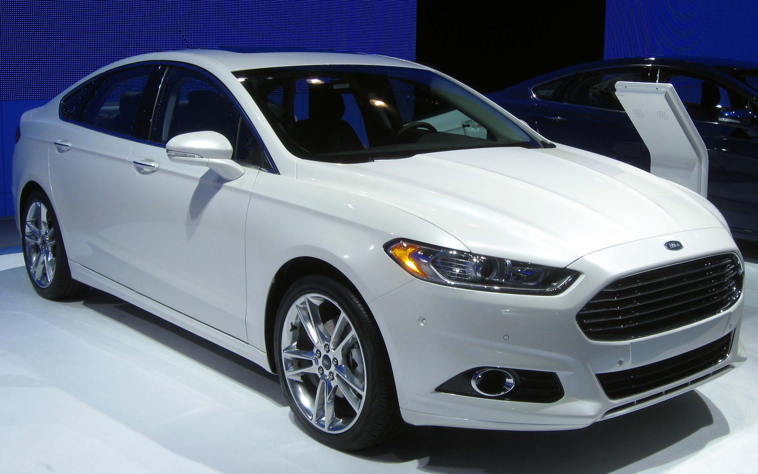
Fast forward to the 2010s, and Ford once again proved that American automakers could make a class-leading midsize sedan, with a trend-setting design that went beyond one model.


Look familiar? These are the recently refreshed Fiesta and Focus, cars which had different grilles before the Fusion arrived at showrooms in late 2012. The cohesion is strong here.
Now I don’t want to give you the impression that exterior familial resemblance is automatically a good move, because it isn’t. In my opinion, what we see above is perfectly fine for mainstream brands for a defined period of time. To paraphrase Harvey Dent: You either die the hero, or live long enough to see yourself become Volkswagen.

See this? Its the Golf/Rabbit from 2005. An attractive, no-nonsense design, for sure. Lets see what the V-Dub corporation has done in the era of selfies and twerking:

If you stuck a human from 2005 into a DeLorean equipped with a flux capacitor set to 2015 (which is coincidentally the year Marty travels to in the second film) his mind would not explode in astonishment from looking at the current generation Golf. Customers shopping in the correct space-time continuum are also not impressed; Annual U.S. sales of the Volkswagen brand went from well over 400,000 units per year to about 360,000 in 2014. The entire Volkswagen brand sold approximately 25,000 vehicles in February 2015, which roughly equals the number of Camrys moved during that same period. Those are not good numbers to have and, in my opinion, it’s a failure to break from traditional designs and move onto something a bit more trendy, even if that means breaking the familial appearance of the brand.
My opinion? Stick with a design theme across your lineup for two product generations, or about eight years maximum. Then it’s time to either significantly revise it or start fresh with a new look. Of course, there are many nuances to this argument and exceptions to my somewhat arbitrarily created rule, so feel free to have at it in the comments. Look out for more discussions related to auto design and its implications in the future.


You’ve brought up a very interesting subject on automotive design. I mostly agree with your feelings. Personally, I think the length of time for a design theme depends on the brand and how well they can carry on a language of design with appropriate updates.
The big determining factors are: 1) How well-received are these styling characteristics, 2) How quickly can other cars in the brand’s lineup be updated with this styling, and 3) How successfully this design theme can evolve over time.
As Audi has proven, the more conservative the styling, the longer it can be carried out. And I’m not just talking about the front-end styling. If you look at the greenhouse of the A6, it has stayed largely the same since 1998. Despite Audi’s still looking very attractive and elegant, I think it’s time for them to start being a little more adventurous. Hopefully the sharper-edged styling of the new TT and Prologue concept can find their way to Audi’s bread-and-butter cars.
Then you look at Acura. They received quite a bit of backlash for their “Power Plenum” shield grille they released back in 2009. Although the look has evolved to a much more attractive interpretation on later models, most people still compare it to the ’09 TL, effectively making it a failed design theme. As seen on the refreshed ILX, the shield is virtually non-existent anymore, in favor of a grille design similar to that of what Acura was doing in the early-2000s.
As for other current brand themes like Ford’s Aston Martin-like front and Lexus’s “Spindle” grille, we’ll have to see how those play out. I really like this look on Fords, but I feel like it will become tire and blasé in a few years. Lexus is making Spindle’s more gaping with each model, and I anticipate a point when it will become too off-putting for most, much the way tail fins did in 1959.
The trouble with the Lexus spindle grille is that it is a contrived rather than a natural shape. It’s like a fat man (me) frantically sucking in his breath trying to convince his wife that he really hasn’t put on weight.
The designers were trying too hard to be different, and it shows in the tortured shapes of the metalwork (plasticwork?) all around the grille. Not elegant at all.
Believe me, I hate the spindle. Especially on F-Sport models, which use the mesh grille grille pattern instead of horizontal chrome slats.
The Lexus grill always puzzles me because it seems like it’s the opposite of their brand identity- angry and rebellious, when their vehicles have always been more friendly and approachable. If they were a person, the new grill is that guy who is always yelling at you, while their cars are more the friendly guy who isn’t very exciting but is around when you need him.
Brendan, You’ve hit the nose on the key factors underlying an automaker’s timeline for design cohesion, with the key really being the reception of the design by consumers, as that should dictate how long it sticks around. Acura really dropped the ball in this regard – they have kept that shield look on their cars for far too long.
I’m still going to stick with 8-10 years as the shelf life for a particular design, at least when it comes mainstream automakers. Luxury makes can extend their look beyond that, as their buyers tend to me more image conscious than most.
While having common design themes for continuity is generally a good idea, I’m not a fan of making homogenized vehicle models that only vary in size. The same styling isn’t necessarily a good fit on different sizes of vehicle, eg: boat-tail Riviera (stretched to fit larger platform), AMC Marlin (stretched to fit larger platform than Tarpon concept), the Lincoln MKX above.
One story goes that RAM was split off from Dodge so that they could follow their own design paths. Why? There’s no rule that pickups and cars from the same brand must look alike. If all upcoming Nissans look like the new Titan XD, that company will be in trouble!
I’ve also read that new Chevys are taking design cues from the Corvette. I think this is a mistake, one that Virgil Exner made by sharing design cues between expensive and cheap cars. It’s a good thing that Acura toned-down that can-opener grille when they stuck it on the new NSX.
I was also thinking that the uniform design language would be bland by necessity, so it is a better fit across all models. On further reflection though, I think that Ford and Cadillac are doing a good job.
The MKZ looks just like the Dodge Dart from behind (I finally know the name of that Lincoln so I had to start with this statement).
I hate the way all the brand have to share the same look, it is boring. And why would I buy the top of the line model when it looks just like the cheap-o. I am not a fan of the Dodge Dart and that certainly condemns the MKZ and therefore the rest of the Lincoln family for me. Also manufacturers really seem to stifle there creativity when they do this, look at the Pontiac double grill design.
MKZ just borrowed some styling cues from the past products. Dodge on the other hand borrowed some styling cues from their past products for the taillights too. I think for the spilt grill MKZ went back to the Zephyr decades ago.
Ah, now I see the Lincoln heritage, a big red horizontal tail light with back up lights in the middle.
So how does one SAY the names of these new Lincolns? EmmKayEx or Mark X? For those of us of a certain age, the brand’s design cohesion is irrelevant if you can’t mention the vehicle in conversation.
I have a Mark VIII and I heard the unfortunately wrongful referrings by Lincoln dealership as MKS, Mark LT by a 19yo kid in mechanical shop, and Continental Mark VIII by an insurance agent.
MKZ was Zephry for one year only and it was quickly changed, but I still hear referring as Zephry sometimes.
dman,
It’s definitely “EmmKayEx.” Lincoln wanted everyone to pronounce their new nomenclature saying “Mar” so-and-so, but it never worked out that way.
I must say that I like the current Golf more than the 2005 model. The older one looks like an innocent little bunny. The new one means business. I like simple and square lines with clear body-angles. “Rounded” cars look dated and odd after a while, clean and simple designs are timeless. That’s why a Mercedes W126 still looks like a modern-era flagship.
Note that Volkswagen dictates the C- and D-segment in Europe, so exactly the opposite of North America. The introduction of today’s Ford Mondeo (Fusion) was delayed for a few years, for whatever reason(s). Too late, this one is the segment-leader.
On the other hand, when it doesn’t work so well…
Agree with Arvid above.
Have the same feeling for the current generation of Lincoln as I do for the Edsel. There comes a time to cut your losses and run. Lincoln needs to come up with something fresh and new or go back to the Continental of the ’60s.
Your wish as been granted!
http://jalopnik.com/2016-lincoln-continental-concept-this-is-it-1694455362
That looks like what the second generation Chrysler 300 should have been, instead of the conservative also-ran it now is.
The styling of the Golf perhaps suggests that VW’s focus was not the USA when it was designed. It is the benchmark in Europe, so “looking like a Golf” is a good thing here.
I can’t get over Ford’s chutzpah in aping the Aston Martin nose, and I’d agree with others who suggest this degree of sameness is a bit boring – and can come across as somewhat desperate, in the case of marques like Lincoln.
Ford even adapted the Aston nose treatment to the current Falcon. It worked – now I can’t remember what the previous model looked like. Or is that just old age?
See, I like Falcons, but that puts me off a little bit. When I look at it, I want to have a word with whoever decided this had to be done – and ask them why.
I’m not saying it looks bad, but it bugs me for some reason.
Pete, no one can remember what the last one looked like. This is because it looked like every Falcon for the last 15 years.
What I like about the current generation of cars, so not only Ford, is that the headlights are much smaller than in the recent past. For a long time many cars had ridiculously oversized headlight-units that went all the way from the grille to the windshield. It looked horrible, especially on small A- and B-segment cars.
Window of My Eyes (Cuby & The Blizzards)
Given how much aerodynamics dictate the shape of a car, whatever they can do to make it somewhat recognizable, is a plus in my book. Ford front ends are a perfect example; the Aston grille and headlights…..
Fascinating topic and a fine write up from Edward. I like the traditional design influences and cues that survived from the 1960’s. It takes a lot of guts and a leap of faith by a manufacturer to go out of their comfort zone when designing something completely new and different. The 79 Ford Mustang was one such departure but it took the Ford Taurus to see how far Ford went out on a limb with that design. The unsung hero who put his neck on the line was Ford Design Chief Jack Telnack, a man who deserves mention in the same manner Bill Mitchell has gotten over his designs of influence. Amazing to consider what came from his design studios, the 79 Mustang, Aero TBird, Taurus, Tempo, Escort among many big selling cars from that era.
The uproar over GM’s decision to axe the traditional Corvette rear 4 round tail lamps in going with a hockey stick-like LED light treatment still has the traditionalists up in arms. But look at the lower grill opening on these cars and what do I see but a Harley Earl-influenced C1 grill! In my time as a young kid enamored with car design in the 1960’s, design cohesion meant the Chevrolet went with 4 rear tail lamps and some variation of an egg crate grill. Cadillac meant rear tail lamps housed in a vertical fin of some kind, an egg crate front grill and stacked headlamps. Pontiac (RIP) meant a beaked front grill. Oldsmobile meant some kind of variation on the twin vertical rear tail lamps and a twin grill opening in the front. The design cues from the 1964 1/2 Mustang can still be seen in todays 2015 model. Challenger and Camaro reflect the first generation of those old nameplates.
In some corners, they call it Retro, in an unflattering manner at times. But I think these design cues and the influence from past models are important to the buyer who remembers fondly those cars back in their youth. I’m glad that at least Detroit recognizes the value in past design influence while trying to integrate those cues on their entire family of cars.
That current Ford front grill opening design being a cue from Aston Martin? I see more of an influence from the 1968 Shelby Mustang there.
So far I agree with the comments posted.
BUT, look at truly great designs: in the early 50s Chevy slowly morphed it’s design….then the 55s arrived: huge jump/change. Another example? The 1st gen Camaro and the 2nd gen. Neither car looked like other Chevys nor was it an evolution from one design to another.
Ford’s 1st Mustang didn’t look like other Fords but as it “de-volved” to look like a mini – Thunderbird the design lost it’s uniqueness.
Oddly, the late 90s Taurus looks awful and is universally reviled but on a smaller scale for the Escort….it works.
Bottom line though, Ford’s decision to extend the Fusion’s “look” to it’s 2 smaller cars is a mistake IMHO. Chevy’s use of the same cues on ALL of it’s sedans is wrong because it dilutes the original design.
BTW, VW’s decision to stick with it’s “neo-breadvan” styling for the Golf caused the British magazine CAR to opine in the late 80s/early 90s that by the time the 4th or 5th gen Golf hit showrooms the “C” pillar might be several FEET wide.
VW went conservative with their styling and it worked….for awhile, but there are only so many customers who ignore the more exciting competitors that VW faces.
I don’t think VWs problem is the styling, it is selling low priced cars with expensive parts and maintenance pricing.
That was a typical CAR comment!
Mercedes was a prime example on how to do it right, under Bruno Sacco and his so called Horizontal/Vertical design language. Conservative as they was, he saw to it that any Mercedes should be instantly recognizable as a Mercedes both horizontally through the line-up, and vertically through time. And if you took a fifties pontoon Mercedes and put it against a 1980’s 190, you would recognize them instantly as coming from the same maker. That whole thing started to wander by the 90’s, and these days I think they have totally lost it.
Citroen, on the other hand, is quite known for having perhaps the most incomprehensive design language of all. Up until the 80’s, none of their cars looked like any other of their cars. Perhaps the GS/CX came the closest as being seen as siblings. Even the DS/CX/XM update is interesting, as there’s only a resemblence in overall packaging but not in the details.
Wasn’t a big reason for Mercedes’ recognizability for several decades the vertical/formal grille? It seems to me that they had to leave this behind at some point…it just wasn’t going to work in the aero age. I think that Ford helped make the Mercedes grille obsolete by plopping one on the front of the ninth gen Thunderbird in 1983. The T-bird’s mismatch of formal grille and aero body kind of worked, but largely as an announcement that the old formal design language was gasping its last breaths. And so Mercedes lost a big part of what made a car look like a Mercedes.
By comparison, BMW transitioned away from the formal grille much earlier. But it kept the twin kidney or oval shape that appeared on its formal grilles, and so everyone can still recognize a BMW today.
I always felt if you had a good look — for example the Mercedes grille, BMW shark face or 70s-80s GM formal roofline (Seville) — why not spread it around? You will sell more cars and at the same time create a stronger brand identity (and more awareness).
I see two common mistakes in the industry though. One is going with a look across your whole line, when it isn’t that great to begin with (your Lincoln pics). That’s so basic most companies don’t make the mistake.
Another is sharing a cue across models, whether or not that fits with the rest of the car’s design. The Tribeca face on all Subarus is an example. I love the Aston face on the Fusion, not so crazy about it on the other Fords.
Maybe a third common mistake is that a brand thinks it needs a hook and then sets out to create one even if they lack the design talent to pull it off. That new VW face is terrible, they should have waited until they could do a better job.
I think the best looks come by accident or from successful risk-taking on one car. The 80s Fords are a good example of that. They all sorta sprang from the ’84 T-bird.
“Another is sharing a cue across models, whether or not that fits with the rest of the car’s design.”
When you said that this is what popped up in my mind:
Ford’s Kinetic Design, the bigger the wilder.
That looks beautiful compared to the RAM Promaster van.
+10
+20
calibrick: The first-gen Tribeca face was never, thank god, “on all Subarus” – the only other models that had it were the final years of the gen-2 Impreza (2006-07) and one or two home-market kei cars.
The thing with the Taurus era is the similarity was only in hard details (flush composite headlights, grilless or semi grilleless noses, flush glass, ect), but the cars, the Taurus, Turbo Coupe, and Mustang LX pictured, really aren’t mistakable for each other, the 2015 faux Aston Martin front ends(which, is image dilution if I ever saw it) on the other hand are are pretty much full blown cut/paste jobs of the Fusion design.
What the current design Language reminds me of, in execution, not the design itself mind you, is the 70s era Fords/Mercuries with what believe Paul called the Ford Face.
Probably for original Taurus, Tempo and Escort should be remembered, adding a Merkur too.
I thought Ford ditched the “Edge” theme too soon. I really liked that. I don’t think the current “Aston Martin” look is as cohesive or will age as well. I’m already growing tired of it.
It’s rather odd too that Ford remade so many vehicles in the new design language yet the F-150 received the most conservative overhaul it’s had in decades (design-wise).
Interesting is that in trucking “similar front fascias” has been the norm for many decades. The whole model lineup has the same face for a long time. Of course it’s much easier to give a big box some sort of face than a car model.
Here’s an example, Volvo’s current lineup of cabovers.
They all have the “sash,” no?
How well does it work on a COE?
The sash was bigger on the previous gen.
And a lot bigger on the older ones. The badge says 12 Turbo 6. That’s a 6 cylinder turbo diesel with 12 liter displacement.
Design cohesion is great as long as the design is good. In no particular order:
Lincoln: I dislike the “wings” grille. Retro yes, attractive, no.
Kia: I like the simple “tiger” grilles. That dude from Audi they hired has some chops.
Audi: Cohesive to the point of being indistinguishable. “Was that an A4 or A6???” The LED headlight accents are brilliant however. Lots of immitation equals lots of admiration. Well done Audi.
MBenz: While the current grille treatment looks great on E or S classes, scaled down to the C class it looks forlorn, scaled up to the M ang G classes it looks ridiculously garish–almost as obnoxious as those huge Cadillac emblems on the back of Escalades.
GM: Huh? “Just put a big chromy grille on Buicks, build ’em in China, and we will all be happy. Take any leftover chrome and put on the truck grilles—use extra for the ‘Lade. Oh, take that supercharged V8 and put in everything with 4 wheels–Chevy, Caddie, whatever…..Oh, don’t forget to duct-tape the ignition in the “on” position.”
Hyundai: Should talk to their cousins over at Kia
Nissan/Infiniti: The Gshon way is not my way. What are they thinking? Juke and Leaf may have coherence, but at what cost? Q50 is a better name than G37 because….?
Honda/Acura: “You will buy this car because Honda had a good reputation” “We don’t do marketing” “That Beek on the Acura….well, don’t stare at it so much, and it won’t be sooo ugly. Drink six beers and call me in the morning.”
Mazda: Lot’s of cohesion, not much pleasantness. Mazdas sell despite their cohesively ugly appearances. Mazda has proven that some buyers do indeed appreciate chassis tuning.
Ford: Aston-Martin or not, it works.
Toyota: Ouch. Reputation for reliability outshines all other attributes. Appearance is irrelevent. Nice new 15 year old Camry you have there.
Lexus: I think the guy who designed that cow-catcher nose was dreaming about steam locomotives one long night. Major gaffe here. Let’s “out-Audi” Audi!
Subaru: Please pass the flat four shaped barf bag. Subie has somehow coralled an unlikely cohort of dedicated enthusiasts among both boy racers and environmentalists. Design is mostly irrelevent to both groups…and it shows. Tribeca anyone?–I really don’t get the whole attraction for environmentalists—why are they so attracted to Foresters? It’s not like they get superlative MPGs. Head scratcher here. This would be a good test case for some Marketing 301 class at Wharton to study.
Land Rover: They have the cohesion thing just right. Now if only they can make them run 5000 miles between major warranty repairs.
Jaguar: F Type does not exactly cohere with XJ. No coherence, but two desirable cars.
VW: Was that a Passat or Jetta? Audi squared.
BMW: Nice symmetry on the front, lots of junk in the trunk. What works for a small sport sedan doen’t necessarily work for a corpulent SUV. I get what they are doing, but I don’t think it will work much longer. Overkill–too much too long.
Porsche: Who cares what it looks like when it goes like that?
Dodge: Avenger as Impala is a fail. Dart forgetable. 300 still imposing, becoming less so. Challenger so retro it works. Charger is okay for a cop car—it snarls hatred. Coherence…what coherence…?
Hyundai/Kia has succeeded in keeping separate identities, interesting that the “parent” brand gets the tryhard, overdone styling though.
Mercedes’ current grille is…okay. Their sedan roofline, especially on the bread-and-butter C and E models, is subtly but non-unseeably wrong, as though the bodyshell was designed to be shared across several divisions including Mercedes.
Lincoln should be flashier, all about chrome and refuting the Germanic look of subtlety everyone else follows. It’s an underserved niche and since people are willing to buy optioned-up full-lux Fords it’s not like Fomoco would be abandoning the buyer who wants something more subdued if Lincoln gets to shout its’ luxury.
GM is four marques. Chevy trucks and GMC are better defined from each other than they have been in decades, Cadillac is on the third generation Art and Science look, Chevy cars are moving (slowly) away from the bowtie just above the license plate and Buick is basically Opel of America (and China) so your criticism of the last is accurate.
I think the “Aston” Fords look good too, although the Fiesta sedan’s blob-butt look is neither helped nor hurt by the new look at the other end. The big question is what’ll Aston Martin do over the next 10-15 years after Ford moves on leaving Aston’s ultra-lux wares resembling an aging cohort of Dearborn iron.
“Was that an A4 or A6???”
Simple – just chuck another couple of rings on for the A6!
A3? Take one off!
You might have problems fitting them all across the A8…..
And I’m so glad someone else thinks the last umpteen generations of Camry all look the same.
“And I’m so glad someone else thinks the last umpteen generations of Camry all look the same”. And the reason why? It’s the same platform since 2001. Yep… 16 model years. Look closely at the doors and you’ll see…
“Porsche: Who cares what it looks like when it goes like that?”
The Panamera. Case study in “Design Language that just doesn’t work on everything.”
All Buicks looked too Buick from ’91 to ’05. Can’t be more Buick really.
The Lincoln “heritage” grill, evoking the Zephyr/Continental indicated that they were at least on a consistent design path…WAIT, have you seen the new Continental? It’s a new “heritage”, sort of an ovoid with Lincoln stars, kind of like the, uh, well…maybe a fresh start is good!
Great conversation starter, Edward.
To use a non-automotive analogy, I think the Apple range of products best demonstrates how to work with styling. You’d be hard-pressed to cite the specific similarities between the original Apple Macs with the current range, but when you consider their progression along the time continuum you can see each model advancing from the previous. The design philosophy is intact, if not the specific cues. (This is also apparent in their interface, a not-insignificant aspect to their cohesion and success).
When the first iPod was released, everyone drew a breath. Gone were the multitude of buttons expected on this sort of technology and it proved to be their most significant game-changing effort. So this quantum leap redefined the whole category whilst staying true to the Apple design philosophy. Something like that is impossible to anticipate and plan for, and yet their underpinning philosophy allowed it to be conceived as well as fit with their other products. But will the market tire of this ubiquitous aesthetic at some point?
Moving back to cars, the best examples of consistent brand styling over many generations are, as mentioned above, Mercedes-Benz, BMW and Volkswagen. But the question has now become ‘how relevant is it to reference the past?’
There are many markets for automobiles. The Mercedes Benz and its ilk appeal to a certain type of demographic who use the previous design cues for validation, whether it be premium (MB) or pragmatic (VW). And other makers such as Lexus are playing some sort of catch-up with this idea.
The consistency across models could be said to be more a corporate desire; that all products on the road be a another easy-to-recognise reminder of the corporate entity. That’s of course not the only reason; the human mind to a certain extent draws comfort from patterns and similarities, and brand consistency plays to that urge. Plus there is the halo effect which has the junior members of the brand reflecting the senior ones. But at the risk of sounding trite, we are presently in a epoch where aesthetic considerations have fundamentally shifted.
I would say one of the more significant designs of recent years is the 2002 Nissan Cube. It is so far from the original idea of making a car look as dynamic as possible, and yet it is completely relevant to today’s market. It’s not specifically a utilitarian styling solution, it’s more an anti-car for a generation fatigued by the previous century’s conventions. Although anecdotal, I remember reading one (young) person’s comments on choosing a car like this specifically because it didn’t conform to what a car should look like. And it didn’t look like a traditional ‘Nissan’, either.
Another is the Tesla, which appears utterly conventional (while still attractive) despite its fundamentally different innards. The Prius tried to look different to reflect this, but the Tesla’s styling is predicated on the idea that a game-changer at the premium end of this market does not need to signify externally how different it is. In fact, quite the contrary, I think it needs to look somewhat like the other cars in the golf-club parking lot, albeit a bit sharper.
In place of brand consistency, and bearing in mind the increased emphasis on the ‘self’ in this day and age, I think we are progressing towards styling reflecting the individual with the ultimate manifestation of that being the 3D printable car which will allow for relatively easy customisation to the tastes of the individual.
When Harley Earl was hired by Alfred Sloan to style the LaSalle, he took the cues from the custom bodied Cadillacs and commodified them to a junior production model that referenced up. This was soon joined by the commercial imperative of building in some styling obsolescence in order to sell next year’s model and these two principles have co-existed for about a hundred years as the prevailing paradigm.
I don’t think there’s an easy answer to this question. Some in the market will want something that’s part of the family, whereas others will want something that entirely unique. Manufacturing processes in the future will allow for this fracturing of consumer expectations.
Don, I am blown away by the intelligence of your comments, have you considered writing for these guys?
Thanks, and yes.
How about the ugly beaks that Acura’s had for a short time?
….vomiting….,.
I still am repulsed by that. The prior TL in particular was and still is a handsome design, that hideous grille just ruined it.
I imagine that brushed grille thingie was to break into an untapped niche – luxury appliance cars! Acura – match your track mansion’s brushed stainless refrigerator, oven, dishwasher, and microwave with a grille on your car of equally shallow taste!
Nothing says “luxury” like a polished metal bucktooth…
Don Andreina:
“….will allow for relatively easy customization(sp?) to the tastes of the individual.”
Waaaay back when it was in the planning stages, one of the big points about the smart car was that like the watches they were being designed for easy customization. Yet, somehow, that idea was lost by the time the cars hit the showrooms in Europe. It is sometimes (VERY quietly) mentioned about the just released 2nd gen smart, and if you remember was also used as a rational behind the plastic body panels on Saturn cars.
You’re right Howard, the Smart car was a (prehistoric) attempt at this. But bear in mind, the Smart watch from which this brand philosophy was drawn, was the perfect pre-historic example of maximum customisation. Cheap to make and available in millions of colours, patterns and faces, it predicted the urges of the market.
But it’s not just about different coloured body panels now. It about the form as well. The simple fact is that the 3D printer will change consumer habits and expectations as much as the computer changed the workplace. Perhaps more so.
Please excuse my anglicised spelling. hehehe
heh, Swatch Watch. Everybody had one of those in high school, even me. The snap-on protectors were a genius move and kept revenue flowing I’m sure.
I can’t even remember what mine looked like though, so I guess it couldn’t have been that great.
Great question.
In a time when the industry is again under pressure from CAFE rules, another compression of the industry is occurring, and again, the manufacturers are struggling with just eliminating cars that are simply too similar in size, looks, and mission to be worth building all of them.
GM struggled with this mightily during the 1980’s. Look alike cars that varied by just a few cubic feet of interior space and utilized similar drive trains. History is repeating itself – how many CCs have been written about the X, N, and A serving similar slices of the market? The A being marginally smaller than the H?
Ford has the Fiesta and Focus that, outside of some specialty fun to drive versions, these are fairly cramped small cars that look alike. At least the Fusion and Taurus have somewhat unique looks, especially at the rear, but both sit on 112 inch wheelbase platforms serving the functional family car market in quite similar ways.
I see that Lincoln has put their Concept on the face of their website, their sales figures this year are pretty terrible, and they are obviously a bit desperate. I’m not a big fan of it, but at least it stands out in the look alike Lincoln sea that has been sloshing around in showrooms for waaaaayyyy to long.
If this link works, it provides some indication of the similarity of the MKZ and MKS…..
http://www.lincoln.com/cars/mks/compare/details?trim=373283&c=368860&c=
Established Lincoln models continue to struggle, the new small CUV helped with enough volume to make total sales go up at the cost of a new body and added platform to the line-up. The slightly revamped and actually advertised for the first time in years Lincoln Navigator also contributed a few units….
https://media.ford.com/content/dam/fordmedia/North%20America/US/2015/03/03/feb15sales.pdf
112 inch wheelbase?! Oh, it’s a compact car size, like the Dodge Aspen! It’s pretty roomy inside though.
I think the 112 inch from Ford is a result of growing mid-size sedan and downsizing full-size sedan overlaps together, but on the other hand GM has three full-size Chevys at the same time.
The Taurus doesn’t carry all of the weight of the change in the Ford styling in the 80’s. It owes a lot to the 1983 T-bird and 1984 Tempo. Of course the Taurus introduced the aero headlights and grille less front end that did permeate the rest of the Ford line up soon after.
I think cohesive design can become a prison for some makes. Jaguar comes to mind. It wasn’t able to evolve its styling like BMW or M-B and for a long time was trapped by retro looks.
An older example of sticking to the same theme for too long, would be the Packard grille in the 1950s and right up till the end.
Trying to stick with tradition when it didnt look good any more
A better example would be Rolls Royce, which still sticks that boxy, upright grille on cars that don’t suit it.
Packard did adapt/modernize their traditional grille, and I think their grille was in keeping with the times in the mid 50’s. However, traditional Packard buyers specifically asked for a car with the old-style Packard grille, which is why the 1955 Packard Request concept and the later Packard Predictor concept had traditional upright grilles. Perhaps that’s what you’re thinking of.
Pontiac and BMW grilles evolved similarly. Pontiac grilles shrank and BMW grilles widened to the point that they looked very similar, before Pontiac got the axe of course.
I don’t mind the Rolls Royce grills so much as the awful rectangular headlights. Probably should have stuck with tradition there.
The 3-D printing comments are interesting because it could bring us back to the days when more people custom ordered a car than chose an existing one on the lot. I would guess that most people under 30 are unaware that the pre-ordered car was once commonplace. Anticipation of the phone call from the salesperson announcing a coming build date was the source of great excitement in a family and was a sure fire way to make Dad the momentary star of conversation at a neighborhood BBQ. It also meant that fewer cars were inventoried and the highways were much more colorful places, as the main plot point in the custom order saga was always choosing a paint scheme. In the current scenario, one has to assume that there would be limits to how much control the customer would be awarded; the self conscious manufacturer wouldn’t want Joe Blow with no design talent to muck up one of their models. Has anyone noticed the ’56 Rambler wagon that keeps showing up on ebay at a silly reserve and never sells? It’s an attractive car until you open the door to find the lime and white exterior is nauseatingly paired with salmon upholstry. The customer who ordered it lives on in infamy.
However, 3-D printing is not a panacea. It takes time. You don’t press a button and make an intricate part in minutes; you walk away and come back much later while the printer laboriously lays down layer after layer and costs mount. 3-D printers are the artisans of our era. So the method is best for aftermarket application. But, even if you can go down to the mall and get your local 3-D printer to make a fender that has a wild shape, you pay for time it ties up the machine, the cost of final finishing and the exclusivity factor. Maybe that’s why we don’t see this happening to any extent.
I don’t think its a panacea, Barko. In fact I’m downright scared of 3D printing because it looks like its going to completely undermine the mass-employment manufacturing model that is the basis for ‘developed and developing economy’ stability and growth. This may be sometime in the future but as the materials being ‘moulded’ have more and more strength and integrity, then almost any manufactured product could theoretically be made with one of these things. I also anticipate speed of production to significantly increase. It’s still early days with these things and the best analogy I can make is to compare the colour printers of today with the mimeograph machines of the past.
Putting on my tin-hat, I see a time when you walk into a dealership and choose between the VW Golf Normal Edition, or maybe consider the VW Golf Extreme Edition with different contours to the body panels, or maybe the VW Golf Hello Kitty Edition with body panels shaped to resemble aspects of Kitty. There might be a large 3D printer capable of producing all of the components located in every major city which then prints out your order and you pick up the car in a couple of days or weeks. Hold on, I can hear radio signals coming in through my fillings.
Hahaha! Time to get those old silver fillings replaced with some current jobs… 3D printed, of course…
For at least the near term, I see 3D printing being primarily used the way it is today: rapid prototyping. It lets you go straight from CAD drawing to prototype part, saving lots of time and money. Once you get to mass-production quantities however, it can’t keep up with other processes such as injection molding.
I have been interested in the idea of “mass customization” for a long time, and I don’t believe it will ever come to pass. For major purchases such as a car, most people would be too afraid of making a “mistake” when choosing and winding-up with a vehicle that they’ll hate later.
If my parents are a good indication, most customers that factory-order a vehicle have a hard enough time agonizing over what paint colour(s) to choose. Their heads would explode if they could choose truly bespoke taillights, grilles, etc. I’m convinced that the percentage of buyers interested in that will remain very small, and best handled by the aftermarket. Not a market that mainstream auto manufacturers will be interested in chasing.
One of the closest things to that now is Katzkin leather interiors. You can order one through the dealer when you get a new car, but it’s still handled through Katzkin and the dealer. The vehicle would ship to the dealer with the standard interior which would then be replaced.
When I was researching the Roll-Royce articles, I discovered that people buying a custom body before the war would normally choose from a range of ‘house styles’ from the coachbuilder, usually rendered in 1/16 scale and shown only in profile to the prospective customer. Sort of the same thing.
Times have certainly changed since then but I still believe its possible to make a purchasing decision along those lines. I think the sales room of the future would also include the opportunity to compare the various VW Golf options side-by-side with a set of 3D projections allowing you to ‘walk’ around the cars.
As you mention (along with Kahneman and Tversky), the choice conundrum can explode heads; but managed carefully people appreciate having options. Just not too many.
It might boil down to this: almost every automaker has the mission to provide products that meet some demands. Two alternatives are possible: you either show the customer that your brand can make a product for every need, or you show him that you can make a single product that meets any need.
Lincoln has upset their apple cart again, as the new Continental concept ditches the split wing grille completely. I’ve not been a fan of it, so no tears shed, but they are getting rid of it just after it had spread to the entire lineup (Navigator being the last one in).
Generally, I think the cohesion has gotten out of control, to the point that it can be hard to tell different models apart from some distance. The rear ends of modern Cadillac sedans are so similar that I often confuse the ATS, CTS and XTS until I get close enough to determine the size. Having designs hold together as a family is one thing, but when they are nearly identical, it comes across as stale and unimaginative.
An automobile, like anything else has an “identity.” Think of Volkswagen, and the Beetle comes to mind; think of Cadillac, and the great, lumbering land yacht is visualized; think of Fiat, and a small, potent sports car is pictured.
When I think of Fiat I think of a pile of rust sitting on the berm, broken down and lifeless…
When I think of Fiat I think of a leading global company that develops, engineers and builds cars (from Fiat 500 to Maserati and Ferrari), vans, buses, trucks and farm- & construction machinery (ever heard of Case IH and New Holland ?). Furthermore it’s one of the biggest global manufacturers of gasoline and diesel engines, transmissions and axles. Known as FPT and VM Motori.
Great question, Edward. Branding is what I spend my days working on, and I broadly agree with your distinctions around class vs. mass auto brands* I’d never heard of Bruno Sacco’s horizontal and vertical design principle before, but as the former owner of a brace of W109s, I can appreciate it.
And it’s why I also feel some unease around the abandonment of the traditional Mercedes grille as a design cue, save for the S-class. The three pointed star is a powerful logo, but it’s not a design cue, no matter how big you make it inside the maw of a grille.
I do believe mass cars do have more room to flex, but also think a house style is important – because brands are really short cuts to the mind of very busy and bombarded consumers. So I like what Ford has done across their range with the current “Aston” grille, or what Chevy did in a past life with the triple and double tail-lights on their big cars, at least.
The big problem is that it takes incredible discipline not to change, and designs – like ad campaigns – wear out inside headquarters long before they do in the marketplace. And not just styling, but other key aspects like packaging, positioning, and naming. Say what you will about Toyota, but Corolla and Camry have kept their respective places in the line up while Taurus and Impala and Malibu have come and gone and come back.
Lastly, a thought on the just-released Continental Concept. I’ve really liked the direction Lincoln settled on with the butterfly wing grille, if not every execution, but at least the direction was positive with successive models.
Now we have this weird conflation of the ’62 Continental and a contemporary Jaguar. Plus 4-bar LED headlights for some reason, and insubstantial wheels. At least the back follows recent trends, but again, here’s an example of a “luxury” brand that doesn’t have the patience to build a design language.
‘The big problem is that it takes incredible discipline not to change, and designs – like ad campaigns – wear out inside headquarters long before they do in the marketplace.’
+1. Headquarters are looking at these things all day long whereas they enter the consumer’s mind only occasionally. Plus; the amount of times a new brand manager has decided to make his or her mark by changing things; new positioning, new campaign, new agency. Arrghh!