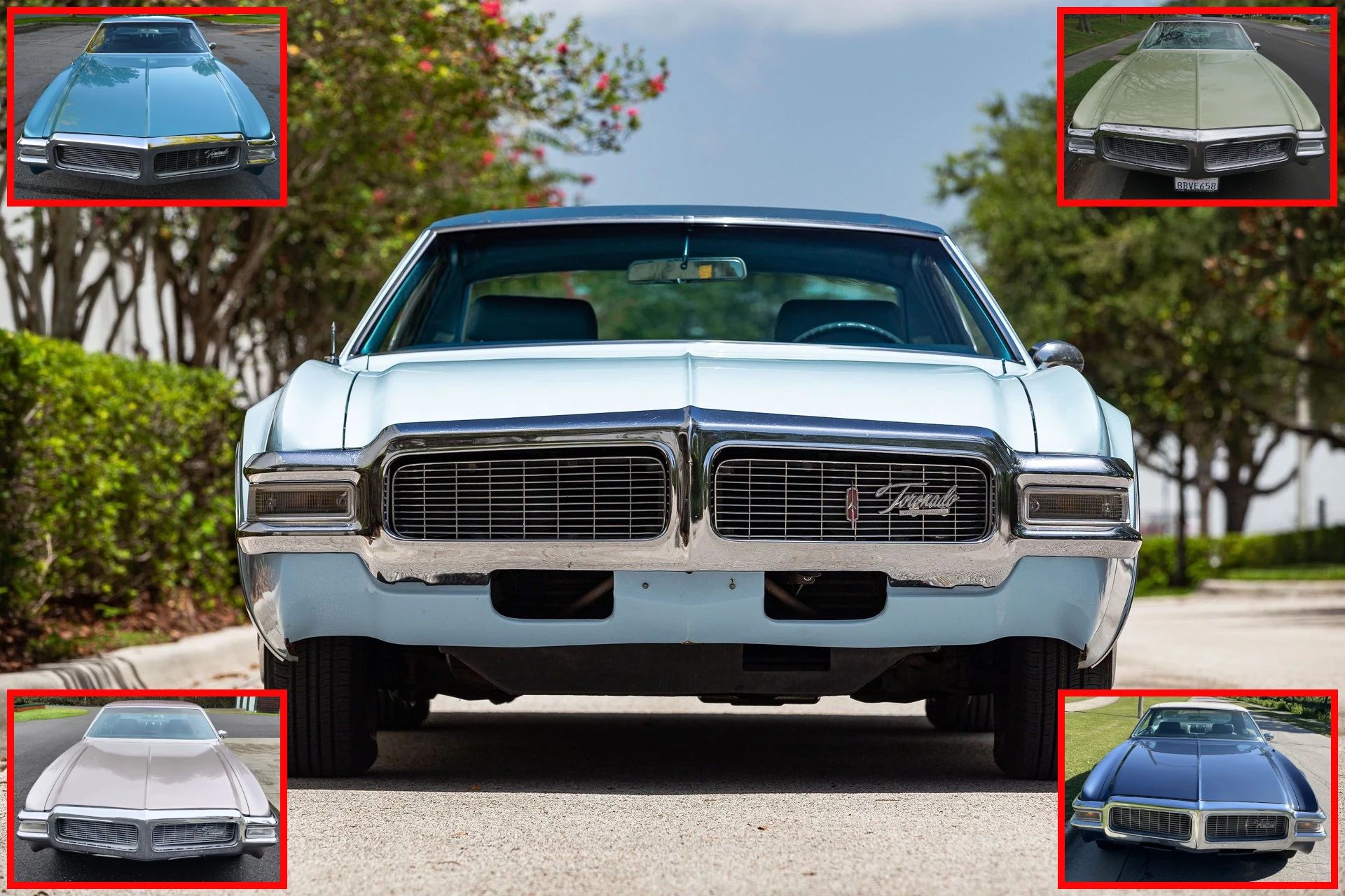
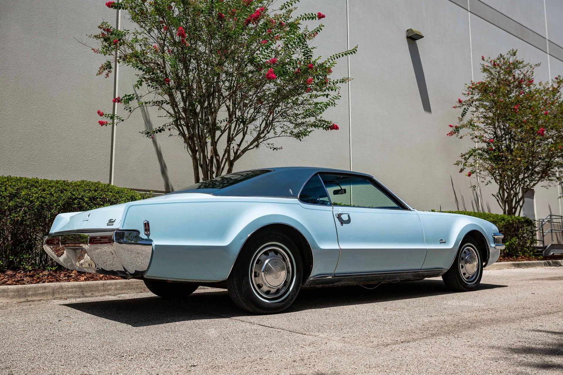
A while back, I ran across a listing for a 1969 Oldsmobile Toronado in an unusual color I hadn’t seen before, which got me thinking about the impact of color on a car’s styling and even its identity in the marketplace.
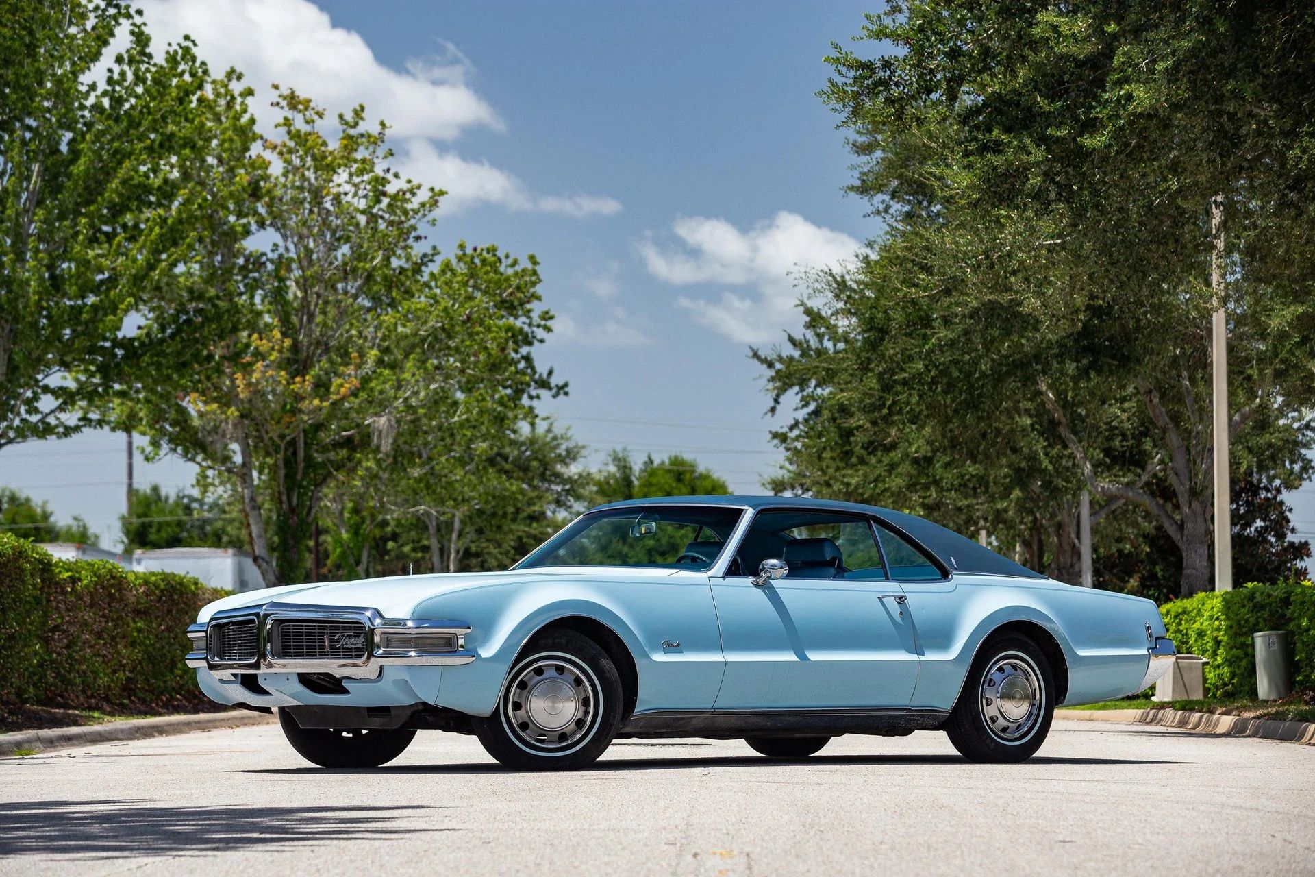
This particular color is called Powder Blue. I think it might have been a one-year-only option (there was a similar 1970 color called Azure Blue, but it wasn’t quite the same). It was a Toronado exclusive, albeit not one of the three extra-cost Toronado colors in ’69.
It’s not the worst color, I guess, and the darker blue vinyl roof gives an interesting two-tone effect, but I kept wondering what it was doing on the Toronado. On a Lincoln Continental or a Coupe de Ville, I wouldn’t have batted an eye — both Cadillac and Lincoln later offered their own shades of baby blue, which were fairly popular in the late ’70s. (As Billy Joel sang, “Your best bet’s true baby blue Continental.”) However, like the vinyl roof, it seems out of character for the Toronado.
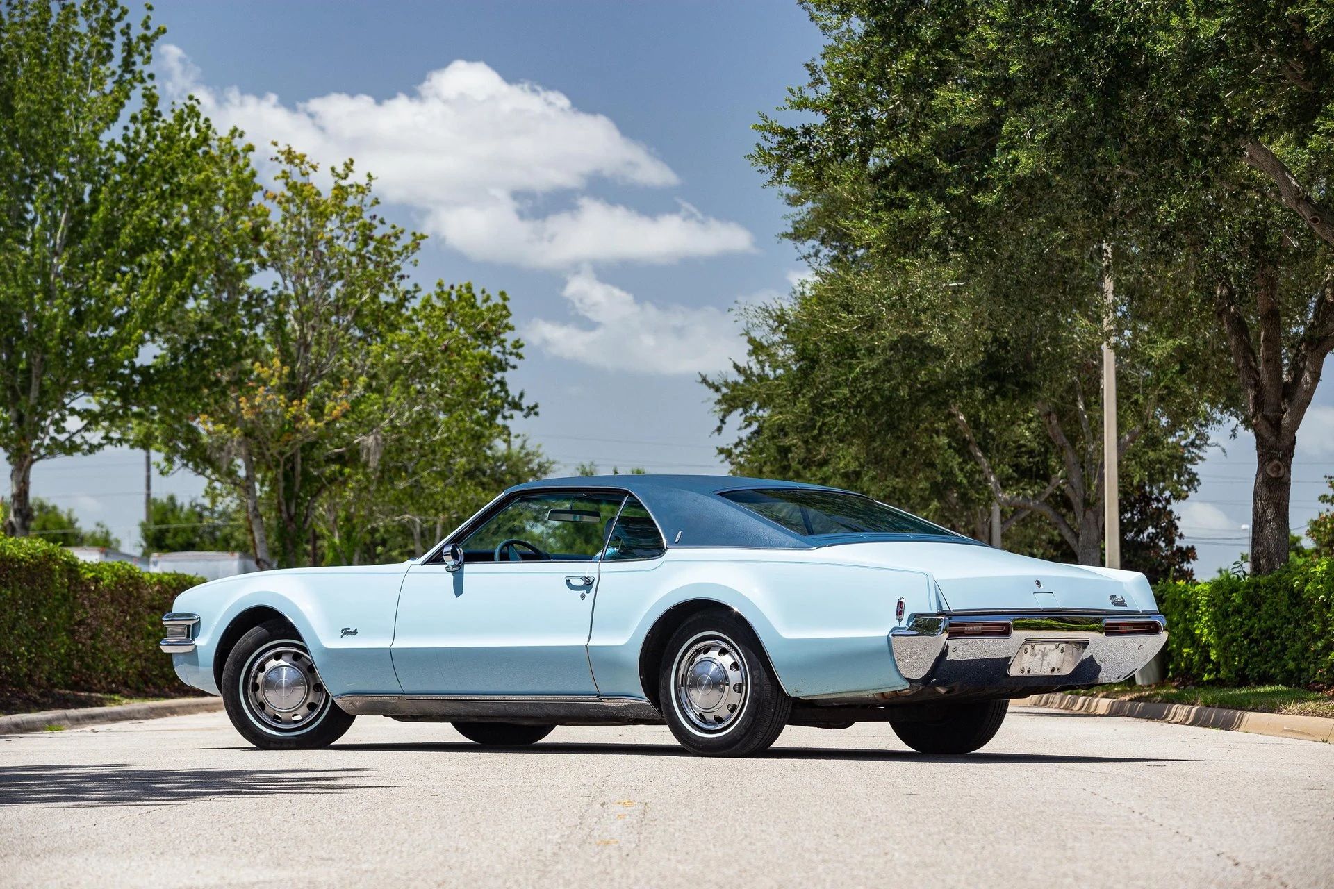
Or does it? Setting aside the question of whether the 1968–1970 facelift spoiled the original 1966 design, what was Oldsmobile actually selling by 1969?
If you’ll excuse my sounding for a moment like all those online sale listings that claim every clapped-out American sedan with a base V-8 is a “rare muscle car icon,” the look DOES say “oversize muscle car.” With its aggressive grille treatment, flared wheel arches, and rakish semi-fastback roof, the Toronado looks like the older brother of the contemporary GM A-body two-door hardtops. It doesn’t even look completely out of place with racing stripes:
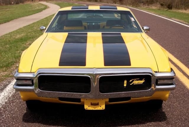
Oldsmobile didn’t offer stripes or matte-black hood paint for the 1969 Toronado, although you could get the 400 hp W34 455 cu. in. engine for an extra $47.39.
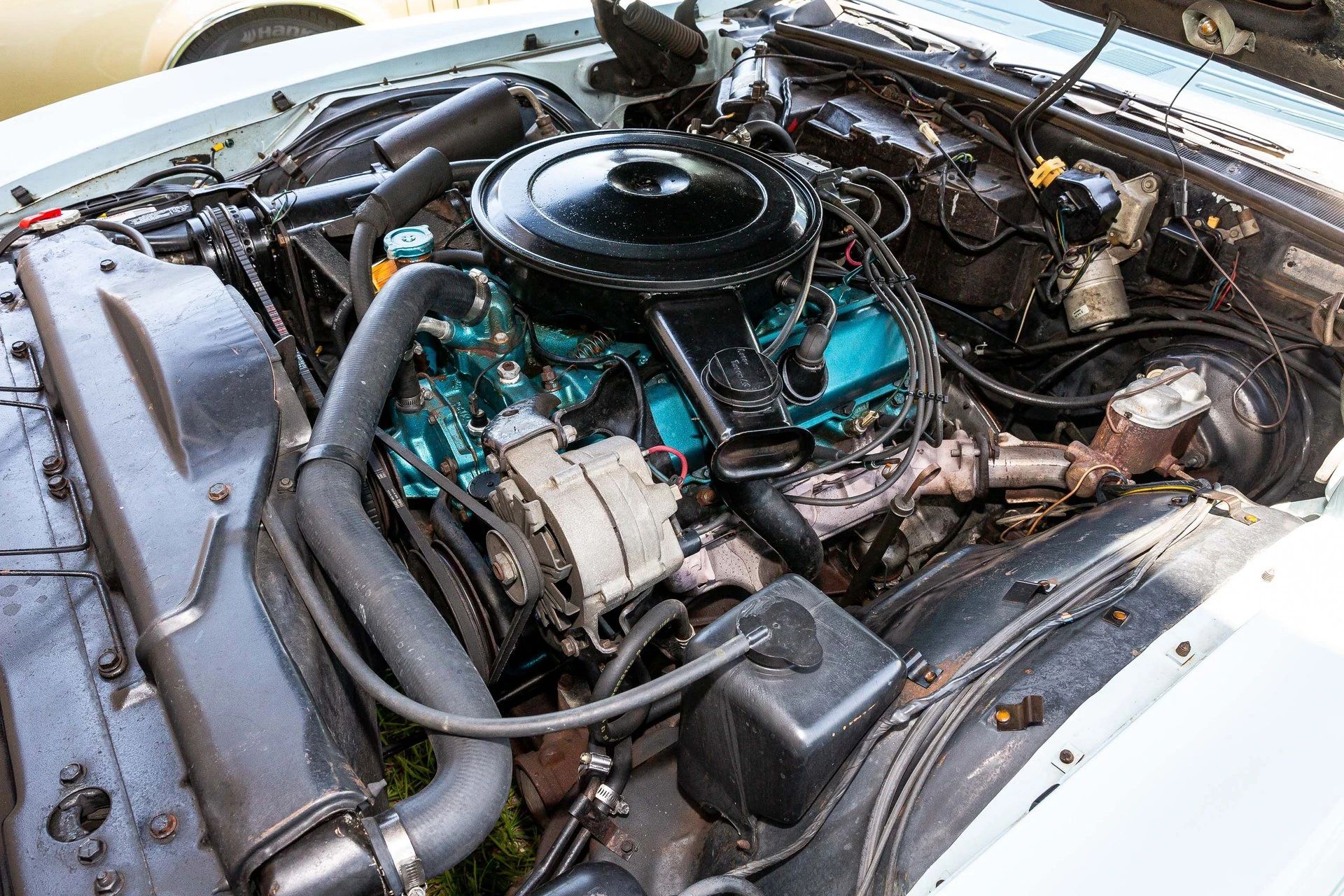
If the Toronado had actually been a Supercar, Powder Blue would have been a very weird choice. Even the loud Mopar High-Impact colors that were beginning to appear by this time didn’t run to baby-rattle blue. However, the Toronado really wasn’t a muscle car, and its claim to sportiness ran no deeper than the sheet metal — this was a big six-passenger FWD hardtop, hardly cut out for street racing or the drag strip. Typically equipped, it was also a $6,000 car, which was way out of the price range of most muscle car buyers of the time)

The price and this color scheme were perhaps more befitting a leisurely lunch at the country club followed by a round of golf, but in that league, the Toronado’s muscular profile became a handicap. As much as Oldsmobile kept trying to disguise it, this was really still a fastback, lacking the “formal” roof buyers in this class seemed to love. Next to a Mark III or a Cadillac Eldorado, the Toronado seemed dressed down, like showing up for a black-tie event in leisurewear.
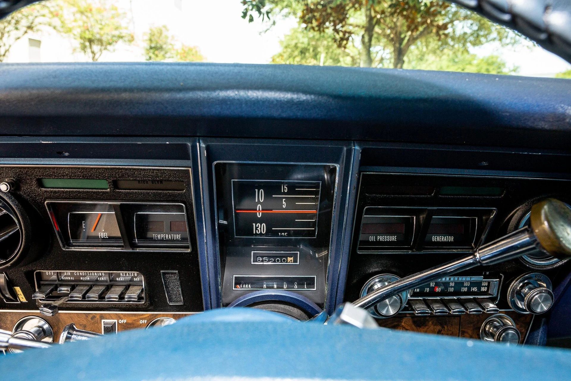
In the 1968 Ford Thunderbird dealer book I posted a while back, Ford knocked the Toronado and Riviera about the ears for their lack of a cohesive interior theme. The Toronado had always been schizophrenic in this area — the 1966 car‘s rolling-drum speedometer, full instrumentation, and aircraft-yoke horn ring had given it a bit of Buck Rogers flair that wasn’t carried through the rest of the interior, which just looked like a fairly nice Oldsmobile. Things had gotten worse in that department by 1969: The steering wheel was now a generic parts-bin three-spoker, and while the rolling-drum speedo remained, the rest of the instrument panel was now a kind of vacant death’s head, with blankly glowing lights in the empty sockets where the cost-accounting vultures had picked away the gauges.
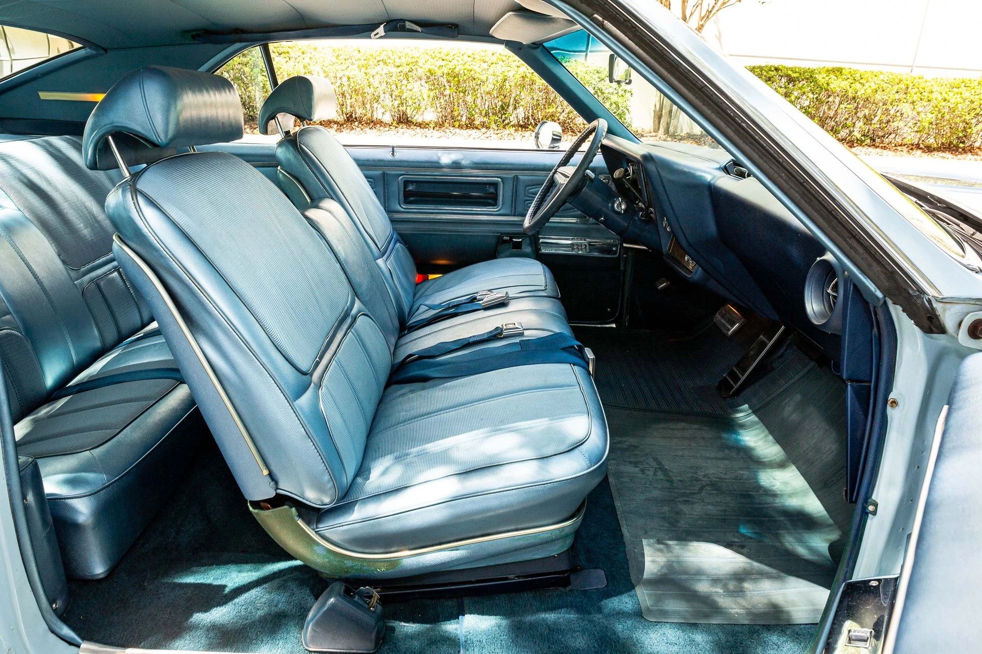
The 1969 Toronado was now offered only in Deluxe form, but most of the features of the former Deluxe model, including the popular Strato Bench front seat, were now packaged as part of the $173.78 Y69 Custom Interior option. Nearly 88 percent of ’69 Toronado buyers ordered this option, which with a Powder Blue exterior required a color-coordinated medium blue interior. This one has blue Excella pattern cloth with vinyl trim, whose design and color scheme has the unfortunate effect of making the seat backs look like they’re wearing bibs — not a felicitous association in a car that already looks like it should come with a pacifier.

Neither the Toronado brochure nor the dealer SPECS guide offers any explanation of the design embossed into the door panels. I’ve seen people describe it as a stylized “X,” although it looks to me more like a stylized fleur-de-lis; as to what either might have to do with the Toronado, your guess is as good as mine.
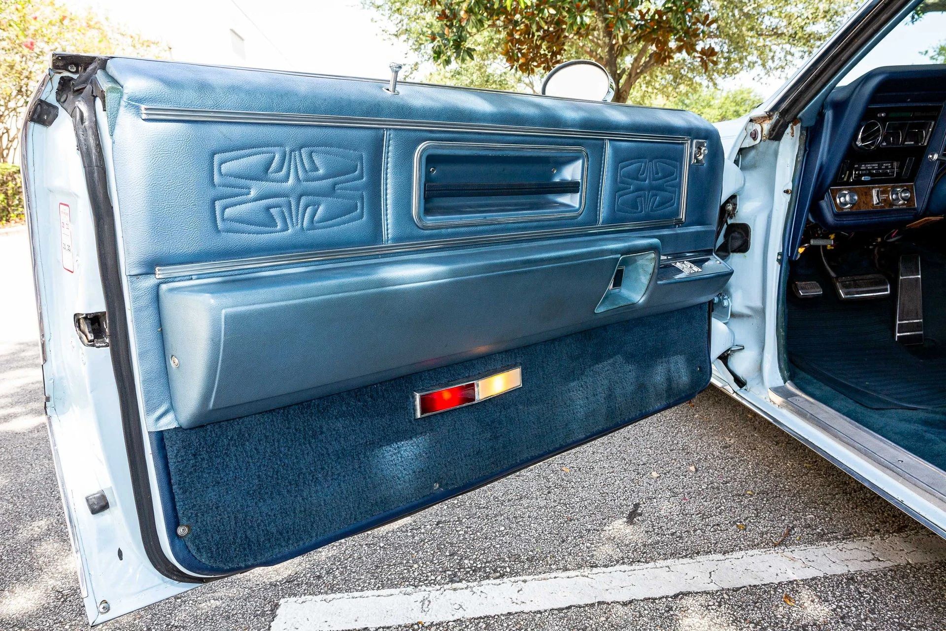
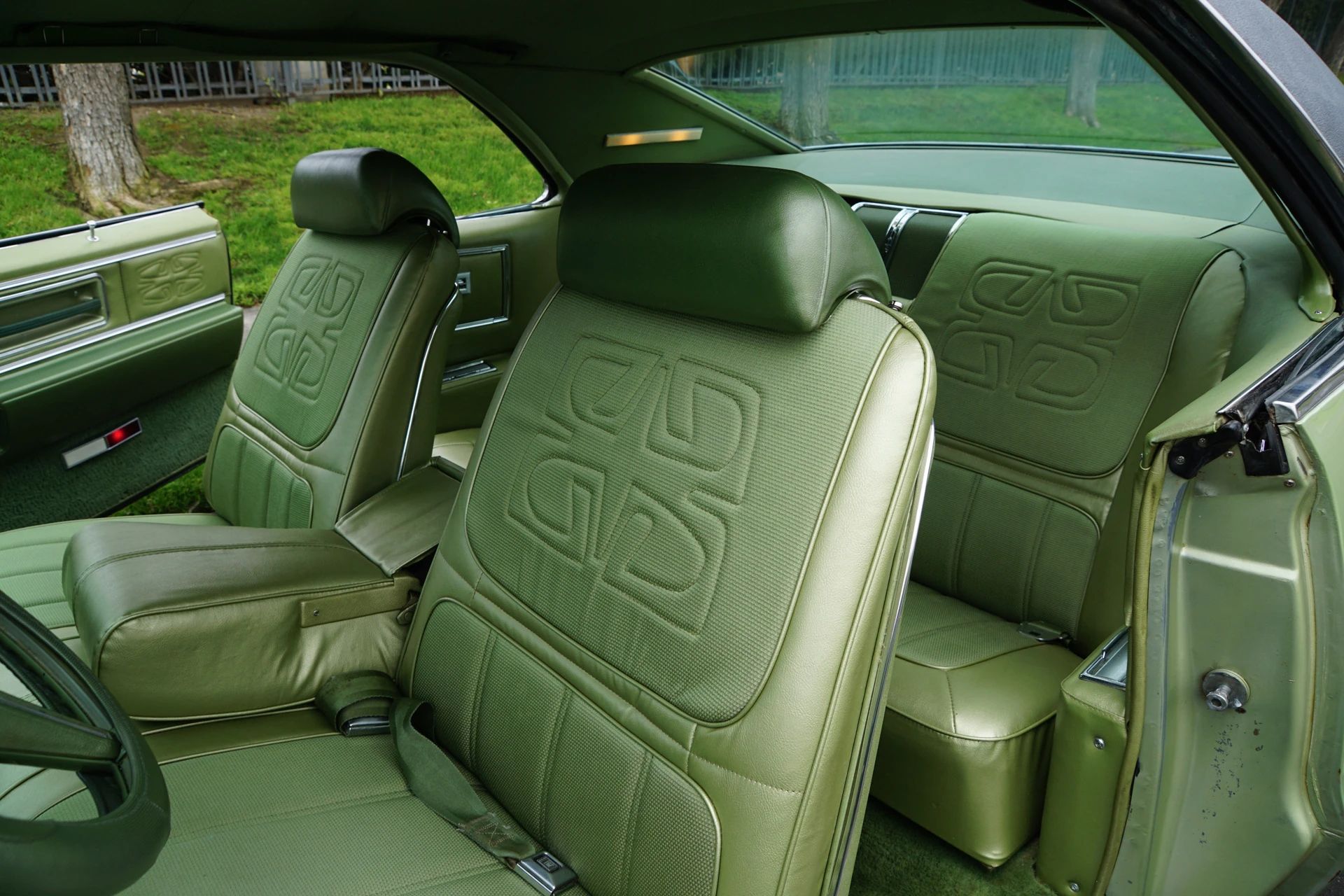
That design also normally appeared on the seat backs, although it appears absent on the front seats of the Powder Blue car and is only faintly visible on its rear seat — worn stitching, probably. Here’s what they’re supposed to look like:
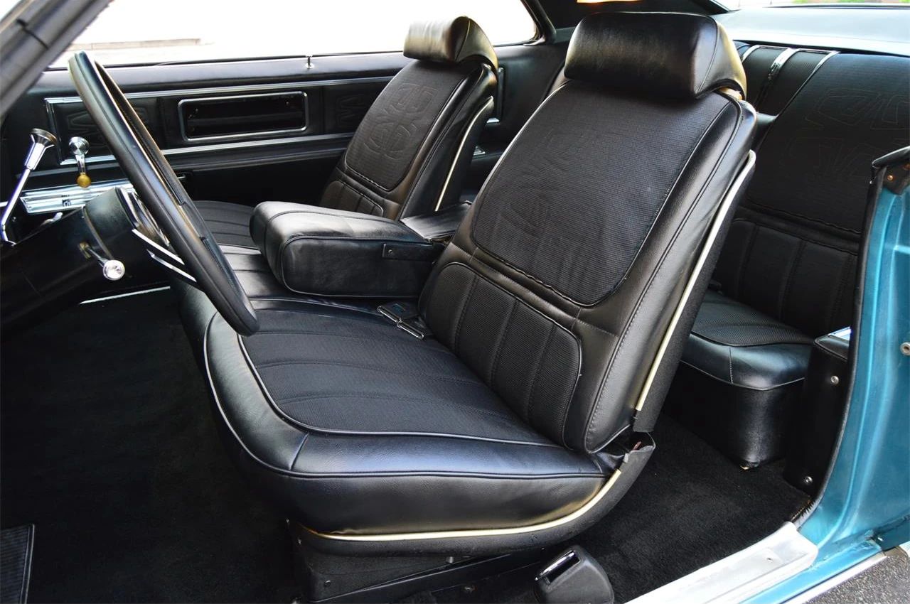
From a design standpoint, the Custom Interior is clumsy enough that black seems like the better part of valor. It doesn’t fix the lack of direction and aesthetic lapses, but it does a better job in masking them:
I’ve said it before, but it’s little wonder the Mark III made such a splash in this segment — it wasn’t always in the best of taste, but the Lincoln-Mercury interior designers clearly knew what effect they were trying to achieve. By all appearances, their opposite numbers at Oldsmobile hadn’t figured that out yet, and the Toronado paid a price for it. This is just not a well-designed interior:
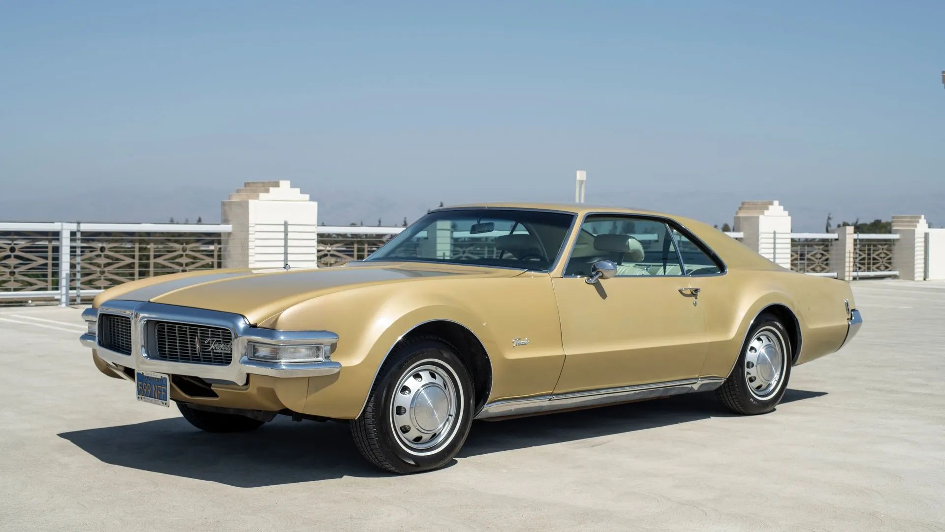
On the outside, so long as you can resist the impulse to compare it unfavorably to the ’66, the 1968–1969 Toronado is still a handsome car, even if it was in the throes of an identity crisis. Taken on its own merits, the shape works well with a variety of colors. It looks fine in gold, of which Oldsmobile offered four shades in 1969 …
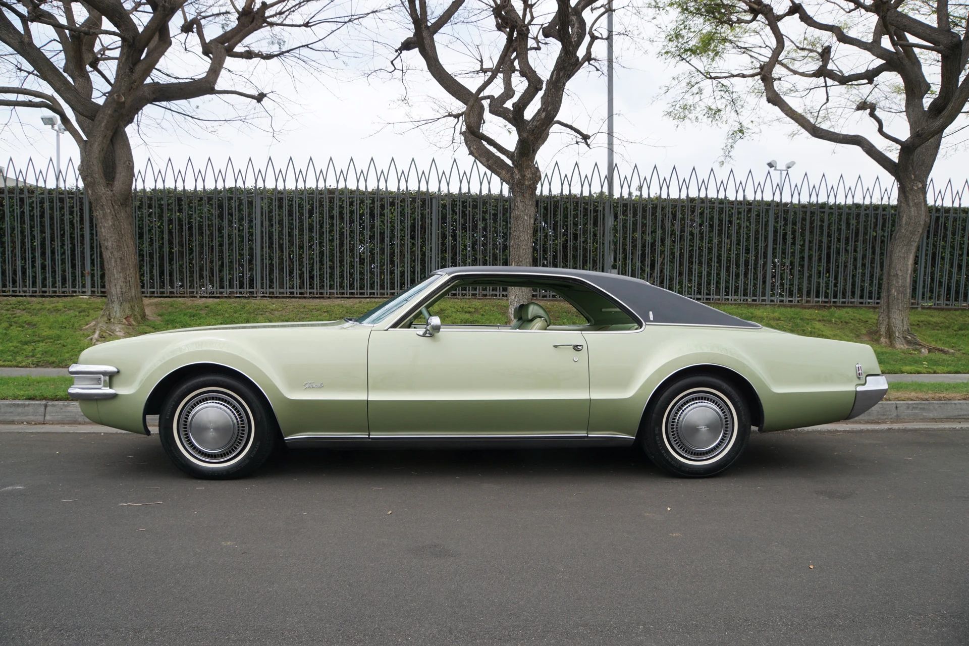
… or in the ubiquitous Meadow Green found on so many big GM cars of the time:
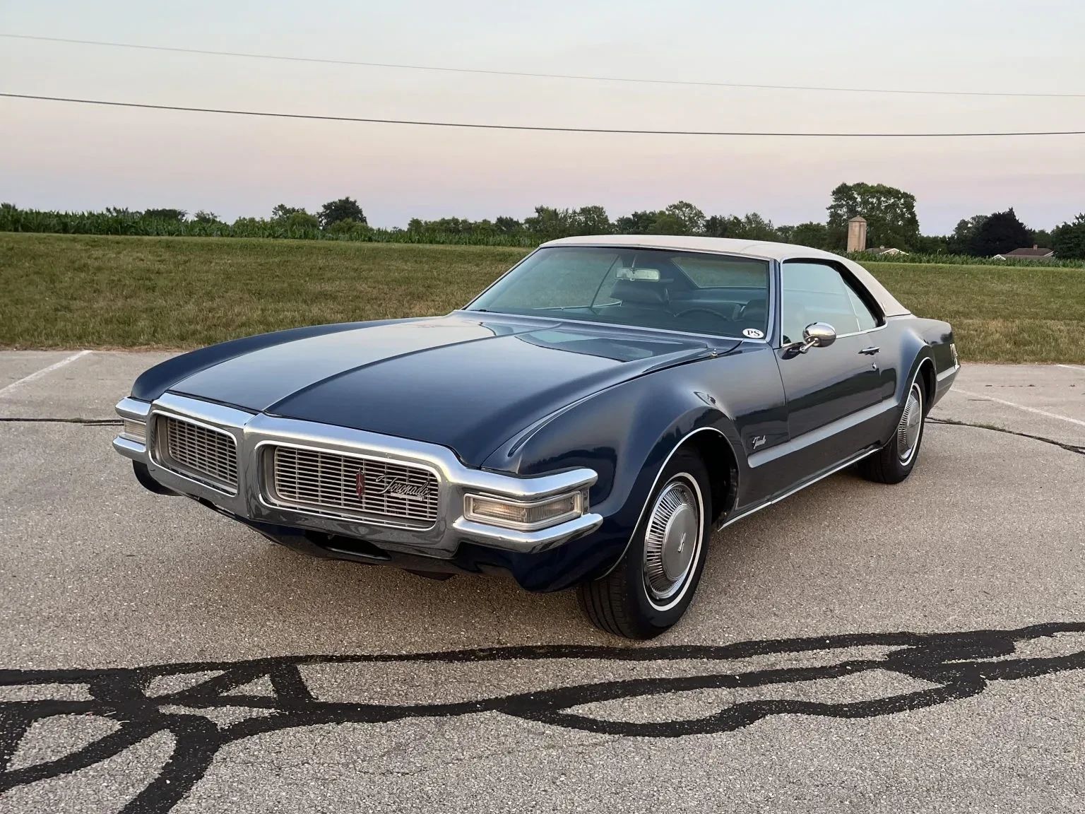
The Toronado also shows off well in darker colors like Trophy Blue, but unlike the interior, the exterior doesn’t demand them to hide the lines.
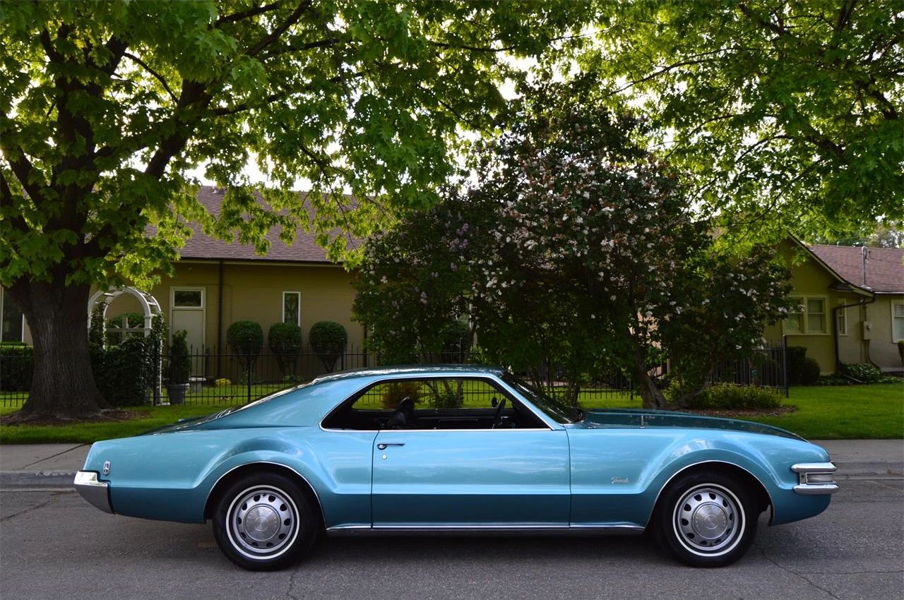
Personally, I think the best compromise was colors that were a bit more interesting than you’d find on an Olds Ninety-Eight of the time, like the extra-cost Caribbean Turquoise of the car shown below, another Toronado exclusive color. Without a vinyl roof, this example isn’t trying so hard to pretend to be a notchback, and looks more like the Toronado was originally intended to look:
Even the worst color choices can’t usually spoil a good design, but they can serve to illuminate its flaws. In the case of the Toronado, its biggest commercial flaw was that it was going in a completely different direction from the neoclassical Mark III, and the Olds color and trim book offered no easy fix for that.
The late-’60s Toronado also suffered badly from being a car without a clear sense of purpose. A well-developed product aimed at the wrong market is one thing, but it’s pretty clear that Oldsmobile didn’t know what they wanted the Toronado to be by this point. The brochure proclaimed the ’69 “the longest, sportiest, most luxurious Toronado to date,” which wasn’t exactly a coherent mission statement.
Some people balk at the idea of cars having (or needing) mission statements, but the truth is that once you move even a little out of the realm of basic transportation, at least half of what you’re actually buying is the story. People buy expensive cars not so much for any tangible virtue as for the image they convey: wealth, sophistication, and style, to fuel the buyer’s internal narrative of being a glamorous jet-setter, a titan of industry, or perhaps James Bond.
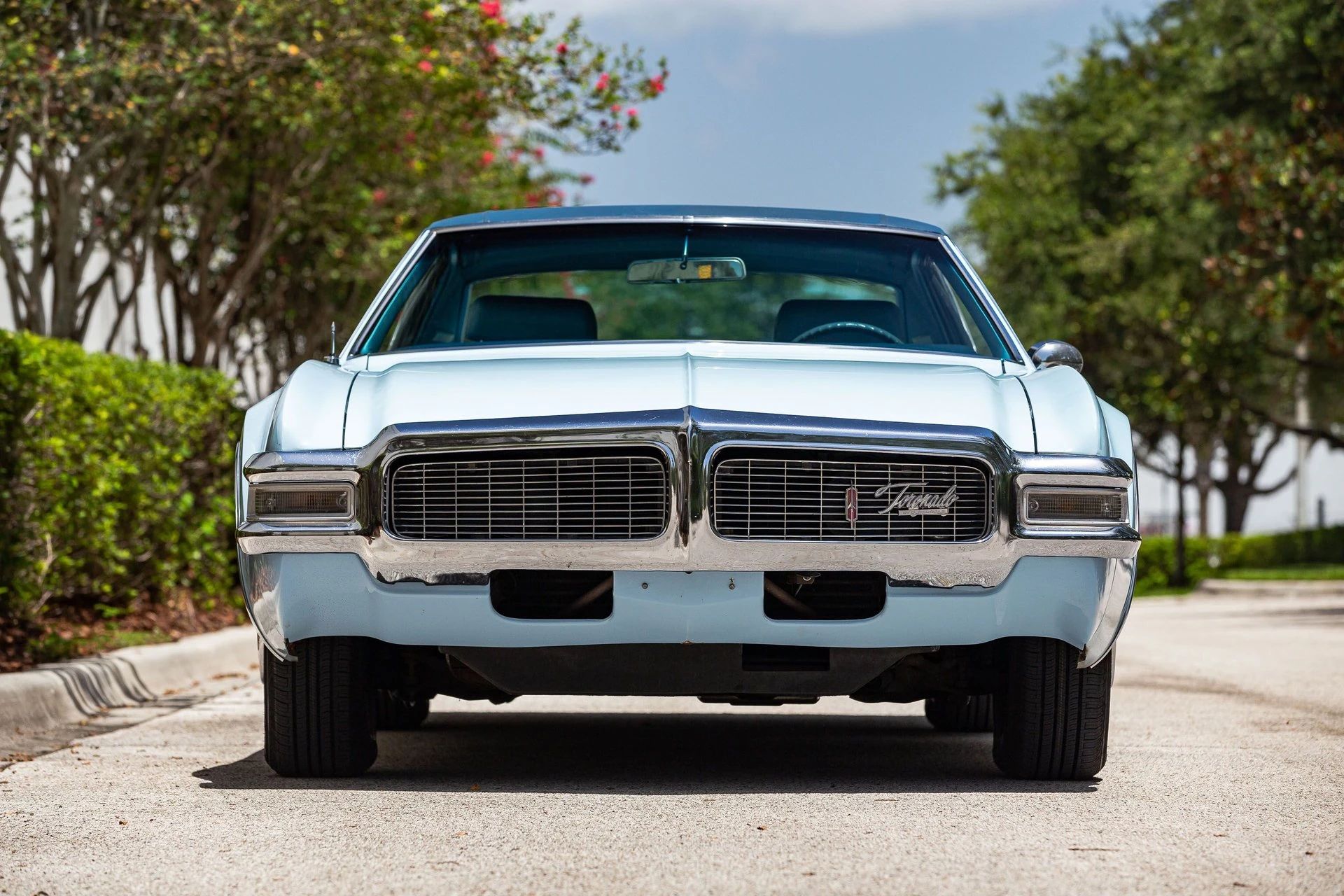
The Toronado still had yet to pick a side in 1969, but in the off chance any well-heeled buyers envisioned themselves wearing a sky blue track suit on their way to a baby shower, their Oldsmobile dealer had just the car for them.
Related Reading
Vintage Review: 1968 Oldsmobile Toronado – April 1968 Car and Driver Road Test (by GN)
Cohort Outtake: 1969 Oldsmobile Toronado – Crystal Blue Persuasion (by Paul N)
Auction Classic: 1969 Oldsmobile Toronado – Profitable Obscurity (by Jon Stephenson)
Cohort Classic; 1970 Oldsmobile Toronado – How To Adulterate A Design Classic In Five Easy Steps (by Paul N)



Really odd how the green interior has that elaborate stitching on the seats but the blue and black interiors don’t. A trip to Google Image Search doesn’t clarify things – I see both designs, as well as a few others like simple vertical stitching (maybe those are the cars without the Custom Interior).
If you look closely at the blue and black interiors, you can see that there’s a remnant of the pattern on the seat facing, but it’s largely gone. Looking at the seats of the green car, it appears that the upper cloth insert is in probably two layers, which are stitched together to form the Excella symbol. On the blue and black cars, it seems like that stitching has almost entirely popped, presumably due to wear and maybe sun damage, which is probably also why the cloth facing seems baggy: The outer layer of fabric is no longer being held in place, so it just bags out. (In the blue car, you can still see the pattern in the back seat facings, probably because people sat in back less often and so there was less wear.)
It’s not an attractive seat design anyway — I just hate the vinyl “strap” that separates the upper and lower inserts — and it obviously did not wear well.
I’d love to see it in the same olive green as my folks old fridge when I was growing in the 80s, black vinyl top, 1″ white walls… call me a sinner, but it’d be beautiful 😍
Darker than the Meadow Green one in the post? How about this: https://car-from-uk.com/sale.php?id=88090
I like it, but then different shades of blue are my favorite colors. I think this light blue shows off this car’s curves well, and the contrasting vinyl top is a nice touch in a very pretty color.
While the interior may be a bit disjointed, and you’re right, that stitching does look weird, the blue theme carries on nicely, and it looks like a comfortable place to be (up front, anyway).
I’d drive it. Proudly.
Some version of baby blue was almost constantly on the color chart of virtually every car built from the mid 1950’s through the late 1970’s. I am not talking about the pale blues that drifted into turquoise or the somewhat hotter versions of light blue, but a true powder blue. If not every single year, it was present far more often than it was absent. Ford was still offering it on most of their cars into the mid 1980’s. The problem today is that it is not a popular color and almost nobody restores a car to that shade, so internet searches do not turn them up as often. Usually you will find them only on some survivor-class sedan. An example is the 1970 Mustang attached, in a color called Pastel Blue. Nobody restores Mustangs in this color.
My father loved the color, but I have never really warmed to it. As for this Toronado, we expect it in colors that were hot in the era (like the greens and golds) and I think most larger cars look better in dark colors. Personally, it is a color I would accept as a compromise for finding an otherwise perfect car, but I never would have chosen it when the car was new.
I have a buddy in Texas that is restoring his ’67 Mustang convertible. He’s going back with the original “diamond blue”. His Marty report shows only 35 convertibles were painted that color. It looks almost white in most angles. Very unusual to be sure.
Of all mass produced options from the 1960’s/70’s, vinyl tops are the most curious to me. When originally introduced – why? Was the vinyl roof supposed to be an appealing aesthetic in and of itself (like two tone paint) or an attempt to mimic convertible (with the top up) styling? I have seen them referred to as “carriage” tops when added to luxury models such as the Toronado. I cannot think of a single example where I believe it enhances an automobile’s appearance whereas a two tone car can be attractive depending upon the colors and dimension of the car. Vinyl top, fender skirts, and curb protectors – the trifecta of poor styling and taste in my not so humble opinion.
Vinyl roofs were really an aesthetic of their own, and while there were definitely some tops that attempted to mimic a convertible top, where were many that obviously did not, like on big four-door sedans and hardtops.
I think the early vinyl tops, like the black or white ones fitted to some ’68-72 GM A body hardtops, were intended to evoke a convertible with the top up. But by the early ’70s they had morphed into an aesthetic of their own, particularly the ones that only covered the front half or the rear half of the roof, had small opera windows that didn’t connect to the front side glass hardtop-style, had opera lights, lots of padding underneath, sometimes had a targa band, and were available in a multitude of colors. These looked nothing like a convertible; they looked like a Brougham which was its own thing.
I’m with you. Can’t stand vinyl tops. Bad on most any car, but especially HORRIBLE on any “muscle car” (Like a Chevelle/GTO etc.). Plus, we all know what’s under the vinyl on a 50+ year old car when you try to restore it.
Still, looks alone… None for me thanks.
Think I like the gold one best. The light, blue feature one is second.
Muscle barge, you’d be astounded at what I see listed as an American muscle car mid range 6 cylinder stuff now qualifies, Who knew/
I do like the colour Ive owned many blue cars that is a very close shade to the capri blue one ive got now, and on a 59 Aussie VW I did up for someone they called that dolphin blue.
This pale blue has something very fresh, springlike, and feminine about it.
I think a car like this is driven by a woman. A woman with sophisticated standards and class, who doesn’t care about muscle car peasants but knows, what she wants.
This car is erotic. Oh man, excuse me, my imagination is running wild…
I can’t claim any expertise at all, but it seems like the door panel / seat back pattern was a riff (rip-off?) of a Native American design, much like the Thunderbird’s was.
Good call, but I would say the Toronado is aping something more akin to an Aztec motif. Doesn’t really pull it off as well as the Thunderbird, either.
My 1979 Westmoreland-built VW Rabbit was a very similar shade of baby blue with a matching interior. It looked good on a small car, but I’d prefer something more like the Caribbean Turquoise on this Toronado.
For the first-generation Toro, I prefer the 1966, with the 1967 a close second. I never liked the plastered-on bumper grille of the ’68-69, and the latter lost the tapered deck of the first 3 years.
Lago Blue for the Westmoreland Rabbits. Just slightly paler, more “powdery” than the Miami Blue offered on German-built ones which also had a slight hint of turquoise Lago Blue lacked.
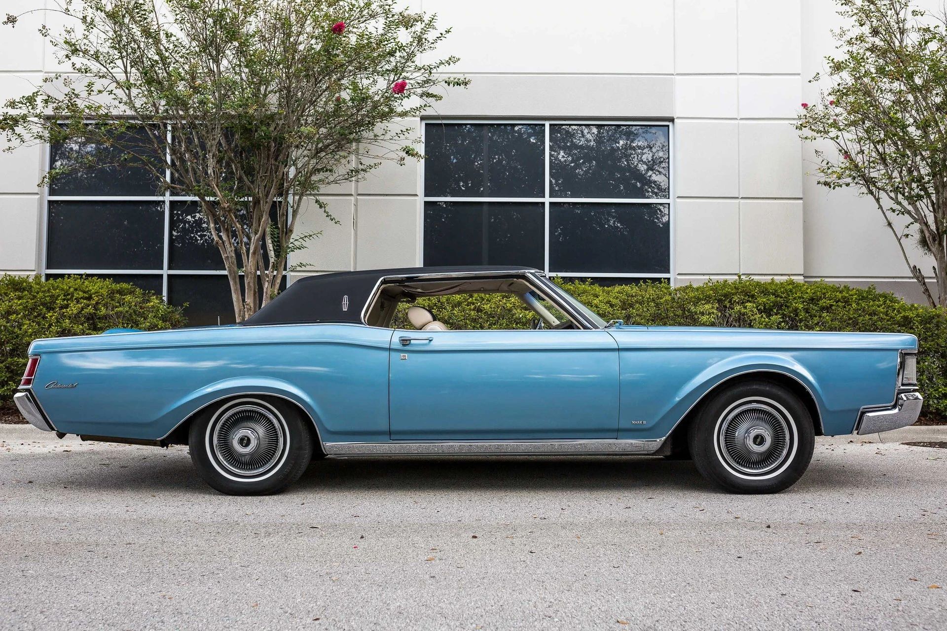
The pair of photos of 1969 blue coupes, the Toronado and the Continental Mark III, beautifully illustrate the differences between GM and FoMoCo styling of the period. I wonder how many here would prefer the former, and how many the latter . . .
To me, the Toronado can trace its lineage back to cars like the Cord it was apparently inspired or influenced by, while the Mark III represents something entirely alien to earlier generations of automobiles—not least the first Continental ?
One car I’ve found whose color really affects its appearance and not just identity is the retro Jaguar S-Type. Lighter colors like this green example really allow the inscribed side line to pop, which lengthens and lightens the car…
…while darker colors bury the highlight, resulting in a frumpier appearance. I wonder if that interior motif was supposed to have some Spanish connotation, given it’s a Toronado?
I can’t think of any. It seems more like a more symmetrical fleur-de-lis.
The Toronado is an awkward car in that it’s original 66 iteration really did bestow traits onto genuine muscle car bodystyles such as the 68-72 A bodies and AMC AMX it’s painful to see it sullied update by update due to its actual market position being somewhat in limbo.
I know this is about color more than about the 68 restyle but I will say the Riv to me (also a very questionable update) pulls off muscle car better. I mean if I didn’t know any better only looking at pictures a 69 Riv looks more muscular than a 69 Skylark GS. The Toronado? To me the 68 Cutlass was the design the 68 Toronado should have been, it has every other cosmetic trait of it in a tidier package with a substantially better looking front end.
That’s the problem with the Toronado in general, it was effectively a mass produced concept car, it’s novelty was FWD and it’s styling, but by a not very distant 1968 you could get FWD on the Eldorado which was way more in line with class standards stylistically and the 68 A bodies had most of its groundbreaking styling in the muscular packaging.
Anyway back to the main subject of colors, I think the Toronado was a harbinger of things to come as the actual muscle car “bodystyles” transitioned into PLCs, all those high impact mopar colors quickly gave way to these muted baby blues and earth tones on cars like the Charger SE, same on Mustangs grandes etc. The default move by Detroit in that time was to slather them in vinyl and chrome with colors like these to camouflage the liability of sporty design they couldn’t afford to quickly retool
Back when I was a boy, police cars in my state used to be this colour!
I think the colour really doesn’t suit the shape, and just highlights how that year’s Toronado sort of falls between two stools. It looks too formal to be a sporty coupe (but looks nice in some bright colours), while simultanously looking too sporty to be a formal coupe. As you say, the colour ‘works’ on Caddies and Lincolns, but a blue this pale just looks odd here. Though they’ve squared up the rear fenders, there’s still that fastback roof and aggressive front. The dark top should minimize the effect of the roof, but the awkwardness remains. I think it’s those huge wheel arches; the pale colour just seems to accentuate their size, which is not a luxury car trait. A ’70 in this shade might work.
Powder blue… well, 1969 was the era of the Gulf No-Nox Horseshoes.
Do they go in the back or the front on a Toro?
My graduate studies included color psychology. Not knew to know some colors are more attractive to men, some colors more attractive to women.
Men might be attracted to saturated yellows while women might like pale softer yellows.
I have a 1960s conv. in pale yellow. The ladies like it, little interest from the men.
I wo