

(first posted 1/26/2016) One day in the late 1980s, I got caught in bumper to bumper traffic on the Henry Hudson Parkway, along the Hudson River shore on Manhattan’s West Side. Stuck in time, I scanned the skyline and found myself doing a double-take. Peeking out from under an arch of Riverside Drive, I thought I spotted a familiar shape in the white cornice of a handsome old industrial building. (Screen capture from Google Maps)

This was years before the existence of the web, and it was some time before I had a chance to research the image at my local library. There, I found a photo of the ornament in question. It turned out to be a striking sculpted porcelain representation of the wheeled logo that I’d seen on the radiator shell of many a classic Studebaker, enlarged to heroic proportions and tiled into the Chiclet frosting of a finishing plant erected in West Harlem in 1923, and now housing financial offices for Columbia University.

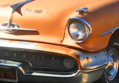
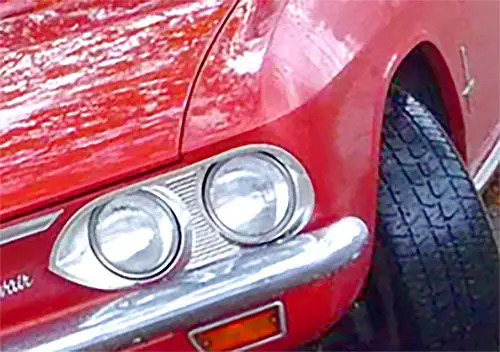
Studebaker had, by far, the longest history of any car maker in America, growing from a family wagon business in late 1700s Pennsylvania into one of the largest vehicle makers in the world by the time of the U.S. Civil war in the 1860s, and becoming a major supplier for the Union Army. They dipped a toe into the fledgling car business as early as 1897, and first applied the wagon wheel logo to an auto radiator shell in in 1912.

From then on, they secured their corporate look with both mobile and immobile wheels. The flat, stylized image used in print and on radiator medallions took on a decidedly pneumatic character in its architectural form, showing details of tire, rim, lug nuts and wooden spokes. It can still be found on the surprising number of Studebaker buildings that survive.
Debra Jane Seltzer’s great site, Roadsidearchitecture.com has the above photos of Studebaker buildings among its 2400 images.

Contemporary when conceived, the wagon wheel logo was dated by the 1930s, when the separate rims and wooden artillery wheels it represented had been replaced by welded, all-steel pressings. Squeezed by the exigencies of depression economics, and reeling from consecutive failures of two low priced marques, the Erskine and Rockne, Studebaker felt compelled to drop the classic medallion for a bauhaus inspired design more in keeping with the streamlined models then in their showrooms. There seemed to be no market advantage in looking to the past.

The change also ended application of the Edwardian-era medallion to Studebaker architecture. Raymond Loewy’s “Lazy S” logo, derived from the Bauhaus ’30s type font, gradually took center stage over the next 30 years.

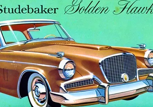
By mid-century, most of Studebaker’s success lay in the past. The now legendary 1953 would be their last totally new design (outside of the low volume Avanti) and would go to the grave with their car business in 1966. The early, missed opportunity of re-establishing prominence with that sensational body is well documented, but what if it had lived up to its promise? What if Studebaker had made all the right marketing decisions, and the car had become the smash hit it deserved to be?

Would that success have led to a new raft of iconic Studebaker buildings to enjoy for generations to come?


I had forgotten that Studebaker had a factory in New York. There are still quite a lot of those old architectural wagon wheels on buildings all over the country, which goes to show us what a reach that company had in the teens and 20s.
Your last building picture shows the old Engineering building on Sample Street in South Bend. I believe that the logo from this building is the one that is now on display in the Studebaker National Museum, and was preserved before the building was demolished a few years ago.
I love your photoshop ad where the 53 Champion becomes a 59 Lark. There is some truth to the slogan you chose. Although it is funny in this age to think that those two were separated by only 6 years. What was such a long time then is such a short time now.
Also, your “what if” question actually did come true – just with a different company making the logo ubiquitous.
True, but I much prefer the earlier version of the Safeway medallion.
As to Studebaker, I think the automotive world would be better today if they had survived. Unfortunately, the challenges the industry faced a decade after they closed South Bend might have been their final undoing, the energy crisis coupled with stronger emission and safety requirements. Making matters worse, the government didn’t allow sharing of emissions technology between manufacturers, they all had to come up with their own.
AMC did well, but mistakes they made during that era came back to haunt them. Another interesting “what if” question would be what if Studebaker had lived and bought Jeep?
AMC did well, but mistakes they made during that era came back to haunt them. Another interesting “what if” question would be what if Studebaker had lived and bought Jeep?
AMC’s purchase of Jeep included Jeep’s government vehicle plants: the former Studebaker Chippewa plant and the neighboring service parts building, Plant 8, in South Bend, which Jeep bought in 64. As the AM General division of AMC, these plants continued to turn out deuce and a halfs and postal jeeps through the 70s.
This ‘S’ is the Safeway supermarket logo…
Or with this company/brand logo – remove the lettering, paint the right half blue, and it may start to look familiar……
Being from Pittsburgh, I missed out on the similarity of the “lazy S” and the Safeway logo. To me the “lazy S” is a sideways Pepsi logo!
Also from the Burgh and I was thinking the same thing
Pepsi spent millions in the early ’90’s to come up with the pre-existing Studebaker lazy S.
IKR? and then they went on to spend who knows how much for their horrifically ugly current logo!
Studebaker did a fantastic job if getting it’s wagons established through the country. They had partnered with one of the major railroads, to have the railroad offices act as Studebaker agents, and, as wagons are relatively simple to make, they had small plants in many cities in the US.
That photo of the engineering building must have been taken shortly before it’s demolition as the windows and doors are all of modern design, while the building was built in 1928.
As to the “what if” question. The best move would have been a merger with Nash: use the more modern Nash platforms, with the Studebaker V8. Consolidate foundry and engine production in South Bend and consolidate final assembly in Kenosha. Clearing the engine plant and foundry in Kenosha would clear footprint to build a body assembly and paint facility, to eliminate the cost of trucking assembled bodies from Milwaukee.
Studebaker’s presence in Detroit was a lot larger. Studebaker bought it’s way into the auto industry with the purchase of the E-M-F Company. The E-M-F plant in Detroit was on Piquette, just down the street from the early Ford plant profiled here a few days ago. The plant burned to the ground a few years ago.
That was not really a factory, that was the Manhattan warehouse. And it’s more important to the Studebaker hobby than you realize!
New York City was blessed for many years with the presence of Tony Caralla, who ran a Studebaker-based repair shop up on Webster Ave. in the Bronx for decades.
In the 1920s, Tony got his first job as a parts-picker in that Manhattan building, riding on roller skates ’round the building and ferrying the parts down to the first floor parts counter. High tech / high speed service, back then!
It was soon discovered that Tony had committed the entire parts inventory to memory, so they moved him to the Parts Counter, then later, he became its manager. He never lost his memory for the parts and their numbers, and even into the 1990s you could ask Tony for a part and he’d start reeling off the numbers for what you were asking for, before wandering into the black depths of his building to emerge with your part, frequently covered in dust and grime.
However, it was in the back office of his shop on Webster Ave. that Harry Barnes came up with the idea for the Studebaker Driver’s Club in the early 1960s. So, to a large extent, the entire Studebaker Hobby owes it’s existence now to Tony.
Here’s to Tony and the Studebaker Harlem Warehouse.
Awesome story!
I used to live just around the corner from that shop in the late 1970s. It was always a pleasure to stick my head in and see what was inside.
Barry, I love where your imagination leads you. That composite ad is brilliant. And your imagined new logo is terrific. The only problem is that if Studebaker had survived for the long haul, that “new wheel” would have become as obsolete as the old one. 🙂
Now it would have to be a 20″ wheel and very low profile tire. Or almost back to the original….
As others have pointed out in previous CCs, Studebaker, even if they had made all the right moves, was simply too small to survive in the long run. Their best bet would have been to be successful enough to be an attractive acquisition by a much larger concern. Even then, it would be a tough call to continue on with the Studebaker name, sort of like what Studebaker did to Packard. While Studebaker lovers lament the board’s decision to cease automotive production, even as sales were improving, it was really the right call.
The most likely scenario would be pretty close to what happened, anyway. Studebaker would have been acquired by AMC, along with Jeep, and when the inevitable market downturn occurred at some point (probably during the seventies), the brand would have died out as an AMC product. So, even in the best of circumstances, Studebaker wouldn’t have lived but more than another decade.
The problem with Studebaker was that there were very few conquest sales, i.e., the only people who bought Studebakers were former Studebaker owners, and that caused the used car market to be virtually worthless. I would imagine that there were many a former Studebaker owner who was so angry over the peanuts they’d get for their old ride on a trade (unless it was for another Studebaker), that they never bought another for that reason, alone.
The combination that has fascinated me lately is “what if” Studebaker had, as part of its continued diversification plan, bought Kaiser Jeep before AMC got to it. Of course, they had an awful lot of issues to get worked out to make it to 1969 when Kaiser sold.
It is interesting to consider that out of all of the mergers of independents going on in the 50s, the only one that is still (kind of) with us is the one most people probably thought had the least chance – Kaiser and Willys.
“what if” Studebaker had, as part of its continued diversification plan, bought Kaiser Jeep before AMC got to it.
The Jeep acquisition would have been dependent on Kaiser’s decision to sell it. The other window to buying Jeep closed in spring 53 when Kaiser bought Willys.
The Kaiser buyout of Willys was mostly about taxes. Kaiser had been running losses for years, and everything pointed to more losses, so no way to use all the tax credits. Willys made a profit, so the deal was primarily about using Kaiser’s losses to offset Willys profits to avoid taxes.
“the deal was primarily about using Kaiser’s losses to offset Willys profits to avoid taxes”
This, as I understand it, was the key to Studebaker’s rapid acquisition of profitable companies in the early 1960s. Those losses from the 50s served as a vehicle to finance the company’s solvency in the 60s and beyond (at least in everything but auto production.)
Their best bet would have been to be successful enough to be an attractive acquisition by a much larger concern.
AMC attracted Renault. We know how that worked out.
Even then, it would be a tough call to continue on with the Studebaker name,
In the best scenario I have been able to come up with: Studebaker merging with Nash in October 54. (Packard already having grabbed Hudson to achieve Nance’s strategic objectives of bringing bodybuilding in house and having an established mid market brand as he moved Packard upmarket), the Studebaker name would have bit the dust in 57, just as the Nash and Hudson names were dropped, as Romney bet the company on the Rambler. The only difference would be the 58 Rambler Ambassador would have been powered by a 289 produced in South Bend, rather than Dave Potter’s 327.
AMC attracted Renault. We know how that worked out.
Well, it did buy them a little time. And that’s pretty much all that would have happened with Studebaker, as well. The sad fact is that the company was never going to be able to compete on a scale with the likes of Ford and GM. Even with all the right moves and funding, there just wasn’t any way Studebaker was ever going to make it up into the big leagues. Even the big guys eventually had some tough years. Simply put, the end was an inevitability for not only Studebaker, but all the independents.
As an aside about AMC, Roy Abernethy gets a lot of flack for trying to take on the Big 3 instead of sticking with small cars. But the flip-side is sticking with small cars likely would have meant Rambler/AMC would have just became another Studebaker. Yeah, Abernethy’s plan was a Hail-Mary, but for the long-term, there was no other choice.
Poor old Studebaker never even came close to being able to field a full line of cars that lined up with the Big 3.
OTOH, Toyota and Honda sure seemed to do well by ‘slowly’ getting into other markets as they built on their small car successes.
As an aside about AMC, Roy Abernethy gets a lot of flack for trying to take on the Big 3 instead of sticking with small cars. But the flip-side is sticking with small cars likely would have meant Rambler/AMC would have just became another Studebaker. Yeah, Abernethy’s plan was a Hail-Mary, but for the long-term, there was no other choice.
I agree. AMC did very well with it’s early 60s offerings, but once the big three were offering compacts and intermediates, there was no place left for AMC to hide. They offered good products, but not radically superior enough to draw loyal customers away from the big three.
The Pacer was an attempt to offer something the big three didn’t: full size car interior width, with minimal exterior footprint. They went a little off the deep end and produced a SciFi movie transportation pod. As former AMC stylist Vince Geraci said “There’s a very fine line between unique and strange”
Which brings us to my favorite 1970s ‘what if”. AMC inherited the old Buick V6 when they bought Jeep. The Jeeps were modified to take the AMC inline 6s and the V6 tooling sat idle in Toledo until Buick bought it back.
What if AMC had kept the V6, modified it the way Buick did: new crank with offset rod journals to smooth the timing and modified for transverse installation. Then ring up Borg Warner for the transverse version of the Type 35 automatic they were producing for the Austin Landcrab.
With a near off the shelf, matured, powertrain, they could then take the money they spent on the Pacer and Matador coupe and produce something very much like the 1980 Citation or 82 A body, and have it on the market in 75. They would probably run wild in the market, as they had in the early 60s, while the big three scrambled back to their drawing boards.
The profits from the 75 front drive models would eliminate the need for Renault’s deep pockets and AMC could have funded development of the downsized early 80s Jeeps internally.
At the end of the day, Chrysler would probably still have bought out AMC as Iacocca was in empire building mode and he wanted Jeep. The only difference would be that he would have paid a lot more for AMC then he did.
The idea of AMC using the Buick V6 is a great one except it wouldn’t have worked as well as the straight six in Jeep’s 4WD-oriented applications where the better torque of the inline would have been preferred. On top of that, it’s unlikely that AMC had the funding to develop both the Buick V6 for cars and keep the inline 6 for the Jeep line. So, the decision was an easy one to stick with the inline and abandon the V6.
But the final nail was likely the whole GM Wankel fiasco. The space-efficient (even if it wasn’t efficient in any other department) Wankel would have completely killed any thoughts of AMC spending the money to develop the short Buick V6 for cars.
It’s a real shame because a FWD, Buick V6 Pacer (or anything else with an AMC badge, for that matter) would have been interesting, to say the least. Probably wouldn’t have sold any better and just delayed the inevitable, but it would have been a much more technologically appealing vehicle.
On top of that, it’s unlikely that AMC had the funding to develop both the Buick V6 for cars and keep the inline 6 for the Jeep line. So, the decision was an easy one to stick with the inline and abandon the V6.
That is what AMC was thinking when they took over Jeep. Reportedly they had to stretch the front end of the CJ about 3″ to make their 7 bearing straight sixs fit, but they figured it was worth it.
On the other hand, Jeep had used the V6 for several years before the AMC buyout, and the more compact V6 would have fit better in the downsized Jeeps of the 80s. Jeep always had the option to put in an AMC V8 anytime anyone wanted more power, and the V8 was also more compact that the straight six.
But the final nail was likely the whole GM Wankel fiasco. The space-efficient (even if it wasn’t efficient in any other department) Wankel would have completely killed any thoughts of AMC spending the money to develop the short Buick V6 for cars.
One wonders why AMC even considered the Wankel. The shortcomings of the Mazda rotaries were well known in the early 70s. Could be part of the same dive off the futuristical deep end that created the Pacer’s styling, rather than something more conventional.
In fact, one of the appealing aspects of a Buick V6, tied to a BW 35 is the maturity of the components. AMC dealers were often not the classiest operation in town, so presenting them with a finicky Renault powertrain was probably a recipe for disaster. Give them an old rockerbox 6 and a BW tranny that dated from the 50s would more likely be in their comfort zone, even if they were installed sideways.
While it’s seriously off-topic in a Studebaker CC, it really would be interesting to explore how the whole AMC/GM Wankel collaboration came about (and the ultimate effect it would have on AMC’s future).
In fact, the AMC Wankel could easily go into one of the top AMC Deadly Sins, considering the impact it had on the production of the ill-fated Pacer. Would the Pacer have even been built if not for the Wankel presumably being the powerplant? I don’t know if AMC would have went ahead with the Pacer without the Wankel. It seems as if the whole Pacer’s design ethos was built around that short engine, and then when GM pulled the plug on it, AMC was too far into development to write it all off, too. It certainly wouldn’t have looked the same, that’s for sure.
And just imagine where AMC could have spent all the precious few R&D funds that went to Pacer development. Besides keeping and developing the Buick V6, could the ground-breaking (if not game-changing) XJ Cherokee been brought to market five years sooner? Could the money have been spent on the existing AMC lineup to be brought up to a level that met (or even surpassed) the competition?
It’s almost as if GM management constructed the whole Wankel deal to kill-off AMC. GM spent a lot of money on the Wankel project, which eventually came to nothing. It’s as if upper level GM management had the attitude of, “Well, at least we can get some return on all that money spent on the Wankel by killing off AMC with it”.
While it’s seriously off-topic in a Studebaker CC, it really would be interesting to explore how the whole AMC/GM Wankel collaboration came about (and the ultimate effect it would have on AMC’s future).
off topic? watch this.
GM no doubt really intended to build the Wankel. I recall reporting at the time said that GM was working on two, a four rotor for the Vette and a two rotor for a small car.
The Pacer, and using a Wankel in it, is the “hail mary” move we see over and over in small companies as they struggle for attention in the market.
E L Cord couldn’t be satisfied using Gordon Buehrig’s radical styling with a stock Auburn powertrain, which would have reduced development cost, improve reliability and brought the car to market sooner. He wanted front wheel drive, so the hasty, and expensive, development of a new V8 and the trick transaxle, which were the largest trouble spots in the Cord 810. Before that, it was the J Duesenberg. Reportedly, all the engines and chassis were made in 29 and 30, and it took until 1935 to get them all sold, by which time the chassis and non-synchro gearbox were hopelessly obsolete.
Studebaker did the same thing (see, said I could get it back on topic). It worked for them in 39 and 47. It didn’t work in 53, when they doubled their cost by tooling for an entirely separate body for the coupe and hardtop halo models, while trying to mimic the styling with the sedans, which compromised their usability, particularly with a small trunk. iirc, Studebaker sales with the radical and acclaimed new body fell in 53 from what they sold in 52, which was little more than a warmed over 47.
The Avanti was another hail mary halo car, and it failed miserably. Like the Cord, the Avanti’s innovative fiberglass body caused production delays and quality problems. They only built about 4500 from the car’s introduction to the closure of South Bend. Something like $3.5M in development costs for nothing.
While spending so much on the 53 styling, Studebaker still tried to build it on the cheap. Deep drawn stampings, like fenders, need to be made in stages, progressively forming the part over usually about 6 stamping stages. Studebaker tried to do it in 4 or 5 to save die making and production costs, and got a lot of torn and wrinkled parts. Studebaker would skip the cost of setting up a pilot production line to make sure the tooling was accurate. They got away with it in 47, but not in 53.
When the Lark was introduced, Harold Churchill demanded, and got, a pilot line to verify the tooling, because he knew that the Lark had to be right, right out of the box.
I have an early 60s issue of Consumer Reports that features a test of the compact models from all the manufacturers. They reported that the Lark had the best build quality in the industry, with the Rambler second best.
Interesting that Harold Churchill was so successful at improving productivity, bringing an innovative, and more importantly, successful product to market, on time, with few teething problems and well built, and he was given the heave ho in favor of Sherwood Egbert, with no automaker experience, who promptly started peeing money away on niche halo products.
It was like the Studebaker board wanted the car division to fail.
I was hoping the final image was an aerial shot of the brand new Studebaker headquarters, where the 2019 Packards, Studes and Jeeps (why not?) are currently being finalised…
A very enjoyable read. Here’s a former Studebaker dealership in Northampton, MA in 2009.
A close up shot. Note the valve stem detail.
Nice .
BTW : that’s a Clincher rim , not an Artillery wheel .
-Nate
Nice big logo on that one. This one is a former dealership on N. Duke Street in Durham, NC:
Neat. It’s such a great logo.
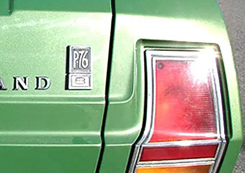
The last totally new Studebaker design was the 1939 Champion, which had an entirely new chassis, engine, body and interior. Every car after that was somehow derived / evolved from this simple, basic car. Kind of like the Falcon leading to that raft of cars for Ford through the 1970s.
Yeah, Studebaker gets a lot of grief for not coming up with a ‘totally new’ car, but it seems like everyone recycles product chassis more often than not (with some very notable exceptions, like the truly all-new Corvair). The thing that separates them from Studebaker is how well they disguise it, with the best example possibly being the Falcon-derived Mustang.
It might have had an entirely different body but, underneath, the chassis of the Mustang was completely Falcon. In fact, I recall one of the lesser magazines of the time doing a side-by-side comparison of 1965 Mustang and Falcon convertibles (something I’m sure Ford didn’t sanction). As you might surmise, the winner depended entirely on whether you favored practicality or aesthetics.
Yeah, Studebaker gets a lot of grief for not coming up with a ‘totally new’ car,
Studebaker came out of the war flush with defense contract profits. Harold Vance pleaded with the board to invest in new plant and equipment, but the board wanted to pay the money out in dividends.
The small companies did not have the R&D budgets that the big three had.
Studebaker had enough money to bring a modern OHV V8 to market for the 51 model year, but that was it. No money for a new platform and updated facilities in the 50s when the trend was to wider bodies.
Nash had enough money to bring a modern platform to market with the unibody Airflyte, which had the wider interior people wanted in the 50s. No money for modern engines to power their modern cars though.
When Romney took over at AMC, he had to spend vast amounts to get caught up: OHV conversion of the 196 *and* a new Rambler platform *and* an in house OHV V8 all for the 56 model year. Romney met with the insurance company money lenders a few weeks after they had turned Packard down. Romney too was on the edge of bankruptcy. Unlike Nance, Romney was able to convince the moneylenders that he had a viable plan to get AMC to profitability, so he got some money from them.
Every car after that was somehow derived / evolved from this simple, basic car.
Yup. Postwar, Studebaker was essentially a 1 platform company, with everything based on the Champion. At times the Commander and Land Cruiser had a slightly better steering system, but they were really just stretched Champions with fancy trim. By the mid 50s, the “full size” Studebakers had the narrowest interior in the industry. Six inches of hiproom one way or the other makes a difference when sitting three people in a bench seat.
I wasn’t particularly saying anything negative about Studebaker, merely that their last ‘all new design’ was in ’39. I’m sure there are various folks who’d debate what they could have or should have invested in. Clearly, a corporation that allowed it’s chief engineer to support Virgil Exner’s design program in one design studio yet kept Raymond Lowey’s studio under contract to design the exact same cars was spending money in places it didn’t need to and could have gotten a lot more for its effort. Sadly, that kinda sounds like bad management!
They did try to bring out an entirely new body/chasis for the 1952 year, the
N-Body. Phil Brown and Max Corkins went into the Proving Grounds back in the ’70s to rescue the N-body, but the woody-wagon was in front of it, it took all day to move that, and that’s all the time Bendix gave them back then. The few pics I’ve seen make it quite ugly, but a larger car all around.
But, the N-Body project was aborted quite late in the development cycle, which led to the opening for the design of the ’53 Coupe, but also, seemingly, to the sales disaster of the sedans and then end of the Automotive Division.
They did try to bring out an entirely new body/chasis for the 1952 year, the
N-Body.
The pix I have seen of purported N body clays and prototype don’t seem that encouraging.
The problem Studebaker had, in addition to the cost of an entirely new platform, was the body plant would need to be reconfigured to accommodate a wider body. Even if they made the investment to accommodate wider bodies, the body plant was still inefficient because of the amount of time bodies spent riding elevators up and down the building’s six floors.
…the opening for the design of the ’53 Coupe, but also, seemingly, to the sales disaster of the sedans
I will always wonder how the Studebaker board, that didn’t want to spend anything, got smoothtalked by Lowey into building the coupe as an entirely different body, rather than offering a hardtop and convert on the sedan body, as they did with the older body in 52.
“I will always wonder how the Studebaker board, that didn’t want to spend anything, got smoothtalked by Lowey into building the coupe as an entirely different body, rather than offering a hardtop and convert on the sedan body, as they did with the older body in 52.”
A very good question. And then they came up with a one-year hardtop body on the ’58!
>>A very good question. And then they came up with a one-year hardtop body on the ’58!<<
I have seen pix of a 56 Hawk with that 58 roof grafted on. Looks OK, but I'm not sure it's an improvement over the original hardtop.
They were also tinkering with a four door hardtop for 57.
Story of the two ’53 bodies seems to be that the coupe and hardtop were designed as a one-off concept car but they were so well liked that they were approved for production, and then the already-designed ’53 sedans were quickly revised to look more like the coupes. Actually basing the sedans on the coupe body wouldn’t have worked, as the low roofline combined with the non-step-down BoF platform wouldn’t have enough room inside.
Didn’t at least some of the ’58 hardtop investment get reused in the ’59 Lark hardtop, which had a different roofline but the same frameless doors as the ’58?
Probably the poorest investment the company made around this time was the new Utica plant to build the all-new Packard V8 in 1955; it would be discontinued in 1956 with all the new tooling sold for scrap.
>>Probably the poorest investment the company made around this time was the new Utica plant to build the all-new Packard V8 in 1955; it would be discontinued in 1956 with all the new tooling sold for scrap.<<
The two buildings in Utica were existing when they installed the V8 line, and moved the transmission and rear axle lines in. The northern building was their new service parts warehouse, and the southern building had been built to produce jet engines under a guaranteed profit DoD contract. The jet engine contract ended with the end of the Korean war, so the space was available, and more adoptable to a modern engine line than any space at E Grand. When they made the decision in 54, they could not have known that the company would collapse only two years later.
In retrospect, if they had merged with Studebaker one year sooner, the powertrain lines could have been moved to South Bend, instead of Utica, and assembly could have been moved to Chippewa, instead of Conner.
Well, Stude had the nearest US-made equivalent of the Toyota Corolla as a prototype; had it been able to produce it until the 73 fuel crisis, it might have been able to steal Toyota and the other Japanese Manufacturers’ thunder… I do not think the big three would have done a “Falcon/Nova/Valiant” on a car like this, it was too alien for them (to wit: Vega, Pinto), so the chance was there.
I do not think the big three would have done a “Falcon/Nova/Valiant” on a car like this,
It would have been easier for GM and Ford to compete/crush a Toyota sized Studebaker: simply bring in cars from their European divisions. Ford was bringing Cortinas to the US in the early 60s and I remember seeing an Opel Rekord running around Kalamazoo in the 60s.
What Studebaker did with the Lark was not only the only thing they could afford to do in 59, it was the best option because it was smaller than what the big three made in the US, but larger than what the big three made in Europe, so the big three had to go back to the drawing board, which let the Lark and the Rambler run wild in the market for about 3 years.
I used to go to a therapist who had a view out of his window right onto that sign. It was very relaxing. 😉
I have magazines at hand featuring 64 Studebakers . Basically they are about as modern
as their horse drawn wagons. Ramblers are not too much better but at least they
had George Romney to help move them along.
According to my book Stude was the fourth best selling car in America in 1930
Rambler was third in 1961 .
tip this on its side
I’d gladly park a ’64 Studebaker next to a ’64 Chevy II, Falcon, or Valiant, with their small rear wheel openings and busier styling and trim. I think the ’64 Stude still looks good today, unlike those others. My humble opinion only.
Bill you are right on the money the Studes looked sharp but underneath quite primitive.
Say what you want about the 60 Falcon,Corvair,and Valiant they were modern cars!
That is to say,new designs
Inside and outside
The ’62 Corvette still had kingpins. A ’63 Studebaker (and ’64, which is styled nicer IMHO) could be had with disc brakes and a three-speed automatic that could be held manually in first and second. Even the new ’63 Sting Ray couldn’t be had with either of those items.
For fun, go to youtube and search for videos on the “Studebaker Plain Brown Wrapper” and “Stude Tomato” from the Pure Stock Muscle Car Drags in Michigan. You have to pass inspection there and come with documentation…and supercharged Larks have been embarrassing Big Three iron there for a decade. I actually heard one guy say “I’m sitting this one out; I’m not going up against that Studebaker”. Real good sport. 😉
Thanks for the credit to my website with the photos which you posted. Actually, there are more than 2400 PAGES, more than 60,000 photos at http://www.RoadsideArchitecture.com
The Studebaker section begins here:
http://www.roadarch.com/showrooms/stude.html
I just bookmarked your site, Now I can get my fix of old cars and cool architecture!
My bad, Debra! That’s a LOT of pages!
Studebaker had a working relationship with Mercedes. Had Studebaker bought VW for next to nothing in 1948, when it was available to Ford, then Studebaker would have been in a better position to partner with Mercedes and become a division of Mercedes and VW today.
Ford was offered VW. Ford refused. VW went on to greatness. Had they been forced to build Ford influenced or in this case Studebaker influenced VW’s, their success may have never happened. Their success was a result of not being acquired.
I was born within months of Studebaker closing down US operations. So when I was 5, the last of the Studebakers should have still been on the road. Age 5 was around the time I started learning to visually identify cars, but I don’t ever recall seeing a single Studebaker “in the flesh”. The only place I saw them were on “Mr. Ed” reruns 🙂
One day, you will meet someone who never saw a SAAB.
Unrelated but sorta-kinda-related: Just a few blocks north of where the lead photo was taken is the location of the ending of the current “Tacos” commercial for the 2022 Chevy Equinox. When I lived at 139th & Riverside I must have walked through no less than 50 film and TV shoots that took place in that area. Once of the recent Spiderman flicks also shot some scenes there. Commonly referred to as the 12th Ave Viaduct Underpass, or some such. (Pic attached)
I read somewhere that the ’62-’63 grilles might have been a shadow of the relationship Studebaker had had with Mercedes, earlier. Anything in that?
BTW, thank you, CC, for reviving this story; it was one I really enjoyed doing. It’s been some years since I wrote anything for the blog, and when something gets re-posted, it’s a hoot to start reading and not remember how the story will end! When I retire, I hope to get involved again.
There is still a Studebaker building standing in Riverhead New York on the corner of Roanoke Ave. and Middle Road. The sign is still on the building.
Love seeing relics from these old dealers.
When we bought the plumbing fixtures when we redid our house I discovered that the plumbing store/warehouse was the old Lynbrook, New York Packard Agency.
Here’s a beautiful Studie dealer that just appeared in vintage.es…..
https://www.vintag.es/2022/01/port-washington-houses-1940s.html
It’s about the 14th picture in the list. I checked Google Streets, and the building is still there, splendidly original.