

It probably comes as no secret to those who read my periodic articles here on CC that I have a tendency to save stuff. By stuff I am not talking about money, seeds, or lost dogs; although in fact, I do a pretty good job of saving two out of the three things on that list. You can figure out which one is number three.
I could add ephemera to that list and then there’d be three out of four that I’m pretty good at. Ephemera describes items that were created with the intent of only being useful for a short time before being cast aside. At this point, you’re thinking “1987 Yugo” and of course you’d be right. But really, if anyone had ever produced a Yugo calendar, that would be the kind of ephemera that I’m talking about. I was reminded of my fondness for ephemera a while ago when I found myself explaining the concept of “advertising calendar” to someone who (it should be obvious) was born in the 21st century.

The particular calendar in question was this spiffy one sporting 12 glorious full color photos of antique tractors. I had scooped up this gem during a visit to a local auto parts store and naturally found a place to hang it once I got home. And of course, once it was hanging I got the opportunity to explain what it was. Not exactly what, as that would only be necessary for people born in the last dozen years, and from what I can tell they’re as hopeless with “calendar” as they are about that round thing with the two pointy bits and the numbers 1 – 12 on it. Actually, the question was more about “Why?“. Why would anyone possibly care about this awkward paper grid that takes up space and needs to be manually manipulated in order to offer even minimal performance?
I guess it’s one of those things that you’d have to have been there – there being the 20th century or before – in order to appreciate. Well, I was there, and I appreciate. And I’ve saved quite a few of these things over the years because they’re attractive and they remind me of things.
As I thought about the function of this rather quotidian device, I started to wonder just how far back does the “automotive calendar” in particular go. Have they had these things as long as there have been commercial efforts to sell cars? Let’s find out.

Three Types of Automotive Calendars: First, the Ones with Cars
Let’s establish the lay of the land for automotive calendars. There seem to be three types of these calendars from back in the day. One is the calendar that might have been distributed by a local company selling products of interest to the automotive industry or automotive consumers. These would be items given for free to customers and that featured the producer’s range of products. An example of which is what’s seen in the above example from 1939. This is essentially a brochure for 1939 Chevrolets laid out as 12 pictures over the year.

Going back further in time, the oldest brand-specific car calendar I could find online is this Ford Model T example from what would appear to be 1918. I say “appear” since there’s a chance that this may not be an original artifact from 107 years ago. It could be an advertisement that has had a calendar stuck onto it in an attempt to create something more interesting than a simple advertising poster. Or, it could be that originally the actual calendar pages hung below the illustration (not covering up part of the image, which seems strange) and a modern hand has conveniently re-arranged things to make it all fit in a frame. Original calendars given their rip off a page and throw it away nature seem to be some of the most ephemeral of all ephemera. So it’s hard to tell nowadays what is an authentic survivor and what might be a full or partial fabrication.
Second, the Ones with Original Artwork
The second type is a calendar that carries some type of original artwork that brings to mind the manufacturer’s product. Often the point is to show the product – such as tires – in use.

This Firestone Tire calendar from 1911 is one of the earliest I’ve been able to locate. It’s no doubt similar to calendars produced by other tire companies such as Michelin. As we’ve discussed before, Michelin was big on advertising and promotion from its earliest days in the late 19th century.

Yeah, still pretty creepy. This particular illustration reminds me of Princess Leia and Jabba the Hutt in a good mood. Nevertheless, Michelin surely must have made calendars, although I have yet to find any of the old ones online.
The relative obscurity of very old calendars underscores their nature as ephemera. Promotional calendars were not items meant to be saved, and true to that point, most were simply tossed like yesterday’s newspaper once their initial use was completed. And why not? They were free to the user, and no doubt next year’s calendar would be as easily obtainable as this now finished year’s. Toss it and move on.

That’s fine, I get that. Although what if no one saved these things? Then we wouldn’t be able to marvel at this 1923 Socony calendar from China. In the early 20th century Socony – literally an acronym for “Standard Oil Company of New York – had extensive oil exploration operations in China and also retail sales of kerosene for lighting. As a consumer product with dealers all over a huge country, Socony’s China operations naturally turned to promotional materials such as calendars for spreading its good word.
In the early 1930s Socony would merge with the Vacuum Oil Company – founded in Rochester, NY just after the Civil War – to form the Standard-Vacuum Oil Company which took charge of Vacuum’s registered trademarks of Mobil, Pegasus, and Gargoyle. Ultimately Standard-Vacuum made the pretty reasonable (in my opinion) choice to change its name to Mobil.

This didn’t happen before Vacuum’s U.S. operations had produced an excellent set of calendars. The above example, from 1924, features pin-up art from an unknown artist. This painting, consistent with the Odalisque and the orientalism craze of the 19th and early 20th century was probably already a bit old and nostalgic even in 1924.
Then again, a little nostalgia and a little sex have long been an attractive advertising recipe. This gas station calendar was likely just racy enough to offer a bit of a thrill to Gomer and Goober‘s dads down at the fillin’ station. Yes, I know it’s kind of jarring to think about pin up art in Mayberry or the fact that Gomer and Goober did not arise from Chaos, the primordial void, but instead had parents (and let’s just wager that they weren’t nuclear physicists since those kind of fancy folk then as now stayed closer to Raleigh never getting much closer than Mount Pilot); but such are the cold hard facts of life. Best to face up to them – all of them – sooner or later.
Third: The Ones You’ve Been Waiting For
The turn to pin up art brings us to a discussion of what is essentially the third type of automotive calendar.

But first, we need to talk about Dogs Playing Poker.

You may be familiar with this famous painting, or one of its many variations, from spending time staring at it from across the bar in some old men’s dive bar. I personally fell in love with it at the Tic-Toc Lounge.

By the time I got to the Tic-Toc in Springfield – a regular destination when I was in college and a great place to stop for a couple of drinks before loading Amtrak-arriving visitors into the LeSabre and making the drive back up 91 to Amherst – live entertainment (at least the paid kind) was long gone. Still, the neon was great, the bourbon arrived frequently and was served in those small glasses that I like, and of course there were the dogs playing poker.
(There were also pickled eggs, looking like specimens from the Mütter Museum, but there was no way I was going to touch those.)
I was probably too young and naive at the time to know that the Tic-Toc’s canine masterpiece wasn’t an original. Not that I really cared, I just thought that it was cool and funky. It was substantially yellowed; but then again so was everything else inside the Tic-Toc given its endless marination in cigarette smoke.
What I didn’t know is that Dogs Playing Poker was the work of New York artist Cassius “Kash” Coolidge and that it was originally created in 1903. The actual title of the iconic painting is “A Friend in Need” and it was part of a series of 16 oil paintings that Coolidge produced for the Brown & Bigelow publishing company. Brown & Bigelow specialized (actually, they still exist!) in publishing advertising calendars that utilized commissioned artwork. The company also licensed the art for any number of other purposes. Aside from calendar art, Coolidge’s work was reproduced in various sizes for use in a variety of settings. Dive bars ended up (for reasons unknown…and you probably have enough other things to do today that you’d rather I not try to figure those out and report upon them here) being one of those settings.
Coolidge’s work was fantastically popular in its time, and many would argue that it remains so to this day. It largely established publisher Brown & Bigelow as the dominant force in promotional publishing, which itself was a part of an increasingly important and absolutely booming component of the American economy. An often-quoted business statistic is that between 1880 and 1920, the nation’s expenditures on advertising grew from $200 million annually to nearly $3 billion annually (see Daniel Pope’s The Making of Modern Advertising, pg. 22 – 23). Between 1900 and 1920, the U.S. Census reported that the number of individuals employed as “Advertising Agents and Salesmen” roughly doubled from 12,000 in 1900 to 25,000 in 1920 (Historical Statistics of the United States Colonial Times to 1970, pg. 142). That’s a lot of people out there pushing Dogs Playing Poker – and as we shall soon see, other art as calendars from companies such as Louis F. Dow and Gerlach-Barklow.
Things Come in Threes, Naturally
This brings us to another “three things”. 1) There were most certainly quite a few Dogs Playing Poker calendars produced in the early 20th Century (99% of which are lost to history). 2) If you were a Brown & Bigelow customer you could choose between something with dogs or something with a naked woman (by either Rolf Armstrong, or Gil Elvgren, two of Brown & Bigelow’s stable of pinup artists) to advertise your product. 3) You now know the origin and importance of Dogs Playing Poker.

Not to mention the dogs’ somewhat more risque competitors for the automotive customer’s attention.

Most of these companies were founded in the early 20th century and most had become defunct by the 1970s. As noted earlier, Brown & Bigelow soldiers on, although it doesn’t currently offer calendars.
Today…
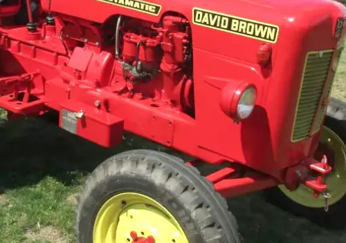
The practice of creating commercial calendars is still alive, albeit in rather diminished form. Nowadays, the old calendar companies that still exist have been subsumed by more modern “promotional products” producers. To the extent that there is such a thing as a “major” producer of paper calendars here in the U.S. it appears that Ashgrove Marketing and Hotline Products fit that bill. Ashgrove turns out to be the producer of the Antique Tractors calendar pictured earlier in this post. It also produces the current line of NAPA calendars.

Hotline has the rights to some (perhaps all) of the old Brown & Bigelow library of artwork. Hotline seems to be part of the Koozie Group, which originally was part of BiC, selling pens as promotional products. All of these places seem to be held by various venture firms and we should not be surprised if any of them end up being turned into entities that sell AI-described energy drinks and cannabis vapes in the near future. A quick browse of Hotline’s site indicates that aside from an extensive collection of Norman Rockwell art (Brown & Bigelow had the rights to much of Norman Rockwell’s images) much of the calendar artwork leans toward photos of cute cats and sunsets with Jack Handey/Steward Smalley-esque affirmations. Such I guess are modern tastes.
Today’s advertising calendar market does not seem to be anywhere as rich a place for the licensing of original artwork en mass as it was in the past. One exception to this is the Landin Calendarios company of San Antonio. Landin is the producer of what’s been said to be the West’s most popular calendar, featuring the artwork of Jesus Helguera. Helguera, who has been dead since 1971, has had his work printed on untold numbers of Landin-produced calendars hanging in bars, restaurants, etc. throughout the Southwest.

It also hangs in Massachusetts, where I’ve saved and continue to admire several pieces of Helguera ephemera. Helguera’s work echoes much of the calendar pinup art from the glory days of advertising calendars with its emphasis on attractive models, animals, humorous situations, and of course vehicles.

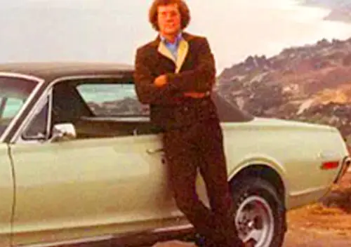
I feel that Helguera’s work sometimes recalls that of American artist Art Frahm, who is the creator of the lede image in this post. Frahm is probably best known for his pinup art – originally produced as calendar art – featuring ladies who have suffered catastrophic and ill-timed undergarment failures (usually while carrying groceries and with a small pet dog in tow).

But Frahm produced other series as well (licensed to the Joseph C. Hoover and Sons publishing company). He did a lot of work for the Boy Scouts of America (just like Norman Rockwell) and produced several other series of works that did not feature women with their underwear around their ankles. Notable of this non-pinup work was his traveling hobo series and his safety series, of which the above is an example (as is the lede image).
Curiously…if you flip back to the pinup art (I’ll give you a second to do that), you’ll see that aside from more modest clothing and a lack of visible underwear, the two series sometimes share much in common. The pet dog, the side-glancing (nearly leering) cop, and often a grown up lady. In the above example, she’s very nearly carrying celery; although it seems actually to be some other plant. Frahm often included vehicles in his pictures, although their precise make and model were usually unclear. I don’t entirely recognize the make of the school bus in the above. Likewise the truck in the opening image.
All this is in contrast to modern calendars which mostly rely upon photographs and when they’re about cars they are really about cars. Often, the cars are “classics” (such as in the NAPA calendar, above) or with somewhat surprising frequency, tractors.

This means that I now have two 2025 calendars about antique tractors.

Not that tractors haven’t always been a calendar artwork subject. I suspect though that back in 1919, tractor calendars were basically intended to serve an audience that had a vested interest in tractors. Like farmers.
NAPA still seems to have sufficient faith in the promotional calendar business such that there’s a whole page on their website devoted to promotional materials that various NAPA stores can order. My closest local NAPA had only ordered calendars, and then only “Tractors” and “Classics”. As for calendars depicting original, commissioned/licensed art they seem to only have a series called “Junkyard”. Junkyard features the art of Dale Klee who apparently specializes in painting cars and junkyards. Mr. Klee is clearly talented, but I for one would like to see a junkyard calendar featuring photographs (yes, that’s a shout out to CC’s own Jim Klein).
In our current reality everyone carries anything that’s important to them in their pockets on a little screen. That’s where you have your photos, favorite artwork, your calendar, your clock. And as they say, does anybody really know what time it is, does anybody really care? Probably not, since it seems that simply knowing the time or date is less important than being told of what’s due at a specific time or date…something that the devices are quite good at.

What’s lost in all of that of course is the linearity of seeing one day lined up with the next in such a way that you have a visual reminder of where you’ve been and where you’re going. The Hupmobile calendar showed its users the entire current month along with the previous and the following months. It places “today” squarely in context. Not so with my iPhone calendar that mostly shows today but is quite visually unappealing (commonly referred to as “uncluttered”) in so far as showing any span of time other than the here and now. The same effect holds true with Google/Apple maps (gps) versus an analog map. Which is why those things are great (generally) at getting you somewhere, but really terrible at helping you understand the greater context of how you got there, where you are, and what might be ahead.
To me, today, and where I am, is largely relevant within the context and importance of a bigger picture of where I have been and where I might be going. This holds true philosophically as well as literally. It does seem a bit ironic that this notion of contextualization – at least so far as time and space goes – could be driven by something as ephemeral as ephemera. But so it goes.
Something to think about since we could all use more context, no?
Not to mention stock pin up artwork and dogs playing poker.


Thanks for a fine collection.
Thank you for this glance down a rabbit hole of something that I’d never actually thought about…
…which is amusing because I pick up a calendar from my mechanic every year. I do so mostly because those calendars are free, and I find looking at a classic car picture every month to be more appealing than looking at whatever would be on some other free calendar I could pick up (calendars from random charities and businesses are plentiful at thrift stores). I do find printed calendars to still be useful, even with smartphones, etc.
I just looked at my current calendar, and it’s published by a promotional-materials company called Comda. Another random thing that I never noticed before is that my mechanic’s shop is ID’d at the bottom of the calendar (similar to your Checkered Flag Tractor calendar), and under the shop’s name, it says “Foreign and American Car Specialists.“… which I find amusing because the term “foreign cars” is itself obsolete now.
Oh, and I never knew the story behind “Dogs Playing Poker” before. I assumed it was much more recent.
Well, now, with a newfound appreciation for old promotional calendars, I’ve got one more type of item to keep an eye out for when I’m at estate sales.
Thank you, Eric.
I’ve been using electronic calendars/calendaring software since the earliest days of “groupware” in the early 1990s. So, I appreciate the value that a shared electronic calendar cand have, but for personal use I still prefer a paper calendar for most of the reasons I write about at the end of the post. Also, I generally view my electronic calendar in “month” view, because again, I need to see weeks laid out in that kind of longitudinal view.
Comodo is a Canadian company, and looking at their offerings, they still have a few of the old cheesecake versions. Their “Building Babes” offering is …. interesting. And stands in fascinating contrast to “Faith Passages”. Hopefully they don’t often mix up the orders when shipping.
The middle aged woman in the 1918 “T’ Model Ford calendar is showing quite a bit of leg for those times .
Hemmings Motor News briefly offered ‘abandoned trucks’ calendars, I’d still be buying them of offered .
NAPA Auto Parts handed out a thin rag called “Sex To Sexty” until the late 1990’s , chock full of cheesecake pictures and bad sex jokes .
As a very young boy the Michelin Man scared the crap out of me for some reason .
-Nate
Yes, I’m sure that the lady in the Ford calendar was pretty darn racy for the time and place. Perley, Minnesota, by the way has a listed population (in 2020) of 113 people. That’s down about 80 people from its population of around 200 when that calendar/poster was new.
As I said last year when writing about the Michelin man, I really don’t get how such a scary, creepy, generally foul-tempered mascot who was fond of smoking and drinking really could ever have done much for tire sales…to anyone.
It was great fun to see all these today, and to get the detailed writeup. I resist buying when I seem them at “in-person” garage sales and such, but they always do get my attention, whatever the category of the illustration.
A tangent is the cheesecake calendars distributed by Ridgid Tool Company (Ohio) since about the 1930s—-swimsuit stuff. They transitioned from paintings to color photography in the 1960s or so, but I believe they’re still at it. It’s more “plumbing” than “automotive” wrenches and such, but I used to see them in independent auto shops, muffler shops, etc. all the time. eBay has a good sampling: https://www.ebay.com/sch/i.html?_nkw=ridgid+tool+calendar&_sacat=0&_from=R40&_pgn=2
You’d think that with a product name like “Ridgid Tool”, that company would have stuck with the idea of pin up calendars forever…but it seems that the last year of their pin up art calendar was 2017. They still offer calendars, but those now just feature Ridgid Tools. In the fully un-interesting sense of the term.
Ridgid’s calendars from the golden age had artwork by George Petty, who also drew monthly pinups for Esquire (back when Esquire was sort of more polite company predecessor to Playboy).
Here’s another good survey of Petty’s work for Ridgid: https://animationresources.org/pinups-george-pettys-ridgid-tools-calendars/
Great topic! I’m a big fan of vintage calendar art, which I think is totally underrated.
In the late ’70s, I was an avid short wave radio listener. I mailed a reception report to Radio Peking (now Beijing) China. They sent me an really nice calendar with images like this:
That’s a really great illustration. I love those types of painted photographs. No doubt that scene has some significance and is well-known to people who are familiar with scenic locations in Beijing.
I am particularly fond of calendars from outside the US. Most years during Lunar New Year I make it down to one of the big Chinatown restaurants here in Boston to get a free wall calendar.
Beautiful calendar with ultra-cute cartoon characters!
Imagine me, age 11, huddled by the radio at midnight, tuned to Radio Peking: This haunting, eerily beautiful chiming tune comes on, sounding as if it is coming from many, many light years away. Then this rousing but muffled orchestral number. Male voice: “THIS IS RADIO PEKING.” Female voice: “This is Radio Peking.” Followed by news and quotations from Chairman Mao. “We repeat the quotation…”
Radio Peking sent me little premiums like the ones shown, all very beautiful. I remember the pennants and the little RADIO PEKING lapel pin. It amazed me that I could listen to a radio station on the other side of the world, and they would send me stuff!
Terrific write-up on a wonderful subject.
We tried a CC Calendar for 2014, but it didn’t exactly sell well. I may still have a few in my closet…
https://www.curbsideclassic.com/blog/the-cc-2014-calendar-is-now-available-treat-yourself-for-the-holidays-and-savor-it-the-whole-year/
Thanks!
You know, I THOUGHT that there was a CC calendar that I recalled from somewhere deep down in the memory of this and that online. I guess I was correct.
It’s such a hit and miss thing selecting the right and thereby successful company swag. This said as the guy who still has random boxes of company-branded everything from mouse pads to water bottles. Doing my part to keep the promotional products industry flush.
Well… A 2014 calendar can be re-cycled as a 2025 calendar. And as a 2031. Don’t throw those calendars away!
THAT is an excellent point!
2026 is going to be the same as 1953, 1959 and 1970. So go looking for those right now for next year. I can guarantee that there were better calendars in ’53, ’59 and ’70 than there will be available otherwise in 2026.
https://www.timeanddate.com/calendar/repeating.html?year=2026&country=1
https://www.etsy.com/listing/1708195036/original-vintage-pinup-calendar-1959
Thanks for the heads up! I’ve only got one left, but it will be reused as long as possible.
RE ‘Dogs Paying Poker’. I had an art appreciation course in college.One ‘field’ assignment was to go to the Metropolitan Museum of Art in NY and view Cezanne`s ‘The Card Players’ that was on special display. I got a few decent cellphone photos of it, but I decieded to have some fun with it. I copied them and copied ‘Dogs Playing Poker’ on my copier and cut out the dogs head and superimposed them o the card players bodies and touched the rough eges up ith some acrylic paint and re copied them. After my presentation, I told the class that a friend worked at the museum nd she wanted to show me what they didn`t put o display. The class laughed, but the professor, a scholarly looking man in his late 70s said ‘see me after class’.’I said ‘I failed, right’ Then he started to laugh and said ‘quite on the contrary. I`ve been teaching this subject for 50 years and this is the funniest thing I`ve ever seen.I admire a man with a sense of humor and you`ve got one’! got an A + fpr the subject and a recomendation if I needed one.
That’s a great story!
The picture where the kid tell his dog to go home remind of that tv ad featuring Morris the cat where the girl at the beginning of the ad tell Morris to go home.
https://www.youtube.com/watch?v=uxde5kEGEls
I wonder if that tv ad was more or less inspired from that picture where the kid tell his dog to go home? 😉
Could be!
As they say, Orange cats are the best cats…and they’re pretty smart to boot.
The one over here is working on figuring out the intricacies of a K jet ignition system that cranks but does not start…although that pretty much has me stumped as well.
I too love well illustrated calendars .
-Nate
Despite growing up at a time when paper calendars and planners were getting more and more irrelevant by the year, I still employ both. The paper calendar for big dates and the paper planner for mundane tasks.
This was a great read. Thanks.
I was wondering what the Michelin Man was really smoking?
They used to have really good calendars where I drove trucks, everything from classic cars, to scantily clad ladies. Depended on whose shop you were in. Then they hired an HR director and all of them were gone! It might offend someone they said. Being the only woman driver at the time I said Who?
In most cases with Bibendum, I’d have to say it wasn’t anything good.
Great post, Jeff! At least two things resonate with me here: ephemera (and thank you for including the definition, as it’s not a word I see often) and paper calendars.
Ephemera and the basic idea of what it is is part of the reason I take so many pictures of what I’d assume others think of as so ordinary and everyday.
I have never ceased having paper calendars. I create them using my own images and get the added bonus of seeing my own artwork. I’m also a visual person who likes to see what the month actually *looks* like in terms of plans, deadlines, and activities.
Thanks! Great idea about making your own calendars with your work. I recall noticing years ago that CVS did that as a service in their photo processing area. Back when every CVS had a photo processing area…it seems like a lot in my area have stopped that.
I was very much into monthly calendars as a boy. We’d get so many as promotions (no pinup girls, classic cars, or tractors though!) and I’d hang them all over the basement and dutifully change them each month. My favorite was one from a local lumber yard; each month featured a dream house rendering.
I learned so much from studying calendars — which months started on the same day of the week (such as September and December, April and July plus January in leap years) and the progression of the dates of a given weekday: for example, 2-9-16-23-30 and 6-13-20-27 — very helpful for figuring out in my mind when future or past events would occur.
The Tic Toc in Springfield Ma had blues night until at least 2000 when I left Springfield ma and if you waited for last call the dancers from up the street would stop by.
Thanks for that comment as I’ve been having a hard time figuring out when the Tic-Toc actually closed. My years of going to it were in the early 1980s, and I know it’s gone now (I recently had a project in Springfield and went looking for it) and has been gone for a while. I can definitely see it having had a renaissance in more recent years as such places became cool. Back in the 1980s, it was just run down and dark. Just the way I liked it.
Yes, the dancers. I was trying to figure out whether I was going to mention that in the article…. 🙂