

No person who’s being honest can argue that 1963 wasn’t one of the greatest years in automotive styling history, and the cars that Italian design house Pininfarina alone presented to the world would make that fantastic year a greatest hit. Nevertheless, there was a little self-plagiarism involved, which isn’t a bad thing.

We’ve all drooled over 1960s Italian styling, but my current fascination began with the book pictured above. Sometimes presented as International Auto-Parade and sometimes as Auto Universum, they were annually “worldwide published in Zurich/Switzerland by Arthur Logoz.” The American version I own was printed in West Germany and published in America by the Macmillan Company; however, there were worldwide versions available in many languages, and the books contain a summary of the previous year in motorsport, technical highlights of the then-modern automotive industry, and most importantly, a pictorial selection of the newest cars available worldwide and their (often incorrect) specifications.

I apologize for the poor photographs (I’m not going to bend a 63-year-old binding in an effort to scan these pages), but near the center of the book is a Pininfarina retrospective, followed by the 1963 Ferrari lineup.

A few things become clear in perusing the photographs: First, even considering that Bertone, Touring, and others were designing absolutely gorgeous cars of all stripes in 1963 (what I wouldn’t do for an Alfa Romeo 2600 Spider), Pininfarina was probably at the top of a very strong list.

Second, it was easy to tell a Pininfarina work, because the same themes showed up on many of their cars.

Finally, you had examples of their work that had been designed about a decade beforehand but still looked great, for example, the Alfa Romeo Giulia Spider. Whenever I see a Giulietta or the bigger-engined Giulia Spider (seen here), I have to work hard to convince myself that it’s not the most beautiful car ever made. Of course, that’s impossible to say, but its elegant grille, gently sloping fenders, quarter-panel kickup, and split front bumpers are simple and right. The only thing I don’t like is the barely noticeable hood scoop on the Giulia.

Even though it was designed in the 1950s, few would say that a Giulia looked out of place in 1963. It would eventually be replaced by the Duetto, which was also a beautiful car that had decades-long staying power, but I’ll argue that it wasn’t quite the achievement that this bodystyle was.

A quick note: Not all of these pictures are necessarily 1963 models, but in all cases, the cars were stylistically either minimally changed or unchanged during their production runs. The FIAT 1600S Coupe represented what Pininfarina was aiming for in the early 1960s, and it looked extremely similar to the Peugeot 404 Cabriolet, which we’ll see in a minute. The lines are just a little squared off compared to the Alfa Spider, and when looked at in profile, most of Pininfarina’s cars had bluff front ends, sloping tail panels, traditional quarter-panel kickups, and fast C-pillar and roof designs.

And the magic was not in the ornamentation, but the simplicity. With a slim horizontal trim piece on the rocker panel to make the FIAT look even lower, and one horizontal body crease about two-thirds of the way up the flank, in addition to those close-fitting and trim wraparound bumpers, it’s the form that’s doing the work.

You can see how similar the Peugeot 404 Cabriolet is to the FIAT (this is a 1964 model). Paul N. wrote about their similarities here, but it’s like John Fogerty being sued for plagiarizing himself: How can you really be upset that the same author recycles their own themes? Aside from sitting a little too high in the back, the 404 is almost perfect. The bodyside crease seems to have a bit more of an arch than the FIAT’s, as does the quarter panel.

The taillights are very similar, and the bumper is even more delicate than it is on the FIAT. The trim is certainly not interchangeable between the two cars, but it would be a close call.

One thing you may have noticed about the Lancia Flavia’s (seen here as a 1967 model) profile in the lead picture is that it has more front overhang than you’d expect from an early-1960s Pininfarina design, but that was a result of the Flavia’s mechanical specification; it has front-wheel-drive in combination with a boxer-type four-cylinder mounted toward the front of the car. The quad-headlight motif is period appropriate, but it doesn’t match the other designs featured here, nor does the protruding beak.

But those are the only flaws, if you can even count them as flaws. The rest of the car has a lot in common with a certain Ferrari 2+2 seen below, with its kinked quarter window, sloping tail, and fast roof line. The Flavia’s rounded wheel arches that almost meet the body crease are also Ferrari-esque.

One thing that this Ferrari 250GTE has all over the Lancia is its proportions. The entire body seems to be shifted backwards on its wheelbase compared to the Flavia, for reasons noted above, and while a massive rear overhang speaks of an early 1960s design language, you can’t deny that it works—the car simply looks fast. Combined with its traditional Ferrari eggcrate grille that was aped by so many other stylists, this is an underrated Ferrari, if that’s a thing.

The taillights have more in common with the FIAT and the Peugeot than they do the Lancia, but you can see where the collective Pininfarina mind was in 1960 or so when they were penning these dramatic coupes.

However, one of Pininfarina’s Ferraris of the late 1950s and early 1960s didn’t seem to share much of anything with anyone: This is the 250 GT Lusso, and there’s little one has to say about its design. The fact that this one was a no-sale on BaT in March 2025 with a million-dollar-plus bid tells you the esteem that the collector community has for it.

Less angular than the FIAT, Peugeot, or 250 GTE, the Lusso stands apart. It still has the GTE’s long rear overhang, but the flat tail panel is coved with simple round taillights and the quarter windows are endlessly fascinating in the way that they almost kiss the rear glass in the gentlest arc. There are no quarter-panel kickups, no kinked quarter glass, just sweeps and swells. I generally think that Bertone’s Lamborghini Miura is the most beautiful car ever drawn by man, but I don’t know how this doesn’t match it.

As a reminder that Pininfarina didn’t only design sporty coupes and spiders, this Lancia Flaminia was still in production in 1963; based on the Lancia Florida of 1955, it still looked just as modern eight years later, and like most Pininfarina designs, it was far-reaching in its influence.
Almost every manufacturer was trotting out some of the best-looking cars in automotive history in 1963, but getting them all together in one book is a good reminder of how many of Pininfarina’s most far-reaching themes converged in one model year.
Related CC Reading
Pininfarina’s Revolutionary Florida: The Most Influential Automotive Design Since 1955 (by Paul N.)
Curbside Classic: 1964 Fiat 1500 Spider/Cabriolet – The Ferrari 250 GT Wanna-Be (by Paul N.)










I agree the Lusso is sui generis, relatively speaking. Far more graceful than the 250 GT SWB and GTE, it’s my favourite shape ever (along with unbeflared Countach). I have no idea who its stylist was, and I once had the opportunity to ask Tom Tjaarda (there at the time it was conceived) who had done it. He couldn’t help with a specific name, but described how Battista and Enzo would come in and evaluate Ferrari shapes between themselves. Battista had one for himself, and I wonder whether he guided the pen closely on this one.
I think someone needs to put together a coffee-table book highlighting the greatest designs of all the Italian design houses, just to have them in one place. I’m normally not a coffee-table book guy, but it would be nice to have something to flip through when I just wanted to look at attractive cars.
Those annual compilations are exactly that for me; Auto Parade/Universum and World Car Catalogue out of Switzerland. Manufacturer images to drool over, plus the weird and wonderful etceterini. I’m also a sucker for the Catalogue Raisonnés though they can be prohibitively expensive and are deceptively not a complete overview of a carrozzeria’s output. I think I’m in the minority but I prefer the contemporaneous photography rather than modern images of said vehicles.
The Italian design houses in the 1960s were inclined to recycle their motifs across commissions: consider Fura’s Maserati Mistral, AC 428 and Monteverdi High Speed. In some cases, there were legal disputes.
There was a dispute over the Monteverdi because Peter Monteverdi upped the quantity of his order and Frua couldn’t meet the new numbers. Monteverdi then commissioned Fissore to build the extra bodies and Pietro Frua sued for royalties, successfully.
Monteverdi took heed and credited himself with the Hai’s design, but he most certainly did not style it. Trevor Fiore eventually claimed credit, though its provenance is closely and mysteriously linked to the Alpine A310.
The carrozzerie needed a distinctive house style so as to differentiate their wares, and repetition of motifs was part of this imperative. Rolls-Royce was furious when they saw the Fiat 130 Coupe after having approved the Camargue, but I think for the most part the manufacturers expected these motifs to carry some similarity to other shapes emanating from the same carrozzeria.
The issue of recycled designs is one that I’ve come to understand better. It is very difficult to create a truly new and successful automotive design. I know this is pretty obvious and something of an understatement, but it really needs to be properly appreciated to understand why so many of these designs share so many elements.
We can look to Detroit to see this in slightly-disguised action.Despite having by far the largest design departments, GM, Ford and Chrysler did the same thing, of course. But they went to great (ridiculous?) lengths to disguise the basic corporate shapes for each brand and then for each model year. This may have kept things visually interesting for America’s ADHD car buyers, but in actuality much of it was pretty lame, slapping on new fins and grilles and gingerbread. And typically, like the ’57 Chrysler Corp. cars, the first year was the best, and by 1961, they were…absurd.
And when a new basic body design was actually created every 5 or so years, they weren’t always so hot, and then they were stuck with it. Think 1969 Mopar fuselage cars. They were “impressive” upon arrival but lacked a critical element, of some tapering in plan view, and ended up looking like they were extruded. This made them visually boring all-too quickly. The ’71 B-Body solved that issue, quite superbly, in the coupes. But the big Chryslers were stuck with that body and suffered accordingly.
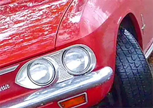
This is why the 1960 Corvair was such an exceptionally influential design (in Europe) as it was that rare smaller-car design that was truly ground breaking and had qualities that could last for a long time.
The other factor is that the European carozzerias were essentially the haute couture-equivalent automotive fashion houses at the time. One could instantly identify a Chanel dress, a Hermes scarf, Ferragamo shoes, etc.. So it was with most Pininfarina or Bertone designs at any given time. That reinforced the brand and at a time when essentially none of the European manufacturers had proper in-house design departments, this was a good thing! But it is quite understandable why the manufacturers eventually had to wean themselves from that dependence. It was a natural evolutionary step; we are now able to design our own cars as brand identity became an ever more significant element.
Keep in mind that for the most part, automobiles in the pre-war era were mostly defined by their mechanical aspects, the chassis and drive train, and that bodies were seen as something one placed upon them and might even change out from time to time (a common occurrence with the wealthy and their expensive cars). The concept of the automobile being a single unified “thing”, where the body was actually increasingly the most important element (in unibody design especially so) is a more modern conception and it simply took a while for the manufacturers to realize that buyers increasingly judged cars more from that aspect than its greasy bits underneath the body.
Nice pictures
The Cortina on the cover is awfully close to the ’61 Rambler American. Both seem to have been developed at the same time. If there was any influence it must have been behind the scenes, through spying or gossip.
The Lusso is fantastic. One of my automotive sightings that will never be forgotten was seeing a Lusso, not red but in a discreet silvery gold, pull into a parking lot in Monterey during the Historics about ten years ago. Now exotica is not exactly unusual, of course, in the area during that week, but this was just an ordinary parking lot in town, and seeing the driver pull in between, I don’t remember, a Camry and an F150 and casually walk away, was very special. All that said, I am huge fan of the 250 SWB coupes. Even more than the 250 GTO, it has a brutal tough look that really struck me as special even when I was ten years old.
Somewhat unlikely as the Cortina was British and shared ideas with the Cardinale project which straddled the Atlantic.