

In a recent piece on a bustleback Cadillac Seville, a comment was made on the merits of two tone paint jobs on cars. We all know that two-tone finishes became common in the 1950s. As the decade wore on the accent color moved from the roof to the body. With the start of the 1960s the accent color moved back to the roof, soon to be replaced with a vinyl top. Two tone finishes had a brief resurgence in the late 70s and died out again some time during the 80s.
Beyond the merits on the two-tone treatment itself is the choices made in colors. For the most part, auto manufacturers put a lot of thought into the combinations that would be offered and chose color palettes that contained complementary shades. But sometimes things got a little weird. Here are two examples from the 1950’s.

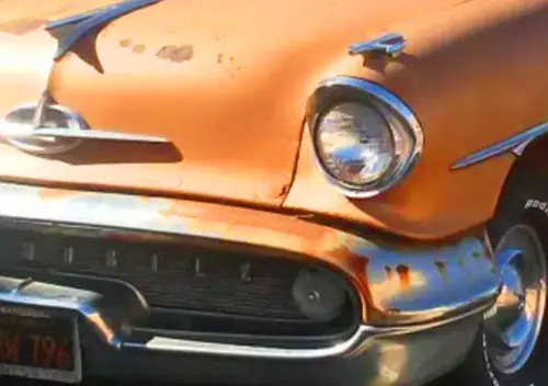
Like the ’57 Chevy that starts us off. I have seen a bazillion 1957 Chevrolets in my day. But never one like this. The main part of the car looks like Sierra Gold . . .

. . . a gorgeous 1950’s color that was more copper than gold and was usually seen matched with one of the two Ivorys. They usually look more like this. [Full disclosure: if I restored a ’57 Chevy I would want one exactly like the one above.]

Grecian Gold appears to be the other choice. This one, while offered in 1957, seems to have been more popular in 1956, judging from the availability of pictures on the web. Again, with the right accent color it was quite attractive.
But mixing the two? While it might be hard to see how combining two different shades of “gold” on the same car could be a problem, well, the result speaks for itself. Maybe if we do some minor adjustment to this underexposed photo . . . .

Nope. Of course, we have no way to know if this car rolled from the factory this way. Did someone’s pen slip when filling out the order sheet in 1957? Or did some guy doing a restoration skip asking his wife’s opinion before ordering the paint? We will never know. We do know that this car is not quite correct in that it has the gold trim pieces of the Bel Air but has the 210’s paint in place of the silver metal panel that adorned the rear quarters of the Bel Air. We also know that there is a difference between colors that are striking and colors that strike out.

This second example is one we can be pretty sure is a genuine original. I recently came across this car online and stared at it for quite a little bit. Everyone here knows that I am a fan of the last “big Studebakers” of 1956-58 and I find these station wagons to be particularly cool. The ’58s, however, are a touch of a challenge for me.

Beyond the fins, the low-buck quad headlight conversion and the even lower-buck interior, Studebaker’s 1958 color chart was kind of . . . let’s call it interesting. Three shades of gray in 1958? Although I have not researched every one of these chips it appears that almost every color offered that year (with the exception of the Midnight Black) was a change-up from anything on the 1957 color chart. I guess when you have very little money for restyling, the paint booth is one of the cheapest ways to make your car look new. Side rant – why do all of these paint sample chips insist on calling any metallic paint “poly”?

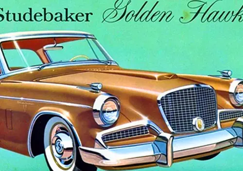
Gold had a brief run of popularity in the late 1950s and especially so at Studebaker, where they built a Golden Hawk. This 1958-only shade called White Gold was a common color for these cars and the Golden Hawk’s appeal probably made this color popular on the regular models too. The Parchment White accent seemed to be paired with this hue most commonly. And we are looking at these colors on Hawks because a decent set of pictures of the regular ’58 models in an assortment of colors is not easy to find.

The Jewel Beige is a bit more of a challenge for me. I have never been a fan of these fleshy beiges that are not pink but not straight beige/tan either. Although it does not go badly with the Canyon Copper on this Silver Hawk,

Or with the unusual Shadowtone Red (which it a bit on the purple side) on this Golden Hawk. I will concede that the Jewel Beige kind of works in both of these examples, in a 1958 kind of way. Although I am still wondering what kind of jewel is anything close to this color.
But this . . . just no. Putting a Jewel Beige roof over a White Gold body on this wagon is something close to what the common law used to call a crime against nature. Someone took a car with more than its share of visual challenges and ordered it in such a way as to make it perhaps the least attractive 1958 Studebaker wagon ever built. But perhaps I am trying to apply normal tastes to a ’58 Big Stude – and maybe this is just something that should not be done. I have looked at a lot of pictures of 1958 Studebakers and have probably seen every one of the colors these came in. But I have never seen another one in this combination, which makes this one quite unique. And even though these colors might not be my cup of tea, I hope that if the owner gets to the point of repainting the car he chooses these very factory colors. When you have a visually challenging car to start with, you might as well go all the way with it – go big or go home.
I had kind of hoped to find a few more like these via online searches, but had no luck. I suspect that we will only find these odd combinations today on original survivor cars, as most folks who decide to pop for a paint job will choose colors more in the mainstream (except for perhaps that fellow with the ’57 Chevy above). But they are out there. Perhaps you have seen one?


Some cars suit two tone some dont, Mine was factory two tone and single colour cars that model were rare when new and almost extinct now, White tops were a popular dealer fitted option here in the 60s the theory being the cars didnt heat up as much inside in the days before AC, later vinyl tops replaced two tone paint,
Third pic down of the ’57 Chevy in sierra gold and ivory is just gorgeous. This is how good tu-toning on a ’50s car was done. Also, the wrapped windshield on this car just works and looks perfect on this car. Somehow, Studebaker even managed to screw up a wrapped windshield and do it wrong along with many other details.
The top picture took me right back to the early ’80’s. A high school friend bought a ’57 Chevy 210 four door… and painted it a color combo very similar to this. Maybe slightly more root beer brownish. Popular color back then. Six cylinder, stock hubcaps.
Poly refers to the type of paint. My Dad ran a body shop and I loved looking through all the color charts. Lacquers, enamels… polyurethanes. The best colors and names came from about ’68-’74.
I get that polyurethane is a kind of paint, but these chips only use that name to refer to the metallic colors. And nobody was using polyurethane in the 50s or 60s.
Could it be “poly-tonal”, in reference to the reflective flakes in the finish? I’m grasping at straws, but I suspect the “poly” refers to a mix of two mediums to create the final product, as opposed to plain colored laquer, which would be “mono”.
OK, I give up
Poly-chromatic. It was the term for the aluminum flaked paints created by (now) PPG paints.
I think there are two reasons, #1 is that the first metallic paints were marketed at the supplier level as Polychromatic. #2 is that as it became more popular different mfgs trademarked different names for their offering. So in the aftermarket collision repair supply chain they seemed to have agreed upon using poly to denote a metallic paint as that was part of the name of the original but not enough to infringe on that or any of the other trademarks.
Ah, good. I was about to ask Dad what it meant because I was stuck mentally on it for some reason (too many paint fumes over the years?) I figured someone would remember.
Remember GM’s Firemist paints?
Yup Firemist was GM’s name for metallic paints in the early years. Not sure of the history but that name is currently owned by BASF. https://worldaccount.basf.com/wa/NAFTA~en_US/Catalog/Pigments/pi/BASF/Brand/firemist
Back in the mid-1980s, I went to an Industrial Designers Society of America (IDSA) meeting at a member’s farm NW of Atlanta. He walked us out to an old chicken coop, and standing inside was a row of Tri-five Chevys, maybe a half-dozen or so.
One was a two-door sporting a black roof over white body, ordered from the factory that way. I’ve never seen another with that combination (in that order, anyway).
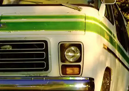
How about light yellow and a red/orange as a colour scheme? The truck claimed to be a re-paint in original colours.
I believe it. Not a common combo, but I could see someone trying it. It reminds me of an 87 Suburban some inlaws had for a long time (bought used in Texas). It was the same colors as the truck below.
I believe it too. This combo looks like Wimbledon White and Medium Copper under fluorescent lighting, and the ’77 F-Series brochure explicitly states “Wimbledon White may be used as an accent color for any exterior color except Silver Metallic.” In this case, the truck has Combination Tu-Tone, as it combined the accent color on the roof and upper back panel (Regular) with the inside molding and tailgate (Deluxe).
Every time I see the greenhouse on a Studebaker wagon like this I see a ’68ish International Travelall with bizarre fins and googaws grafted on. It’s very unsettling.
The most unusual two-toning job I’ve ever seen was on a 77 Grand Prix at a dealership when I was a kid. The body of the car was painted medium blue metallic, but the car had a red vinyl top and interior. It may not sound odd on paper, but it was a very weird combination. I remember my mother seeing it from the traffic light at an intersection and commenting that she couldn’t believe they’d let someone order that.
Not long ago, I recently saw a new Corvette at a car show in the same, odd blue exterior/red interior color combination. I mentioned it to another guy standing nearby and he pointed out that, since this was in Florida, the owner was surely a Gators fan.
And they wouldn’t have let someone order that normally. That would have had to been a true special order that would have required a Central Office Production Order to build a non-standard combination. If you look at the big brochures they will list the acceptable interior, paint and roof color combinations.
Jewel Beige needs to be more rose quartz to justify its name. Maybe Jewel was a brand of hearing aid in 1958?
When it comes to the history of two-tones, don’t forget about all the cars of the late 80s which were something over dark grey. Mercedes started that. My Plymouth was one of those, the accent color was actually a little bit gold if you looked at it closely, upper was white. I’d tend to favor cranberry and silver combinations. I see a late-model Ram 1500 sometimes which is dark red over metallic tan and looks great.
” Maybe Jewel was a brand of hearing aid in 1958?”
You have given me the biggest laugh of my day, Dave! Perhaps it was a generic store brand? 🙂
A two-tone combination that I never cared for was a real “mixed-media” thing: a late ’80s Lincoln Town Car with white vinyl landau roof, white hood, front of roof and trunk, and metallic silver sides (center section) with white fender and door tops and white lower doors and fenders. I didn’t like the white non-metallic paint along with the silver metallic, and the texture of the vinyl landau roof covering only added to the cacophony. That gold and cream ’56 Chevy is one of the best-looking two-tones I’ve ever seen.
Focusing on the 1955-62 era, it is interesting to look at period photos of actual cars. There were a lot of two-tones; also many browns, greens, and colors that are hard to classify.
I do not criticize any car painted its original colors. All of the colors created by the manufacturers were carefully selected to achieve certain artistic effects, and to appeal to a broad spectrum of color tastes of individual consumers. No color or permitted combination was intended to be “ugly” or unappealing. All the single tones, two-tones, “Flo-Tones”, etc. opened up new vistas of artistic creativity. Cadillac (as well as others) had detailed charts showing what colors could be paired with others. And if you study the charts, you realize it all made beautiful sense!
Then there were the romantic names for the color choices: Sun Glitter, Cameo Coral, Sandstone, Desert Frost, Persimmon, Ocean Turquoise, Arctic White, Presidential Black, Gleneagles Green, Crown Sapphire. . . just say the names and beautiful images swirl through your mind.
When I see a car with original paint, I think, “Somebody chose this. Somebody looked at the choices and said, ‘I want THIS!'” It’s a lasting testament to the individual car buyer as well as the spirit of the times the car was built.
Look at all those two tones, even if it is just a white top. The white top of course makes a lot of sense when A/C was a very expensive and rare option.
I do agree back in that era they frequently had much better names for colors and of course had a much larger number and range too. Of course when the norm was to order a car and cars sold in such large numbers it was easy to do that. As long as you moved enough to use up a drum of paint before it went bad it really didn’t matter if they offered 8 colors or 12.
Here’s something pretty wild – a ’56 Chevy featured in the Jacques Tati film “Mon Oncle”. I assume it was painted after the fact for the film, which is a comic sendup of materialism.
I think the ugliest two-tone in recent memory is a real biggie from the mid-late 70s….silver with a maroon vinyl roof often seen with a strip around the bottom of the car.
I learned something new, PPG stands for Pittsburgh Plate Glass. which lead me to a new question, why would a plate glass company buy Ditzler?
They’re still one of the big players in paint. The company is probably officially just PPG now, with all they’re involved with.
It’s Pittsburgh Paint & Glass.
And today they’re just a paint company, which leads to the naming rights they obtained for the sports and entertainment complex in the Uptown section of Pittsburgh, PPG PAINTS Arena.
That two-tone looks outstanding on the ’57 BelAir. Love love love it.
I for one really like two-tone cars. Whether today’s designs would lend themselves to a comeback remains to be seen if two-tone ever became in fashion again, of course.
I mentioned this here once before, but a buddy of mine whose father owned a body shop when we were much younger, took a break from his usual Mustang restorations and decided to get an 81 or 82 Grand Prix and custom paint it like an 85 or 86, but instead of using a stripe package to do the two-tone transition from top to bottom (My Dad had an 85 in Dark Blue over Silver) he used a non-standard color like Candy Apple Red and transitioned it to the Silver below with a spraying technique that stippled it into place (controlled overspray if you will). The result was quite striking.
To your question regarding “what kind of jewel?” goes, while I too am stumped by the beige, that “Shadowtone Red” could be had on an Alexandrite….
Curious that both Chevrolet and Studebaker offered “Surf Green”, especially since surf isn’t green, or at least that shade.
The Shadowtone Red on the Hawk looks amazing. I’ve never seen one in that color, online or elsewhere.
I don’t mind the specific colors, but the two-tone paint on the Stude wagon just exacerbates the odd mismatch of the greenhouse on this car that looks about two feet too short for the lower body it’s mounted on. That fin seemingly adding about 18″ to the car’s length with no increase in interior space is insane. Odd that the coupes, sedans, and new hardtop got flatter, lower roofs for 1958 but the wagon didn’t until 1959.
My favorite ’50s two-tone was actually a three-tone – the yummy-looking ’55-’56 Packard Caribbean that in certain combinations reminds me of those neopolitan ice cream slices that were a popular desert selection back then, so carefully stacked.
Apart from a few grey shades and one ivory, I can’t imagine any of these colors being offered on a 2018 model, which is sad.
I thought the color on this Spark that I saw in traffic last week had a ’50s vibe to it. It’s not far off the Surf Green on the ’57 Chevy chart.
It seems that the companies are only willing to try bright colors on cheap cars. It does make sense, in that a less expensive car will probably be purchased by a younger buyer, one who enjoys the exuberance of such colors. It seems that the more expensive the car, the more likely it is to be black, silver, or white. Then, at the top of the line, color comes back into play, as the car becomes a “look at me” statement and color helps draw attention.
I have also read that brighter colors actually command a higher price in the used market. Seems that a yellow car will not sell on the new dealer’s lot easily, but very easily on the used car lot.
Reminds me of the first ’55 Chevy Nomad model kit I built in 1998, which I painted in that same copper-type color with a white roof, and a matching interior.
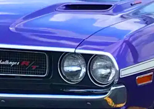
I love the wide range of colors available on cars in the fifties, especially now that the vast majority of new vehicles are either “Plumber’s truck white”, “German resale silver” or “Eastern European warship gray”. Just last night I was reading through the latest Hemming’s Muscle Machines and there was an article about the 1970 Dodge Challenger. According to the article Dodge offered 20 different colors for a car that was likely built and sold in relatively small numbers. I just wonder how many of the Challengers left the factory painted in a shade of pink that reminds me of a certain upset stomach remedy.
None of them, unless the Mary Kay people special-ordered a Challenger to give away to their top saleswoman—which they probably didn’t.
Other than a special-order deal, the only pink available was build code FM3, PPG № 2260, “Panther Pink” (called “Moulin Rouge” on a Plymouth or “Penta Magenta” on a Chrysler…did anyone actually specify this colour on a Chrysler?). It is much more saturated and much closer to magenta than either Pepto-Bismol or the panther; see here (where it also appears the actual color offering was closer to 31 than 20.
I went back to the magazine and looked and the pink Challenger they have pictured is definitely closer to Pepto-Bismol pink than magenta. Either the car was ordered with a non-standard color (I’m pretty sure that Chrysler was willing to provide a non-standard color for an additional charge), the car has been repainted at some point, or, and this is the most likely answer, my tired old eyes see it as bright pink even if it is not. In my defense I’m having cataract surgery in the morning and haven’t been able to wear my prescription glasses for the past couple of months. It is hell getting old. Peace.
Yes all the mfgs were willing to paint a vehicle just about any color you wanted, for a price.
Want a color from that year but not listed available on the particular model you want? A few bucks and a salesman/manager that knew how to properly submit it and you were good to go.
Want a color from a previous year so it matches the older vehicles in your fleet? Buy enough and it probably wont cost a dime, otherwise just a few bucks.
Want them painted in your very specific color like that Mary Kay Pink, provide a paint code from the mfg and/or samples and bring enough money and they would make it happen.
Look up Fordite jewelry. Today, it’d hardly be worth looking at.
I don’t find the first example ugly. In fact, I like it.
Jewel is a grocery store chain in Chicagoland, it’s been around since 1899 and is one of the biggest employers in Chicago.
I like the 1957 Chevy 210/Bel Air 4dr.
My first car, 1983 Chevrolet Caprice Classic, was factory two-tone colors (dark red top and dark maroon body). When I had it in early 1990s, i still saw some 70s two-tone cars and trucks ran around. But with in surge of imports which were single tone color mostly, the domestic car makers switched to the one color scheme for fshion and cost reasons.
In 2000s, Mini reintroduced its two-tone 1960s scheme to US. For a while, it is the only car maker offering this as I notice. Finally, recently Toyota put two-tone in its C-HR probably to shake up its boring image, in addition to its currently unnecessary complex body shape. Other take notices, Kia and Mazda are now offering two-tone in thier small SUV. I predict this trend may last ten years before dying down.
The ’77-’79 Caprices looked fantastic in most of the 2-tone combinations they offered: lighter metallic dark red (or blue or green) over darker metallic dark red (or blue or green) or vice versa, silver over metallic red, black over silver, etc.
Similar colour schemes on the ’80-restyled Caprice never looked anywhere near as right to me, but then I’d say the same of the ’80-restyled Caprice itself, no matter the colour.
How about THREE-tone cars? Not that there were a lot of them, but they did appear in the mid/late 50s. I remember Chryslers and Dodges, mostly.
Here’s one of the best-looking three-tones – ’56 Chrysler New Yorker St. Regis.
The ’55 DeSoto Fireflite Coronado comes to mind, a very low volume spring selling edition. Love that turquoise/black/white combination. I actually saw one of these in my old San Diego neighborhood about ten years ago.
And the ’56 Packard Caribbean, similarly three-toned, stunning.
I like the 56s in crocus yellow and laurel green, seen a couple like that.
I donno, that Sierra Gold/Grecian Gold Chev doesn’t strike me as too far outta line. Unusual, surely, but it’s not making my eyes bleed. Are we sure its accent colour is Grecian Gold, though? Paint chips are notoriously approximate, especially after many years’ time, but the photo of the car suggests the accent colour might look greener than Grecian Gold, maybe more like Laurel Green poly, i.e., metallic.
(Low-buck quad headlamp conversion on the Stude: did you get/may we see pics?)
“(Low-buck quad headlamp conversion on the Stude: did you get/may we see pics?)”
I was referring to the cut-rate re-styling job that took the existing 1957 fender stampings and added pods/blisters to cover the transition from the single-headlight fender to the double headlight housing.
Oh! Sorry, I misunderstood; I thought you meant an aftermarket hack. Yikes, but this what you’re showing and describing might just as well be out of the JC Witless cattledog.
I agree that the chips are unreliable. My second step was to do a search for year brand and color name. Even then you get variations in lighting, car condition and (with restored cars) differing results with modern paint or spraying techniques.
As for the laurel green, I asked that same question, but the cars I saw seemed to rule that one out.
Oh, yeah, wow, that’s quite a lot greener.
How ’bout this highly unusual ’74 Chrysler specially ordered in white-over-bright-red? I’d vote “Yes” on this.
The fire chief ordered it as a service car, but the city council backed out on paying for it.
Was this the one that Frank Sinatra supposedly bought for someone as a gift? I recall a story like that was associated with the only bright red Chrysler of that vintage I ever saw.
Donno, but it’s in appreciative hands now; OsbornTramain owns it.
Ahh – I mistook it for an Imperial on quick glance, and the guy’s video mentions that Sinatra ordered one of the red Imperials. But the Newport Custom makes this really an oddball.
As an aside, Fender and Gibson both used Ditzler/PPG paints and Duco for their guitars, and often used the same names; IIRC, Fender used the Chevy names (such as Surf Green and Inca Silver) while Gibson used Caddy names (Firemist, etc).
Ooooh, it’s even weirder than I thought!
https://www.vintageguitar.com/24640/fender-custom-colors-in-the-1960s/
For those of you interested in color, in 1953 Packard made a fascinating filmstrip entitled “The Magic of Color”. This little cinematic masterpiece shows cars and interiors in various colors, with male and female voiceovers breathlessly describing the beauty of the color choices available. Dark Blue is described as “The blue of the deep blue sea, which gladdens a sailor’s heart.” Yellow Gold bring forth images of “pirate adventure, pieces of eight, and the sand of the seashore, each grain fashioned by nature into a perfect diamond.” Green reminds us of “dewy forests, the scent of sassafras.” Fiery Red “demands attention–defers to no one.” In the background, stirring orchestral music plays. It’s really something to watch and listen to this. Unfortunately, it hasn’t been uploaded to YouTube yet.
Today we get “a gray that reminds you of the leaden sky of a February day that urges you to climb into a soft bed and pull the covers up so completely that you can neither see nor breathe.” 🙂
I’ve always preferred more elegant “dual shade paint combinations” as Cadillac in the 1980s used to refer to them.
Especially black over silver or vice versa.
The 1978 Cadillac Seville Elegante:
Apologies for my tardiness, but I managed to find my rare Studebaker-Packard color choices brochure. It confirms that the two tone scheme on ugliest 1958 Studebaker wagon in existence was not one of the 32 combinations regularly available from the factory.
What a fabulous piece of literature! You ought to scan that up to OldCarBrochures.org. Does your book say whether any of the selections on the Ditzler sheet were Scotsman-only colors?
Oops, your next shot answered my questions.
Upside down perhaps, but I hope they helped! Wish I know how to straighten them out!
Jewel Beige was only offered in combination with Canyon Copper, Shadowtone Red, and as the main color with Parchment White. The wagon seems to be a custom order with a White Gold body. It would be fascinating to have a look at the build sheet for this car and see how this happened. Articles in the Studebaker Drivers Club magazine Turning Wheels have mentioned how the factory would build almost anything to complete an order, especially in lean years like 1958, but this order seems really strange.
Jewel Beige is a really tricky color. It at times comes off as really pink in bright sun, leading people to call it “dildo pink” on more than one occasion.
Normally though, the beige part really comes through. It’s almost like a dusty peach if that makes sense. Pairing it with any color besides white (or black which oddly wasn’t a choice) gets pretty bizarre fast. My own car came with a Shadowtone Red roof but was badly painted a non metallic maroon at some point. It is being returned to its original hue now, but I have to believe that this was a very rare combination to begin with. Turning Wheels did a breakdown of the Packard Hawk build sheets by color and exactly two were built with this combination. Seeing as only 588 Hawks were built, I suspect only a single digit of the 675 Hardtops built had this color scheme.
Thanks for the pictures! In searching pictures it seems that the Shadowtone Red is another color that photographs really strangely depending on the lighting and the camera. Or maybe some have done like your last owner did and chose a more conventional metallic maroon during a repaint.
I find it odd that they did not choose a beige that would mix better with a wider selection of other colors. But then the white they used that year was almost beige. And the lack of any kind of yellow is another thing I find strange. When you eliminate the Scotsman-only colors, it looks like the choice was only 13, a pretty thin selection for that day and age.
I remembered your hardtop. I still cannot say that I am in love with the color, but I do find it fascinating and would not change a thing on a rare car like that.
Anytime! Shadowtone Red should be an almost-purple metallic color that definitely appears different in varying degrees of light. Given the quality and age of the paint job on my car, I would guess that an Earl Scheib type place “didn’t have” anything close to it and sprayed what seemed to be the next best choice from what they did have.
There’s so much that just shouldn’t be about that car. The color scheme is really the icing on the cake.
Dildo jokes aside, in these pictures of the ’58 Packard hardtop, when the dark red roof is visible, the Jewel Beige takes on a pinkish hue. When the roof is not seen, Jewel Beige looks more tan or “fleshy”. One color in proximity to another can change the way the colors look. That’s why this is an art and a science. More complex than it seems.
I just looked at the wheels on the Studebaker wagon, and they seem to be parchment white. Could this just have been a respray of the top in an incorrect color? Especially as the top does not show as much wear as the body does. I do understand metallics age worse, but the mismatch of the wheel and roof seems to point towards this one being originally parchment white with white gold.
I don’t know about 1958 or when they started, but Studebaker painted its wheels white on everything it built in the 60s up to the end.
FWIW, the 1957 Chevrolet only had one two-tone colour combo with sierra gold and that was adobe beige, such as the 210 shown below. Grecian Gold wasn’t listed as being available on ’57 Chevrolet literature I have, although it is listed on your paint chip chart and on paintref.com.
My dad’s favorite car he owned over his lifetime was a ’64 convertible Pontiac Catalina he bought new with a midnight blue body and a light blue top. I have never seen a picture of any Pontiac in this color combination, and I’ve searched the web hard….