

I decide to scan some of the ads in this issue of Road and Track, to share them with you. I noticed a distinct gradient in their effectiveness, so I’ve decided to treat them as class assignments and grade them.
This gets a B. Obviously it caches you attention both visually as well as with the title. But it doesn’t quite go far enough to make the sale. Eye catching is one thing; selling you on how your life will be better if you buy this is another. It’s a bit weak there.

B. I’m a bit surprised how effective I found this ad to be. It’s title is very effective, in selling the Sprite’s purpose in life: a cheap sports car. The “hot” might have been “hotter”, to emphasize the Sprite’s new bigger 1275 cc engine. But it’s there in the copy, which is also pretty effective at getting its key points across.

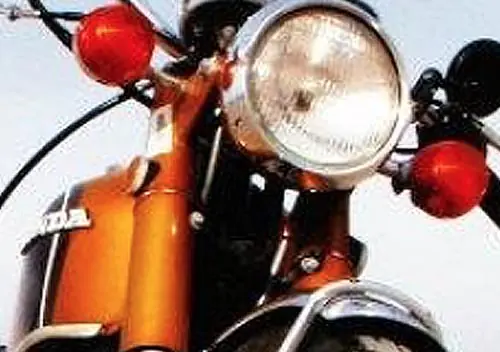
B Another good effort, with good eye appeal. I never knew there was a Honda Custom Group, as these two “custom” versions of the Sports 90 show.

D I almost flew right past it. What’s it for? Neither the car or the brand are given anywhere near the space they need and deserve. The list of dealers is visually painful, but in that pre-internet era, finding an NSU dealer wasn’t all that easy presumably.

F This is a total fail. One of the most seductive cars in the world is only shown in a very unseductive little outline drawing. Zero visual appeal, and terrible messaging. Who gives a damn about Spaghetti, Sausage and Wine? Everyone knows where they originated. Zero effectiveness, and shockingly bad.

B This is a formulaic ad of a kind used by so many companies and for many years: A catchy title on top, an image of the car, and then a lot of text, hopefully compelling. Actually, I find this one better than average of the genre, but then the basic sales pitch of the Tiger was pretty compelling. Maybe a rear view of it leaving a nice patch of rubber on the road might have even been more compelling.

D- I almost gave it an F. It reads like a press release. And showing the same exact picture twice is not effective, even if it’s trying to make a point. BTW, I didn’t know that the 230SL was still being sold alongside the 250SL, but I suspect that was quite short-lived.

It gets a C, Naturally. It’s another very formulaic ad, but for some reason, it doesn’t catch my interest, unlike the Tiger ad.

C It’s visually catching, because it’s in color and it’s a good photo. But the title has no connection to the actual car, even in a stretch.

B+ Corvette ads were typically some of the best, for a number of years. This one lacks the catchy copy, but the text is effective given that it reflects the Corvette’s perceived superiority and popularity. Corvette ads almost always make you want to be in the ad, the hallmark of it being effective.

B Another sold effort, with good titles, photo and decent if uninspired copy.
Now here’s the classified ads. No grades, though.


Some mixed results for sure. NSU should have taken a 2 page ad with a zippy photo on page 1, and the boring list of dealers on page 2.
But those classifieds just kill me. I’ve love to buy a Ferrari 250 Boano for $3995. I think one is now worth a lot more than two Sprites.
I am not so negative on the dealer list in the NSU ad. The potential buyer is not likely to search the phonebook right away. A 2 page ad is not likely to increase the number of callers but it will double the cost. The mag is distributed nation wide, so tell the reader where you can be found.
David E. Davis Jr wrote many of the Corvette advertisements of the era.
With that photo and “Almost nothing to wear” and “Solo Suzuki”, it comes off like some kind of teen-boy wet dream. Were they looking to sell to high school boys? Perhaps. You have to wonder. What were their other ads like? A pizza delivery guy being told by a topless bikini model that she is out of cash to pay him, but can give him something else? “Spank Suzuki”?
The NSU ad looked like it was a car that would start a marital fight, not resolve one. The couples have their back turned away from one another and glancing over their shoulders. The split down the center looks like an impenetrable wall. Either focus on a happy couple, or the car! What is this ad selling?
The Lotus ad is horrible, stereotypic, and ignorant. Comparing a car to wine, spaghetti and sausage is just stupid. What arrogant morons thought this sold anything?
The Mercedes ad shows that their cars aren’t one of a kind – as a matter of fact, they’re identical and mass produced like a disposable diaper. No – I refused to read it.
That Ford Model C ad photo is unbelievably bad. What kind of a rally has only two cars in it? Neither car is even dusty. The car itself isn’t posed in a way suggesting that it had been in a tough fast race. Instead, it looks like a meter maid’s vehicle with a number on it. You’re kidding me about the couple, right? Who gave her the cup? Where are the race sponsors? Where are the crowds? Why is she excited?
The idiots who staged and set this shot were pathetic, unimaginative and cheap.
Bad!
Guess even ad agencies didn’t have rent-a-crowd in those days. The basic idea is good, but I’m giving it an F for execution, for all the points you mentioned.
The Sunbeam Tiger ad is interesting for what it doesn’t say. Namely, that “gung-ho V-8” used in the Tiger is the 289 Ford V-8, even though Chrysler Corporation owned a controlling interest in Rootes!
Indeed, the end of the pre-Chrysler buyout Ford/Rootes contract was the end of the Tiger because no Mopar V8 should physically fit in the car.
The 164hp in the Tiger ad indicates a 260. Yes the 260 was out of production by ’67 but it doesn’t mean they still didn’t have some on the shelf. A 289 2V was 200hp, 4V 225hp.
The Mark II versions, which were offered for 1967 and marked the end of the Tiger in the U.S., were supposedly only offered with the 289 V-8. So either the company had some leftover 260 V-8s or the copywriters hadn’t paid attention to the engine change.
The Opel Rallye ad doesn’t show a car that is passing anything. The photo doesn’t go with the ad copy. What if they actually showed cars being raced with the Opel, you know, actually passing them?
People GOT PAID for this crap?
Really not sure whether I’d take the $900 XK120, or stretch to the $4900 Gullwing, or maybe just go racing in the $1600 Sting Ray- hey, it’s a roller, but you can get the L88 at the parts counter , right?
The owner of the restored 1933 Lincoln KB V-12 convertible sedan by Dietrich is asking $10,000, which, adjusted for inflation, is roughly $84,000 today.
It must be admitted that the NSU ad writers were handicapped by that picture of the car being so pug-ugly!
These all pretty much suck and generally fail to convey any information beyond
the fact the vehicle “x” exists and is available for purchase.
The Honda “Rally” 90CC cub advert is humorous for those who like old Hondas ~
Honda made it’s bones on the 50C.C. cub and in 1966 (IIRC) brought out the 90C.C. OHC Cub and it flopped ~ by this time folks were buying CB450s and other faster lightweights, Honda N.A. had to come up with the plastic tank and short seat to try and move these, no one wanted them in step through or Rally format .
-Nate
90% of A-grade car ads from this era were from either Pontiac or Volkswagen. Some of the Corvette adverts were excellent too, but not this one.
I wonder if “T. Bennett, M.D.” ever found the car he was looking for.
Oh, to be able to pick up a ’62 Austin-Healey 3000 for $2400. Acknowledging that it probably wasn’t a screaming bargain in ’67, but I’ve lusted after them forever, so that one pains me.
Also the ’55 MG-TF for $1695 recently restored- because the owner was drafted. Sign of the times in ’67, obviously.
I thought the photo in the TR4-A ad was very compelling. Has sort of an ‘Endless Summer’ vibe going on. Yes, the Corvette ad beats it, but it’s GM…deep pockets, big budgets, etc.
“Who gives a damn about Spaghetti, Sausage and Wine?”
Well, I do for one. Had spaghetti and a merlot last night for dinner.
Don’t look at the prices for all those cars in the ads, which for that time, were quite reasonable as compared to this day.
I have to say that I thought the Lotus Ad was terrible in its choice of association.
I mean, the meme about British
cuisinefood is that the quality and preparation are terrible, and that is the lead in to thinking about buying a British car, and especially a Lotus?Oh, and you get bonus points if you made the association small small portions when you thought about the Lotus.
The attached photo is a British classic: Pie and mash with jellied eels
Suzuki X-6 was my first motorcycle back in 1970 when I got back from Nam. Drove it back and forth to college daily, even in the rain. I didn’t have the “girl in bikini” option though!
Later moved on to a 1967 MGB to stay dry.
I may not be the only one, for me the girl in the Suzuki ad upstages the motorcycle exponentially. That level of distraction may not be good for the purpose of the ad? I don’t know.
What is interesting about her, and many of the models you see from that era is almost unnaturally wide hips. It seems models were chosen for this feature.
To my point…..
I was not aware you could still buy an NSU in the US as late as 1967. I’m sure they sold well over a dozen copies.
About 900sold in the USA , from a printed reference I once found. That’s all models, from two-cylinders to rotaries. Amazing to think that I owned two of them. That clunky ad tells the truth, though. The NSU 1000 was an engineer’s car, not a stylist’s. They were very well suited to racing, if you could find a one-liter racing league. That was no problem in Europe. If you look on Youtube, it seems most of the worlds remaining NSUs are winding out their lives at hillclimb meets over there. True sleepers, those cars were. They looked like toys, sounded like the motorcycles they were so related to, and went like stink.
The dealer list was a key issue for NSU buyers. I stumbled onto their Memphis “dealer” in 1973, and eyed the odd little shoebox cars on the lot. Two years later, back in Nashville after college, I was comforted that the $750 car I’d just purchased had dealer parts in stock at the local import car dealer. The second time I went by for an oil filter, I learned that they’d tossed all their NSU parts into the dumpster a week before. Fortunately, Mercedes diesel filters were identical, and so I was off on a ten-year run of scrap yards, substitutions and simply doing without.
I would have been reading R&T at the time… but I have no memory of this ad. Nowadays I research a big purchase exhaustively, but I bought this car with none of that. Just the impressions of a fast drive on winding roads, steered by a beautiful German blonde who didn’t shave her legs, or brake for the curves…
I’m going to be a dissenter and say I really like the Mercedes ad. It explains the differences between the two models, raising interest in both, has nice touches of humor, avoids the hard sell, and in general is pitched perfectly at the well-educated professional who was their customer then.
I’d bet it was a product of Ogilvy and Mather. David Ogilvy famously thought that most ads didn’t have enough copy, and did tests showing that if readers were interested enough to read 50 words, they’d read 500.
When I was a kid I actually wanted to work in advertising. I pored over Ogilvy’s classic “Confessions of an Advertising Man,” which is full of wonderful principles (mostly ignored by advertisers today).
His most famous ad ever was of course this one for Rolls-Royce …
Land Rover did a hilarious spoof of that ad (“At 60 miles an hour the loudest sound in the new Land Rover comes from the roar of the engine”), written by another advertising legend, Howard Gossage. Later after he became friendly with Ogilvy, Gossage sent him a framed copy of the ad with a note saying “Imitation is the sincerest form of larceny”.)
The amazing thing about that ad is that it listed no less than seven (7!) dealers in Vermont. Today there are zero.
Count the words in a modern car ad. You probably wouldn’t count past 20. Image is all, supported by a slogan. Maybe one selected performance statistic. Nobody knows or cares about brake and clutch diameters or suspension designs. We’re a post-literate society, for sure.
I think the only thing that the Rallye ad execs passed was gas; more likely flatus rather than petrol.
What I remember most about that RR ad (though unfortunately not where I read it) was a reply in some car magazine: “At 60 mph in a Rolls-Royce you couldn’t hear Big Ben!”
I agree that the Lotus ad is terrible, but it’s another Elan ad (below) that I remember most from looking through magazines of this vintage.
The tagline of “Elegance breeds elegance”, and in fact all of the copy, and the photo, seem more appropriate for a Cadillac ad than a Lotus Elan. Did people really buy the small, lightweight Elan for elegance, or to show people that “they’ve arrived?”
But according to their other ad it has “full luxury specification” including carpet! Take that, Cadillac! 😉
Sunbeam wins. Tight focus on the car itself, solid details of both performance and comfort. The text around the cutaway diagram is arranged so you can look at each item while reading about it. Good ergonomics.
But Sunbeam “kind of glosses over the engine”. That was from Ford.
Ferrari’s for under $10k! MB 300SL Gullwing for $7500 obo!
I love the ad ( not displayed here) for the Volvo P1800 sports car that declares; This is either the least expensive GT car, or the most expensive economy car. You decide. I couldn’t find it so I’ll go with this one.
1. A least two ads (Tiger, Opel) declare that they have “power brakes at all four corners.” NAME THE CAR that has power assist only on the front (or rear.)
2. Chrysler wasn’t satisfied by selling Ford Flatheads (via Simca) including in the USA, they had to go on and sell Ford “Small-blocks” in the Tiger.
3. Whoever wrote the Land Rover ad as a take-off on the Rolls-Royce ad, pretty-much nailed the reasons for the SUV–Crossover phenomenon. Can you imagine in ’65, when the ad was current, that GM and Ford would pretty-much throw in the towel for building Coupes and Sedans fifty-five years later?
4. Notice the Land Rover dealership in Butte, MT. “Get an Evel deal at Knievel Motors”.
Numerous British Commonwealth cars (and those with British-made brake systems) used a remote-servo setup: pedal mechanically actuates master cylinder, which has one hydraulic line to the rear brakes and another to a booster usually mounted on one or the other inner fender. That hydraulically-actuated servo actuates another master cylinder which outputs to the front brakes. Hence: power front brakes, unboosted rear brakes.
I say “commonwealth” because this setup was found on numerous Australian and South African Chrysler Valiants and surely many other cars I’m not as familiar with.
Thanks for that. I’ve never seen such a system.
I remember seeing that remote servo setup as an aftermarket add-on fitted to Holdens back in the day, usually over the opposite side of the engine bay from the master cylinder, facing sideways or backwards. Never gave a thought as to how it worked. Cars fitted with it has a sticker on the back window alerting following motorists to the fact that they had power brakes (and you didn’t).
Of course Selex decals had a similar one without the Nasco (Holden accessory division) logo on their price list so anyone could buy them……
That photography in the Triumph ad! That’s the one photo that grabs me out of all these. Would I have read the text? Eventually. Would I have bought the car? Only in my dreams.
I wouldn’t have given any of the other ads a second glance back in the day. Maybe the NSU ad, but only because it was such a rare car. The layout is off-putting. The list of dealers says “We’re a minor brand”. This is the sort of thing we saw here in Australia from the Japanese brands nobody had ever heard of when they were getting established, usually in Readers Digest; often a list of the state distribution companies down the bottom of the ad. I’ve still got a lot of Aussie magazines from the sixties; maybe I should scan some ads to the Cohort?