

If one car represented the counterculture in 1960s America, it was not the 1966 Imperial; however, Chrysler Corporation hopped on the psychedelic train to sell a few, as the Imperial’s sales catalog was a bit trippy around the edges.

Psychedelic art and music began filtering into popular culture in earnest in 1966, and soon, everything from album covers to posters to 7UP advertisements had paisley and kaleidoscopic patterns. Songs called “Kaleidoscope” were produced by bands called…Kaleidoscope. There is a song floating out in the ether called “The Paisley Window Pane,” which was sung by teenage sisters named “Wendy and Bonnie.” And while the proliferation of LSD was the driving force behind the trend, it’s probable that many who put paintbrush to canvas in the name of advertising art never even tried the stuff. Maybe.

As far as psychedelic art goes, the sales catalog for 1966 Imperials is tame, but if a stuffy, conservative outfit such as Imperial got into the act, who didn’t? I recently purchased the brochure pictured above because I was struck by its colorful paisley-esque cover and illustrations, and although I like 1966 Imperials, the cars were a rare secondary consideration in this case.

LeBaron Four-Door Hardtop
The brochure starts at the top of the Imperial line with the luxurious LeBaron four-door hardtop ($6,540). Of the four Imperials offered, it was the second-least popular with 1,878 units sold, and it was only offered in this one bodystyle. However, painted in Lilac Metallic, I think this is the 1966 Imperial I’d choose (if only the picture were a little less grainy).

Bucking the trend toward photography in automotive advertising, the sales catalog is entirely illustrated, but unlike the social climbers pictured in Pontiac’s ads, there’s more of a serene, sunsetty, bleached-with-color vibe in the Imperial brochure. There are pretty girls in fashionable hats surrounded by flowers, not pretty girls posing in Alpine locales or parking poolside. I’m obviously not denigrating Pontiac’s work, as it was the gold standard; it’s just that it was Frank Sinatra to Imperial’s Nancy Sinatra, at least in advertising, if not in real life.

I was unable to find a good picture of a LeBaron’s interior, but this is a fairly good rendering. Once again, the images are colorful, flowery, and not-quite-realistic…in other words, psychedelic art.

Crown Coupe
The next car pictured is the $5,887 Crown Coupe, of which only 2,373 were sold (making it, sadly, the second-most-popular Imperial).

In this image, we get a mixed message. I get more of a “Love Is Blue” (by Paul Mauriat) feel from this illustration, as a rich guy hangs out with his fancy dogs, who are certainly going to hair up the back seat of that Crown Coupe. But at least the one who gets to ride shotgun will enjoy a reclining seat. The best line: it’s the “sportiest of all Imperials.”

Indeed, the Crown Coupe does have bucket seats as a sporty car should, although the sales catalog regrets calling them “buckets,” because they are no ordinary seats at all:
The back is curved. This 8° kick forward in the seatback gives firm lumbar support you’ve never felt before. And on long trips you’ll find this remarkably soothing. Especially when you have a 6-way power control to position the seat for your maximum comfort. Your passenger has the added comfort of a reclining seatback and hidden headrest. A touch of a lever adjusts the seatback to any angle within a 45° arc. The headrest lifts to 4 positions.
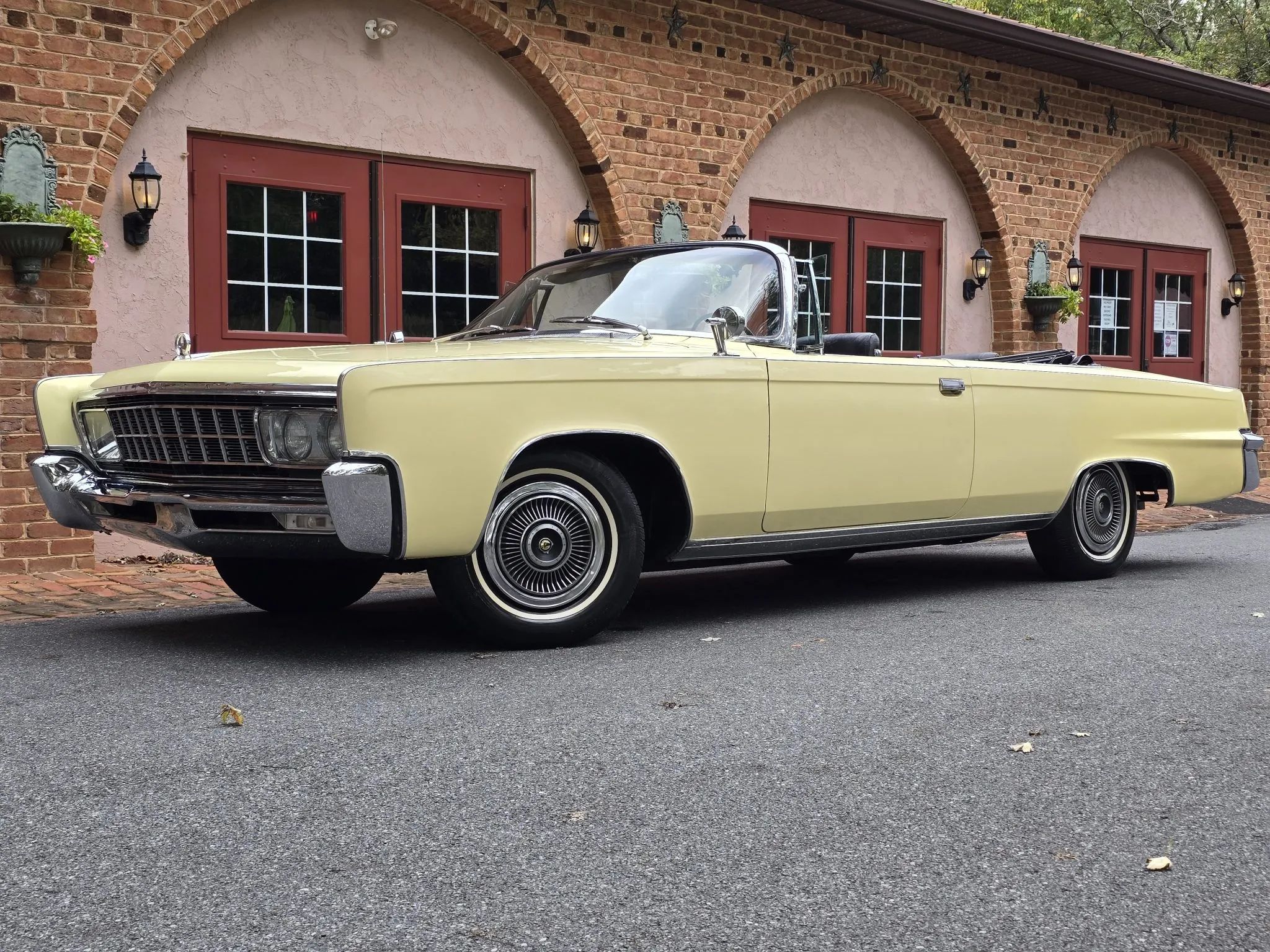
Crown Convertible
I would imagine that this beautiful Daffodil Yellow Crown Convertible would be the sportiest Imperial rather than the Crown Coupe, but I’ll let the advertisers make the decisions for me.
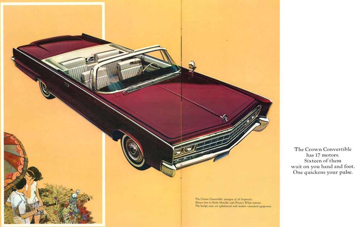
Ah, we’re back to flowers and tennis, right where we belong. The Crown Convertible’s 17 motors not only present the future collector with any number of electrical headaches, but it also presents those who fixate on semantics an opportunity to explain that an internal-combustion engine is not a “motor,” even though we celebrate motorsports and motoring.
Speaking of motors, the 1966 Imperial enjoyed the new 350-horsepower 440 under the hood, which replaced the outgoing 413.
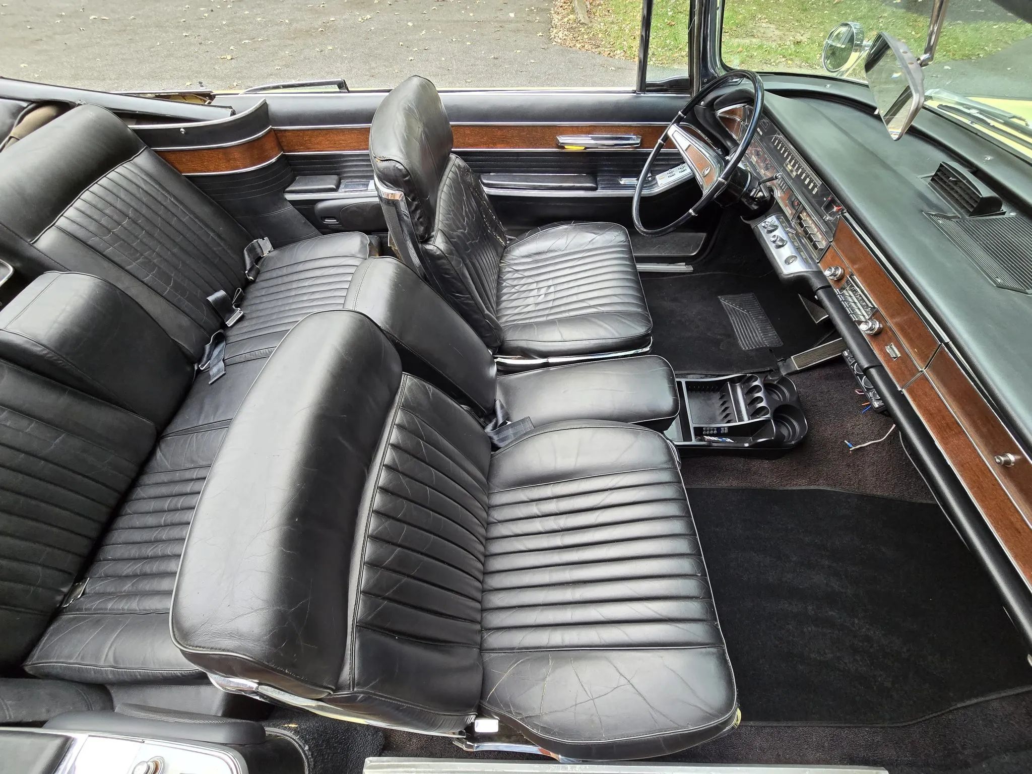
The Convertible clearly has real leather seats, and one truly has to wonder why so few Imperials were sold, as this looks like such a nice car. Alas, only 514 Crown Convertibles were sold in 1966, each starting at $6,146.

The brochure illustration evokes an autumn day with the top down (and perhaps a tennis racket or two in the trunk). It’s good to be rich.
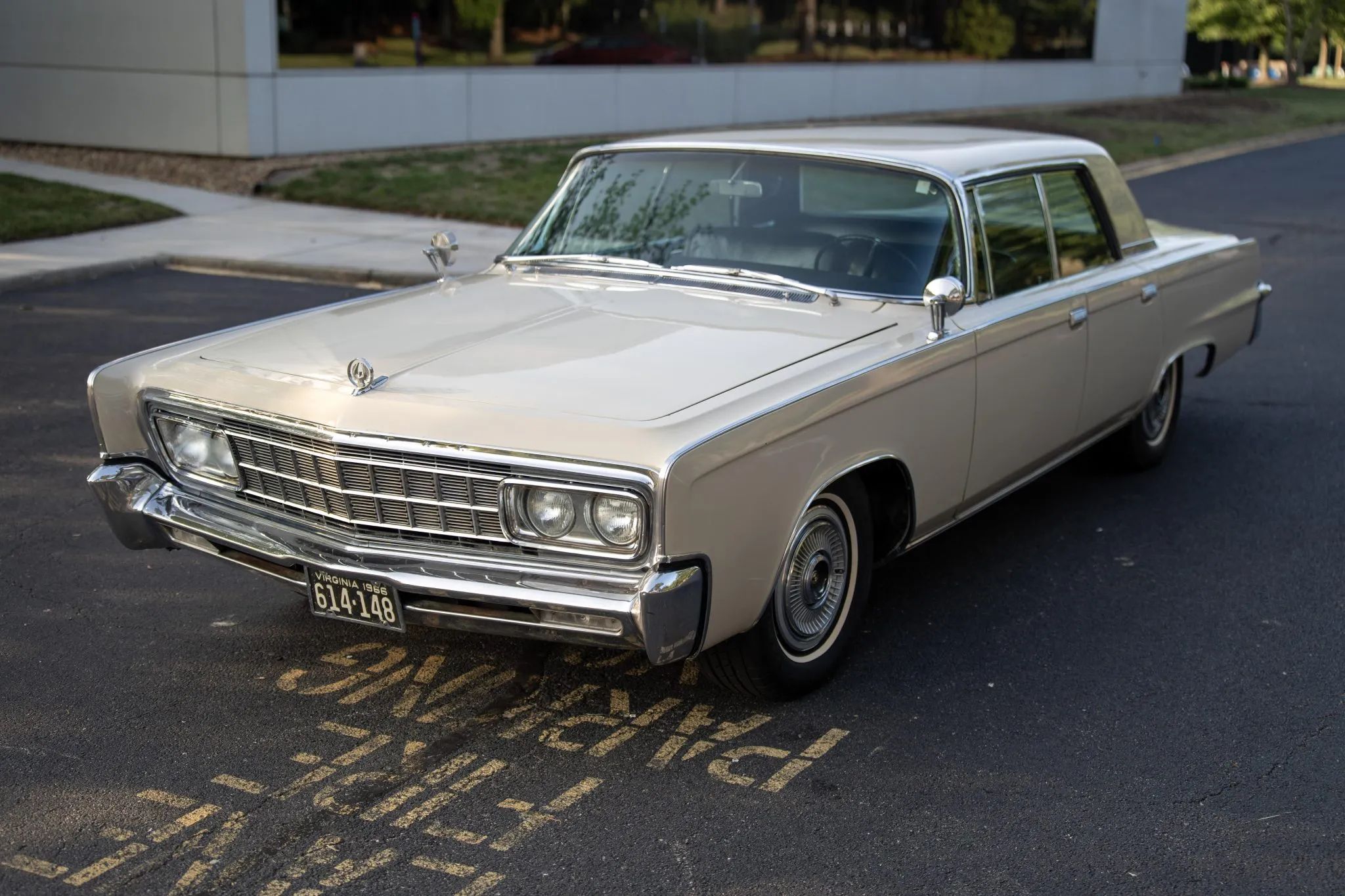
Crown Four-Door Hardtop
The “thriftiest of all Imperials” was the $5,733 Crown four-door hardtop, by far the most popular Imperial with 8,977 units sold.

This is my favorite image in the brochure, because we’re getting into mermaid territory. I don’t know why, but this pseudo-psychedelic image invokes baroque pop rather than psychedelic rock, maybe something like “Pretty Ballerina” by the Left Banke.
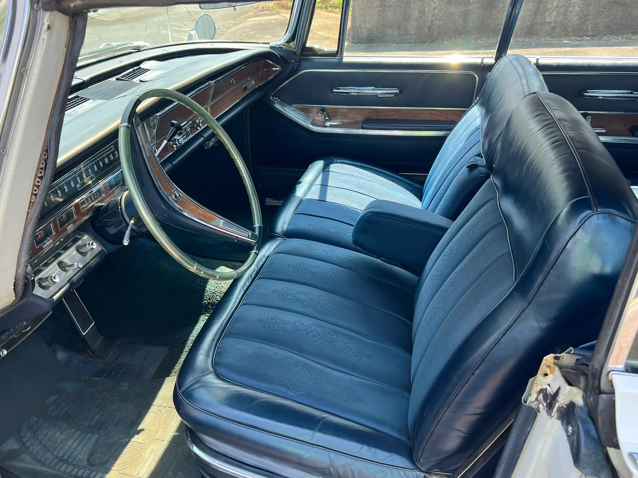
The Crown four-door hardtop’s interior is the most paisley-themed, as you can barely make out in this well-preserved example.

It’s a lot more pronounced in the brochure, where the Crown is parked among the reeds, seagulls, and mermaids.
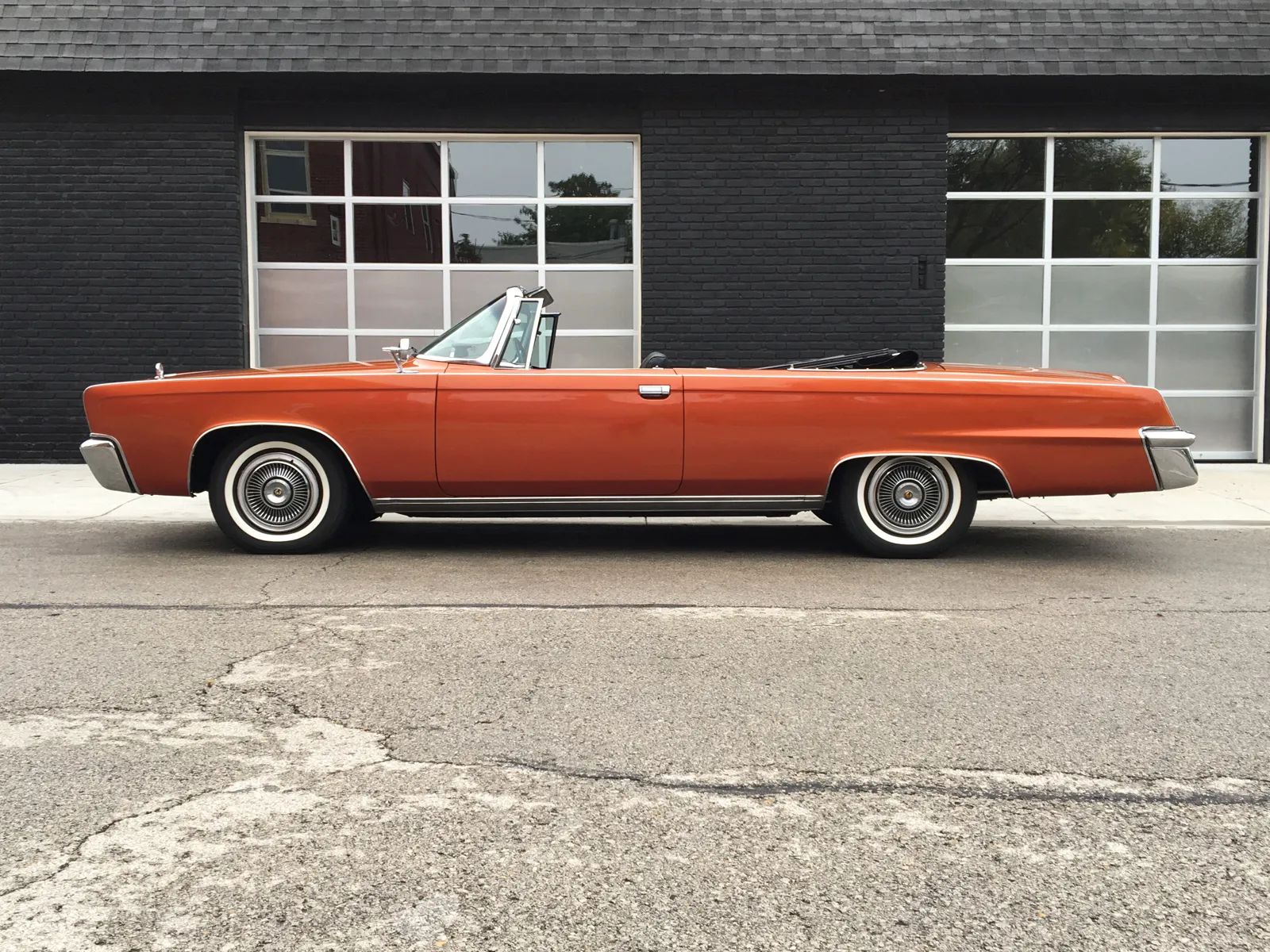
Of course, the typical Imperial buyer would more likely be worrying about their ulcers and balance sheets rather than what the kids were up to, but even if the sales brochure for the 1966 Imperial was a miss insofar as moving actual cars, it is an attractive reminder of a time when marketing departments weren’t afraid to mix a little pop culture with their conservative clientele.
Related Reading




The mermaid image and the black car from the rear view reminds me of Houses of the Holy by Led Zeppelin. A mixture of softness and art combined with a car heading off to do no good, and considers itself above the others.
The Green Hornet got a lot of miles out of their version, but like it’s real life progenitor, was not terribly successful as it could have been.
Chrysler configured one (definitely non-psychedelic) 1966 Imperial for that season’s show circuit. Anticipating advances in mobile communications which would unfold over the next quarter-century and dubbed “Imperial Mobile Executive Car” the Crown Coupe was fitted with a telephone, Dictaphone, writing table, typewriter, television, fax machine, reading lamp and stereophonic sound system. At the time, car phones were available (the first service in the US offered during the late 1940s) although they were expensive and the nature of the bandwidth used and the lack of data compression meant the range was limited as was capacity, only several dozen calls able simultaneously to be sustained. In 1966, there was even the novelty of a Datafax, able to send or receive a US Letter-sized (slightly smaller than A4) page of text in six minutes. Today that sounds unimpressive (even if compared with the 14.4 kbit/s for Group 3 FaxStream services of the 1990s) but the appropriate comparison is with the contemporary alternatives (driving, walking or using the US Mail) and six minutes would have been a considerable advance. As it was, the tempting equipment awaited improvements in infrastructure such as the analogue networks of the 1980s and later cellular roll-outs and these technologies contributed to the extent of use which delivered the economies of scale which eventually would make possible smart phones. A less ambitious implementation appeared in 1967 as the “Mobile Director Package” available exclusively on the Imperial Crown Coupe.
One of the CC Cohort spotted one of those a while ago: https://www.curbsideclassic.com/blog/cc-cohort/rare-find-1967-imperial-directors-chair-package-chryslers-luxury-statement/
It’s a cool brochure, but I have to think the overlap between potential Imperial clientele and the audience for psychedelic art or anything that smacked even faintly of counterculture was pretty close to zero. In the ’70s, it might have constituted a desperate attempt to stay hip, but at this stage, the archetypal domestic luxury car buyer was the guys who snickered when James Bond made that crack in Goldfinger about how drinking warm champagne was like “listening to the Beatles without earmuffs.”
That James Bond line has always makes me chuckle. Sean Connery was only something like 34 when he starred in “Goldfinger,” young enough that I wouldn’t expect it, but Ian Fleming had a slightly older guy in mind in the novels, so the line probably fits.
The screenplay was written by Richard Maibaum, a 54-year old American writer.
I’m no art historian, but the paisley and floral designs, and the general style of the advertising artwork, brought to my mind the late 19th century British pre-Rafaelite period, which also coincided with a popularity for paisley, a century before the psychedelic era.
It’s interesting that the reclining passenger seat was offered for the passenger only, as today it seems common in lower-end cars to provide more seating adjustments and features for the driver. Was this a safety concern? Not allowing the driver to get too comfortable and get drowsy?
The reclining passenger seat was so the passenger could put their seat back about 30 degrees to take a nap, like an airline seat.
I had the same thoughts on the art history aspect as well.
1966 also strikes me as a few years early for a luxury car brand to go full psychedelic. The images seem to me to tie in to the increasingly sophisticated folk music of the time (Simon & Garfunkel’s ‘Parsley, Sage, Rosemary and Thyme’ is playing in my head…), and the interest in (elegant) tradition and roots as a way to move forward – a canny way to make (conservative) Imperial buyers feel more cool and contemporary. Fascinating stuff.
When something is “in the air” like psychedelic art, it appears everywhere, and is authentic and genuine to the era in which it is produced.
I’m fairly well convinced that a lot of 1969-early ’70s Sesame Street was inspired by LSD trips. Sesame Street was produced in New York, and I think some of the writers and artists went down to the Village, dropped acid, and then created cartoons for kids to watch–kids like me–based on what they experienced. Far out!
Here are two classic examples (which you may remember). The 2nd one is actually called “The Psychedelic Alphabet” (but not officially). I still get an enchanted, hypnotic feeling when I watch these things.
As for the 1966 Imperial, I think the problem was the front end looked like a “car”, but Cadillac’s front end looked like a “Cadillac”. Still, I would select an Imperial over a Cadillac, because an Imperial is superior to a Cadillac in many important ways.
I think when you are in the 3rd year of a none-too-popular car after new designs from the competition in the last 2 years, you can be forgiven for making a play for those few who consider themselves artistically “in”. A conventional brochure wouldn’t have helped.
It was probably an attempt to distract from the 1957 windshield still hanging on nine years later…
I was thinking the same thing. That dogleg visible in the picture of the Crown Coupe interior really shows how dated the car had become by then.
Correct about the windshield, however I think it could have been worse, if you forget it is 1966 it looks kind of ok on the convertible, especially the one in the first pic.
Filling the background of a page with leaves and flowers is also a medieval tradition. At that time many of the old rich lived in mansions with terra-cotta masonry and carved wood closely resembling those ads. The ads would have looked familiar and cozy, not groovy and far out.
I would call this “pre-psychedelic”. This was the new direction in popular graphics, art, decor and such, and it clearly picked up on the budding vibe of the time.
As to who was using LSD at the time, it’s easy to forget that in the ’50s and early ’60s it was being used in therapy, typically for affluent middle-age patients, not inconceivably driving an Imperial. It was legal until 1968, and sold under the name Delysid. Magazine articles about LSD therapy were not uncommon in that period, but psychedelic art was not yet associated with it.
As to early psychedelic artwork and record covers, “The Psychedelic Sounds of the 13th Floor Elevators” (1966) was the first to actually use that term in its title and its artwork was pretty much the first too:
I’m going to go out on a limb and suggest that they were the only band to ever have an amplified jug sound.
One of their songs was used in a commercial maybe 10 years ago?
I live in a town called Paisley [ which gave it’s name to the pattern] – no need for psychedelic cars here.
Sorry, Aaron, but the psychedelic theory won’t fly.
First, the 1966 Imperials would have been in showrooms in the fall of 1965. Brochure design would have been locked by the summer of ’65. Way too early for the pop boom you’re referencing.
The ’66 Imperial brochure cover art was likely inspired by 16th and 17th century Sevillian textiles:
https://www.artforum.com/columns/collecting-textiles-introduction-by-lauren-oneill-butler-199556/
Cool link, Mike.
It’s OK if I’m wrong on its being strictly psychedelic; on stuff like this that’s kind of speculative, I write more to share ideas. I figured that people would disagree, and I was looking forward to seeing the other viewpoints.
There were two very different brochures produced for the ’66 Imperial. The other was this cringey, not-even-remotely-psychedelic booklet informing you how manly and in-control Imperial drivers are. I’m not sure if these were produced concurrently or if negative reaction resulted in that brochure being replaced by the one discussed in this thread. Or maybe it was the trippy brochure with the mermaids that wasn’t received well and was pulled in favor of the other one but that I find unlikely.
https://oldcarbrochures.com/static/NA/Chrysler_and_Imperial/1966_Chrysler/1966_Imperial_Brochure_2/dirindex.html
Brochure 2 feels more like an advertising supplement—possibly an insert in magazines or newspapers. There’s not the typical detailed description of models, standard and optional equipment that you find in an actual showroom brochure.
It wouldn’t have been adequate as a replacement for the brochure we’re discussing, so I’m betting they were concurrent.
I noticed the last two images are of an envelope, suggesting your scenario was likely the case here. Still, what a strange divergence in tone between the two. I’m trying to imagine where the supplement was distributed or what magazine/newspaper it was included with, as it’s unusually long (18 pages) for an ad supplement. It’s possible it was on much smaller paper than a typical brochure, which would explain the large typeface.
Might have been an experiment in very targeted advertising to a single demographic (upscale men 35+).
Given the envelope, it’s possible single or double-page ads were run in magazines aiming at that demo (in those days, Playboy, Esquire and GQ would have been likely candidates) with a tear-out, postage paid mail-in card (“For an 18-page full-color brochure about the 1966 Imperial, fill in your name and address and send this card to us.”).
That’s how Chrysler gets the addresses, and mails the brochures out in that envelope.
I was nine when the ’66s hit the showrooms—in fact, my Mom worked for the local Chrysler dealer at the time—I got all the brochures from all the dealerships, and I had not seen the “A Man Meets His Match” thing until today.
This reeks of old people trying desperately to be young and hip.
And we’re still at it! 🙂
I was thinking about the “17 motors” note, and trying to place them: 4x windows, 2x seats, 1x convertible top, 1x wiper, 1x washer, 1x blower motor, 1x power antenna, that’s 11. (1x engine is 12) No power mirrors back then. What 5 am I missing? Power vent windows? Wonderbar radio?
Vent windows definitely. I’ve never worked on one, but it sticks in my mind, that each of the front seats needed more than one
They must count the power locks as motors; that would add four on four-door cars.
I just looked this up at the Imperial Club, but four-way power seats have two motors, while a six-way power seat has one motor, a transmission, clutches, and cables. Yeesh.
Imperial didn’t wholly give up on psychedelic swirls, the division in 1971 offering an exclusive dark purple vinyl roof on cars ordered with “Sparkling Burgundy Metallic” paint, also unique to the Imperial line. Reputedly, the vinyl was surplus stock in the warehouse (this was some time before just-in-time (JIT) supply chains) after a collapse in demand (after an encouraging start in 1969) for the colourful Mod Tops (Plymouth) & Floral Tops (Dodge). Coincidentally or not, as soon as the Woodstock music festival ended, people stopped ordering the paisley (although that was a bit misleading) tops. Neither the Mod or Floral designs would have suited an Imperial customer so the story is unwanted bolts of paisley vinyl were dyed dark purple and added to the Imperial option list as an “exclusive”, the theory being (as hairdressers will confirm): dark can always cover light. Some testing verified that and in September the 1971 models began to be shipped to dealers, some cars parked outside… in direct sunlight. Almost immediately, the now purple vinyl began to fade. If nothing else, the incident illustrated the point made by Austrian–British philosopher Sir Karl Popper (1902–1994): What is critical in theories is not proof but disproof; it matters not how many bolts of vinyl satisfactorily can be dyed purple, if just one fades in the sunlight then it’s a bad idea. This time the paisley option was killed for good. A handful were sold with the purple fabric still attached, later to fade, at which point most owners took up the offer for the white or black re-cover but at least one (which must have spent the decades protected from the ultra-violet) still exists as it left the factory.
https://www.web.imperialclub.info/Yr/1971/Paisley/index.htm
That you brought up Karl Popper when discussing paisley vinyl tops lets me know that I’m among my people. 🙂
I never knew about those 1971 Imperials…neat. I’m surprised the owner takes it out to shows.
I love the Daffodil Yellow, make mine a coupe .
-Nate
Good looking car. Especially that ‘Orangey’ Conv..