
I’ll admit there are plenty of Mopar experts who know these colors inside and out, but I’ve always been drawn to them for one simple reason—they refuse to blend in. Chrysler’s High Impact hues weren’t just bright; they were something entirely new, a short-lived burst of bold experimentation that lit up the years from 1969 to 1973. I won’t attempt to write their history, as that’s been done many times before, but I’ve jotted down a gallery of models to share in those hues, with related random thoughts about them.
Ten colours. On sale for a limited period (one VERY limited!). All gone after four years. What made them special? It’s not that they were all fluorescent (popular as that was in the hippie era). Nor were they all metallic. They didn’t all flip-flop between colours (but two kind-of did, seeming to change between bright and dim light). With the exception of perhaps Bright Green (a rather unassuming metallic green which didn’t last long), they stood out because they hadn’t been used on an (American) car before.
And I would like to upset the applecart (here he goes!), by postulating that there are other Mopar colours just as iconic as these famous High Impact ones. Consider B5 blue – since they don’t have a High Impact blue. What?

Holden Cyan Blue, standing in for B5 blue.
Who would deny that blue a place in the Mopar pantheon of iconic colours? You’ve only got to look at a Mopar-type enthusiast publication to see the respect accorded to a car painted B5 blue. Why is this so? I’ve no idea, other than to say it is a nice colour; bright, light-catching. Maybe not as eye-catching as the actual High Impact ones, but not as polarising as some of those either. Is a colour being polarising (we’re talking of opinion, not the scientific usage of the word) a good thing? Maybe, maybe not, but it sure gets you noticed. Whether that is a good thing is for you to decide.

Go Mango
Now, I don’t have all the High Impact colours amongst my models. I do have half a dozen, and passable imitations of some others. Some of these models are painted in the ‘correct’ colours, some have other manufacturers’ colours standing in for them – For example, Ford Australia had a fantastic range of colours in the early seventies, (some of which we’ll see), and Holden’s Cyan Blue on that Charger above has been mistaken for B5 more than once! (Real B5 is a bit lighter) For some colours I have nothing close enough.
But let’s get going.
For some years, Testors used to have a range of actual car colours, certain popular colours offered by American manufacturers. These were in their Custom Lacquer System range. Unfortunately, these colours have been discontinued for about fifteen years now, maybe longer. The range focused on fifties, sixties and seventies colours, and some nineties shades that were current at the time. There was much discussion back then that certain colours (one in particular) didn’t look much like what they were supposed to be, while others seemed spot-on. We’ll shoo that elephant out of the room first, shall we?
Hemi Orange/Tor Red

Supposedly this is Hemi Orange. Don’t shoot the messenger; it says so on the (Testors) can. Now Hemi Orange is a fascinating colour, but it’s not much like this model paint. It’s much redder, but an orangey-red. More of an orange in bright light, looks redder in dimmer light. That’s why Plymouth called it Tor Red. It’s a colour that can be either. And it certainly doesn’t have gold flecks in it. This is a nice colour, but it’s not Hemi Orange. What do I have that might be closer?

Now this looks more like Hemi Orange. I can’t remember what it was for sure, it’s about 30 years since I built this one. Might have been Aussie Ford Red Pepper, I think.

This could conceivably be as well. Hemi Orange remained available from ’69 till ’72.
Go Mango/Vitamin C
Moving on to the other orange on the list we have Go Mango, aka Vitamin C. Testors got it right this time. It’s on that second ’70 Super Bee you noticed earlier.

Here it is again. Less vibrant than Hemi Orange, but more orange than the other 2½ dared use up till now. This one was available in ’69 and ’70. So I cheated and used it on a ’71, this Duster.

It’s a great colour I’ve even used on non-Mopars.
Plum Crazy/In Violet
Let’s look at purple next. Who doesn’t like a nice metallic purple? Plum Crazy – absolutely brilliant name! It’s on the Super Bee in the lede photo. Despite being one of the best-known High Impact colours, it was only available for ’70 and ’71. Aussie Ford Wild Violet is close, and I’ve used it when I’m out of Plum Crazy, but Plum Crazy has more of a blue to it.

P.C.

Not P.C.

Also not P.C., this is Aussie Ford Mulberry.
Panther Pink/Moulin Rouge

From purple, it’s only a small hop to pink. Did any other manufacturers back then dare to paint a car bright neon pink? Chrysler Australia used what I’m told is the same colour, called Magenta down here, on our ’71 Charger. It seemed to be a press-fleet-only colour; I never saw one on the road!

A colour made for Cudas? I seem to have used it only on these two models. Hmm.
Butterscotch/Bahama Yellow.

In 1971 MPC came up with the brilliant idea of moulding some of their kits in actual manufacturer’s colours. This ’71 Charger is moulded in Butterscotch.

The paint on this Cuda is close; if you think you’ve seen it before, it’s actually a Datsun 510 colour!

Also close but not quite.
Citron Yella/Curious Yellow

Only used in 1971, this seemed to change colour depending on the time of day. Must’ve been some neat chemistry there! In bright light it looked yellow, in dimmer light it seemed more of a green. While not Citron Yella, this yellow Challenger here would be close. This was a hardware store enamel!
Top Banana/Lemon Twist

This wasn’t as vibrant a yellow, and remained available for three years, so it must’ve been pretty popular. Here’s Humbrol #69 standing in for it.

This is also pretty close.
Now we come to the greens
The situation gets very confusing here. There are two solid High Impact greens which are close but different. Sub Lime (aka Lime Light) was only available in ’70, while Sassy Grass Green/Green Go was available for ’71 as well.
Confusing? When you get a can of paint which says one colour on the body of the can and the other green on the cap, wouldn’t you be confused? It happened to me.
It’s not just me, or paint cans. Google either name and you will come up with cars painted two distinctly different colours – some are obviously being misidentified. So what’s going on?

Sub Lime/Lime Light is the lighter of the two colours. Here MPC thoughtfully moulded a ’71 Challenger in this ’70-only colour.

And this is the Testors paint. Good match.
Sassy Grass Green/Green Go is a darker green, but still pretty bright. I can’t find a Mopar product I’ve painted this colour.

This isn’t it, but pretty close. Might see if I can remedy that (what Mopar kits do I have in stock…?).
There’s also Bright Green/Rallye Green. This was a 1969 colour, a medium metallic green that only lasted one season: spring 1969 only. Doubtless someone in the Mopar enthusiast community knows why. Maybe even someone here. It’s a tad darker than this Challenger; that’s the closest I have. I won’t name the company whose colour this is, let’s call them Brand F.

With the rising popularity of the Brougham, these bright colours didn’t really suit the styling and appointments, all the chrome and the vinyl that was being slathered on. While Go Mango might have suited something like a Volare, and Green Go would have looked great on an Omni, could you imagine a Panther Pink Cordoba? Something more subtle was called for, so they were discontinued. Plenty of colour choice remained through the seventies, it just wasn’t as bright and lively as before. The hippies had left, and had taken their colours with them.
So, they’re an interesting bunch of colours. Love them for the brightness they brought into our lives, for their high-visibility, for the funky names loaded with double-entendres and period cultural references, love them for the fun times of those years. A shame they went away.




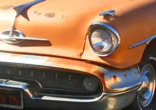
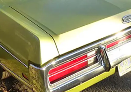
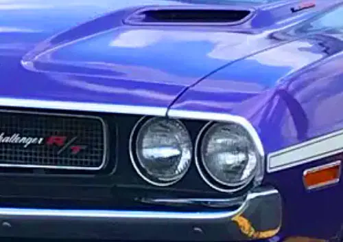

I’ve always appreciated all of these Mopar colors…Plum Crazy and the various greens the most.
And yes, if I had a Cordoba (t c 4 t m w k w i a), I would definitely paint it Panther Pink.
Excellent work, Peter.
Thanks Jeff. It was interesting in preparing this to find how short-lived some of them were. And yet often the cars that stick in my memory the most are the ones in these colours. Case in point: Bright Green. A bit of a misnomer (potentially the dullest of the three), yet once I’d done an image search, I remembered it.
Nowadays it’s hard to think of a colour only being available for a year or less.
Gorgeous models and cool premise. I love it when Chrysler Corporation’s pendulum had swung from mild to wild – often against the grain of the general market.
I also love that Testors (my old model paint of choice) had gone the extra distance to match original colors from the manufacturers.
That green Challenger with the sidepipes is giving me Barris-lite vibes… and I like it.
Joseph I’d have to check; I have a feeling that ‘custom’ Challenger may well be a Barris design although it’s unusually restrained if so, just the roof bar and pipes. I think it was that restraint that attracted me to build that version.
Sometimes I’m glad Chrysler went to extremes; in a way that made them the most interesting of the three.
I well remember these colors back then .
They didn’t spin my crank at the time but I think they’re neat now .
A high school mate Grant McBride was also into cars but fast ones unlike me, shortly after he graduated he was able to buy a 1971 Dodge Challenger in Plumb Crazy that over time he fully rebuilt into a fearsome Hot Rod, not one of those silly burn out cars so popular beck then, one that once rolling was nearly impossible to catch, being a MoPar he was able to change then re adjust the torsion bars and the rest of the suspension to make it handle well as well .
I think he was in Chico, Ca. the last time I saw him, truly a hand build Hot Rod (413CID V-ate IIRC) that if still running would be fun to cadge a ride in .
I use his full name in case any C.C.’ers know him and wish to give him my contact info .
MoPar was in many ways far ahead of the competition back then but I found their vehicles goofy looking and bad seats plus of course near indestructible _cop_cars_ .
I hope you showcase that mid 1960’s VW Typ II single cab pickup some day, I’ve had a few, they’re great light delivery trucks but I need to haul Motocycles so never kept one long =8-^ .
-Nate
A Plum Crazy Challenger would be a cool ride whatever was underhood!
As for the VW, I have shown it before when I discussed weathering back in ’23, but I don’t mind showing it again. You might want to find one with more structural integrity though!
https://www.curbsideclassic.com/blog/miniatures-toys/cc-in-scale-theyre-not-always-shiny/
The Duster is the icing on the cake for me. Nice color, nice wheels, nice build. The fuschia GTX is pretty bad (good) too. Nice car.
Thanks Colin, that Duster always does seem to attract attention whenever I show it. Any other colour and it would just be ‘meh – another Duster’.
I built that Mulberry GTX about 30 years ago; it might not be as spectacular as the High Impact colours, but it grows on you. Apparently the guys in the studio had come up with a lot of other High Impact colour names – one was to have been Unforeseeable Fuchsia.
okay that’s awesome. I love that would-be color name. Sounds great IMO.
Peter: “Heaven, I’m in (Mopar) heaven!” LOL!! 🙂 All of these models were excellent, about the only color that I didn’t really care for back then/and now, was Citron Yella. I also appreciated the word play with the names…what a time period that’ll never exist again!! Thanks for such a colorful display on a gray rainy day!! 🙂
Ah the word play! That has always been a great attraction for me; the sound of words and the other associations that can be set off by the sound of words. Whether they’re puns, or what my daughter calls dad jokes, or allusions and cultural references that don’t need a degree in English Literature to understand, that anyone can enjoy.
And the names that didn’t make it: Hi Ho Silver would’ve been good, Cost of Living Rose, yeah, we get that all too well. Catch Me Copper would have been asking for trouble though, and as for Fisher Body Rust – the lawyers would’ve been foaming at the mouth!
Grey and rainy down here too. Didn’t plan the matching weather.
Back to a ‘Technicolor’ world! Bright and cheerful indeed! Thanks for brightening up the day, Peter.
Any time, Bernard!
It would be interesting to see how the Aussie Charger diecasts would look with these colors.
Well I can show you one.
Here’s a 1/32 scale R/T E38, by Ozlegends; DDA also does one, I’ve seen other names too. This looks to be equivalent to Hemi Orange. They made quite a range of these to different spec, in different colours.
Honestly for as much as I whine about modern car styling, I suspect I’d be less critical if the norm were colors like these that suit the more curvaceous body styling we have today better than the greyscale dreariness that is reality.
Sassy grass green is my personal favorite, I’ve actually attempted to paint a few models this color experimenting with various brands but never quite found the right looking shade
Matt, I think it’s the same everywhere; we all complain about the achromatic ugliness around us, yet so rarely do we seem to be offered a viable (affordable) choice. Looking at colour charts from the fifties to seventies as I do when choosing model colours sometimes, it’s amazing that popularly-priced cars were offered in so many colours. My 1974 Ford Cortina (Australian production) was available in fifteen colours IIRC, three (perhaps four) colours of vinyl roof and heaven knows what upholstery choices. Black was available but you rarely saw it (that was Grandpa’s colour), white seemed to be for fleet cars only, take away silver and you still had a dozen real colours, the like of which you rarely see these days.
As regards Sassy Grass Green, that Cuda convertible above is painted in a Kawasaki motorcycle colour – close enough?
Ok, Peter, what are these three to your eye?
Is there a right and a wrong answer? My laptop’s screen isn’t the best, but I’d say (from the ’72 Plymouth chart) Lemon Twist, Basin Street Blue (B3) and Rallye Red. Hard to tell from the lighting, but I don’t think that Cuda’s bright enough for Tor Red. And the second Duster’s too light for B5.
Wow – I love that ultra-violent violet. Possibly even more than plum crazy, which is the bestest colour with the bestest name.
Rolls-Royce is about the only manufacturer with an excellent range of purples – and I mean range! I suppose one pays for what one gets.
Thanks Nick. A friend had a ’72 Falcon sedan in that colour, with a white/black interior, quite startling to look at, but in those days fairly popular.
Can’t think when was the last time I checked the Rolls-Royce website, but I should think you would be able to get anything you wanted. I wonder if they still try to guide you away from choosing combinations which, um, ‘express a sub-optimal taste’. To be a customer consultant for Rolls-Royce, I should think you would have to be a consummate actor not to shudder, to judge from some of the examples seen online.
The high impact colors are great but I don’t think I would want to live with any of them on a daily basis. Ok, Plum Crazy maybe? My pick for the best Mopar color is the ’60s Turbine Bronze. A little special, but unlike the High Impact group it looks good on anything, not just the muscle cars.
I think my pick of the models this week is the orange Duster, but the photo of the green Cuda outdoors is very nice as well. The lines on the trash bin lid make it look almost like a parking lot.
Thanks Dan. Back in those days we just took the colours for granted. If you didn’t want a standout colour, there were plenty of others to choose from. And it was often surprising to see older drivers choose nice bright metallic greens and blues.
Good call on the Turbine Bronze, though. Its counterpart at Ford was an extremely popular colour, and I would often come back to my car to find an identical one parked nearby. It suited any car large or small, cheap or prestigious. Yes, that green Cuda really pops in the sunlight.