
Today we take a deeper dive into that era when… well, if I say that one, I won’t have to call it names. Which some might object to. ‘Every car has a story”, goes the saying.
In any case, what we’ll be doing is a brief tour of the late seventies, when car excitement was harder to come by. What began as a child in the ’50s as a thrill of new cars had settled into something far more familiar—aging designs, subtle changes, and a sense that even the “new” ones weren’t all that exciting anymore. But, regardless, a distinctive car era. Let’s take a look.
Pickings get rather slim as we go on through theser years. I look over the list of cars I have out for this instalment, and so many of them are so old, being based on cars dating back to the early years of this decade, and in some cases nearly indistinguishable from the previous year’s model… not exactly boring, but uninspiring.

Starting with the Dodge Monaco. Was this unchanged from ‘76? Was there perhaps a slight grille texture revision? A change to the taillight lenses? Upholstery pattern? To be honest, I’d have to do some research to check, and I suspect I wouldn’t be the only one of us. Exceptions would be those whose user names start with the letters “Mopar-“. The basic body dated back to 1971. Consider what cars looked like back then: six years was an eternity in the seventies. The coupes were rebodied in 1975 but the sedan just hung around like an afterthought. A sedan in the style of the coupe could have stolen a march on GM’s downsized biggies. But, in the usual Mopar problem, no money. While an old Mopar intermediate was much the same size as the new big Chevy, it looked old. In a tired way, not a classic way.

Okay, I wouldn’t expect a smallish SUV from a truck manufacturer to change every year, and they did at least change the grille from time to time. Oh, and the stripe pattern. Very important, that stripe pattern, in the seventies. Ertl had long made farm toys, then added models of International trucks, trailers, tractors and even a few implements, and soon added the Scout to the mix. The kit appeared in several varieties over the years. This one’s a reissue, dating back around fifteen years. (I’d like to be more precise, but the database at scalemates.com hasn’t got on with my server for the past two months.)

I can’t work up a lot of enthusiasm for these. It’s like the boys in the studio were told to out-Excalibur Excalibur, or something. “Make something so outrageous the retro-classic pastiche builders can’t possibly go any further with it.” And you know what? I don’t think there was a ‘replicar’ based on this Monte. But c’mon you guys, this thing’s been around since 1973! But H. Economicus pointed to the sales figures, so the factories cranked it out yet again. Just over 411,000 of the things for ’77 (alert: sales record). Um – you guys sure you want to replace it next year?

Since 1974. It had seemed a long, long time since Ford turned the Mustang into more of a Celica-competitor. For those who just wanted their old Mustang back, they’re just going to have to wait a few more years. This might not exactly be a factory colour, but at least the build style is CC-spec. Yes, this was a reissue.

Ah Vette, what’ve they done to you? Answer: not much. Using the same body since 1968, plastic bumpers replaced chrome at both ends, with some rather dramatic reprofiling at the rear, all of which had been seen for the last two years anyway. I won’t say there’s no change but not much you’d see in a model. And, as I’ve found out over the years, often stuff that should be changed on the model – isn’t.

Why? Of all the things AMC could have done with their limited resources, why this ugly nose on the Pacer? What was it with AMC and ugly noses? Following the line across the top of the lights and grille is like a ride on a roller-coaster: up, across (headlight), down, up, way, way across (grille), down again, then swoop up for the other headlight. Then down again to the indicator. I reckon they guys who signed off on this needed remedial taste therapy. Is there such a thing?

Well, yes, not altogether bad looking, but the basic curvy, heavy shape had been around rather a while. In my opinion, the years were being kinder to the Firebird than the Camaro – possibly because Pontiac’s designers weren’t afraid to be more radical. To be fully accurate, the grille should be larger, and the nose lower. But it’s an old Monogram kit – yep, them again!

The big change from the ’77 we saw earlier was the fastback rear window, which was new for 1978. Although not a hatchback (which would have seemed natural), it provided more room in the interior as well as a new look. This one’s a Monogram pace car model without the side stickers.

Ah, that’s better! All change for the Mustang. Out with the heavy, lumpy, frumpy shape and in with smooth surfaces and straight lines. It looks lighter, leaner, cleaner; the kind of shape that can pull off both Performance and Luxury – without looking ridiculous in either guise. Rather like the very first Mustang in that regard. Yet another Monogram kit.

Oh dear. It wouldn’t look so bad if Ford hadn’t just debuted that new-shape Mustang. In fact, it was probably the best facelift of this body yet. It wore the body-coloured bumper look quite well, but alongside the Mustang (or the Firebird?) it really showed its age.

What can I say? This MPC kit was an annual, and has never been reissued. Not surprising, from what I’ve read of the car. (But then, Monogram reissued the Chevy Citation!)

I find it weird that France, Germany, Italy, home of so many small sports coupes, saw no need of this – despite the Dodge Omni/Plymouth Horizon being based on the European Simca/Chrysler/Talbot Horizon. Okay, it is rather awkward looking from some angles; this MPC kit was revised every year until Dodge discontinued the real thing.

Better-looking than the ’77. This one carried over the fenderside look in a less exaggerated form, looking less dated into the bargain. And usefully less bloated. Another annual kit from MPC.

A new, smoother and more modern front end on the ’77 body. A small step, but big changes were coming…

Another new front end from Pontiac, but the discrepancy between the curvy bod and the angular schnoz was becoming quite pronounced. Must have been a hard year for GM fans; so many product lines would be renewed in the next few years, which left so many just hanging on, waiting.




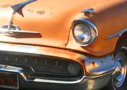
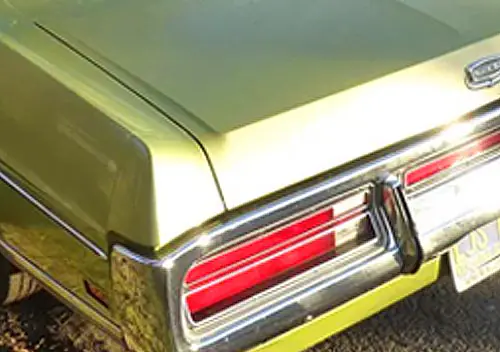
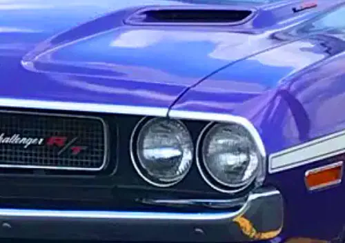

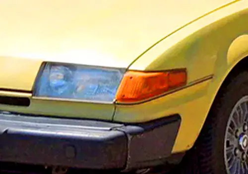

I think the awful facelifted grille on the late (1978–on) Pacer just came down to desperation and lack of money. The lack of money is obvious (the chairman of AMC lamented that they might as well change the name of the company to “Ailing American Motors,” since that was what the press always called it).
As for the desperation, American car dealers tended to get very nervous if there was no visible change in quite a while, especially on products that aren’t selling well. (How do you get the punters to buy a new one if they can’t tell the difference from the two- and three-year-old trade-ins cluttering the forecourt? If they’re too nervous, franchise-holders start to jump ship, and it can become a stampede.
It is truly awful, though. The Pacer was a dorky-looking thing, but it had a theme; the grille looked like someone welded part of a stray industrial furnace to the front end.
I’ve read disparate things about the modified Pacer grille and hood. One is that the taller hood was necessary to clear the newly-available V8, and the other is that it was just for a different look and the original hood could in fact be retrofitted onto a 1978-80 V8 car with sufficient clearance.. I asked both ChatGPT and Google AI and they’re both unsure, undoubtedly due to the conflicting information online regarding this. Anyone here know for certain which it is?
All inline sixes are inherently longer and taller towards the front of the engine compartment whereas V8s are more compact, shorter, and lower although wider (not a problem in the Pacer). So does this answer your question? ChatGTP or Google AI, both of which (or all AI so far) are not nearly smart enough to answer questions like this. And if that’s not enough, Google for images of both of these engine compartments and the answer will be quite obvious.
In fact, one would expect the exact opposite: if the Pacer had originally been designed only for a V8 and they then wanted to add a big inline six, one would expect that the hood might need to be raised at the front.
My understanding is the Pacer was designed for the GM Wankel engine, that was cancelled at the last minute. The AMC 6 was fitted in a crash redesign, the results somewhat similar to a full size van if you look under the hood of one of those things. FWIW I too heard the raised hood/grille was done to accommodate the 304 V-8, in particular the larger radiator and air cleaner. Pacers with the 6 had a special low profile air cleaner assembly, not the standard one mounted directly over the carburetor as you see on a Hornet or a Jeep.
Physically fitting an engine under a hood is one thing, cooling it to OEM standards is quite another.
I have two very good underhood pictures. The air cleaner is a total non-issue, as it sits all the way back right up to the cowl where the hood height is not any higher. And there are numerous references on the web as to the 6 cylinder hood clearing the engine.
A close look at these two pictures shows that the radiator on the V8 does seem to be a bit further forward and there appears to be a taller (bigger) fan shroud. So yes, it seems that the packaging of the cooling system played a part, but:
1. They could have found ways around that, like using an electric fan.
2. Even if it needed to be taller, they could have avoided the ugly styling of the grille, like by using a hood scoop or bulge or such.
Let’s not forget that this was during the same time that AMC grossly uglyfied the front ends of the Matador and Ambassador with somewhat similar bulging grilles, so I am convinced that there was an unfortunate attempt to have some family resemblance to them. There’s no doubt in my mind that even if there was an actual need to raise the hood height at the front, it could have been handled much better stylistically. Think MGC.
Wow those both look like tight fits.
And yes I’m aware that AI often gives wrong answers, but it usually doesn’t throw up its hands and say “I don’t know” quite like it did here. (I also know the Mustang II needed some front-end modifications to fit the V8 for 1975 it wasn’t originally designed for, so it seemed plausible the same was true for the Pacer).
As an update for the sake of updating it square headlights would have been a much more attractive and modernizing element, possibly without even having to make a new hood stamping like this which took some investment that undoubtedly didn’t pay off given its dismal sales in its final years.
“The Pacer was a dorky-looking thing, but it had a theme; the grille looked like someone welded part of a stray industrial furnace to the front end.”
And here I thought I might have been being too negative with my roller-coaster comment! But I have to agree, Aaron. I’d say you win the internet for the day except that it’s only 0630 here.
They seemed to have quite a few peripatetic industrial furnaces wandering through AMC’s styling department, bumping up against drawing boards and joggling stylists’ elbows. A never-ending supply, one might say. Until AMC ended.
Looking back none of these could set the world afire but how poorly new cars ran at the time I doubt anyone much noticed .
-Nate
From what I have read, new cars must have been a hard sell during these years. I’m surprised people bothered. I’d have just hung onto the old car a bit longer, and hope they’d have had the drivability issues fixed in a few more years. Or turned to the aftermarket to fix what Detroit seemingly couldn’t. Or just written off Detroit altogether and turned to a country that still cared about building cars properly, like Japan – as many did.
The only real “facelift” in the 1977 Chrysler B-body Dodge and Plymouth midsizers was rectangular quad headlights replacing the round twins on the 1976. They were set in a plastic panel so the cost of the change was relatively low. Dodge aldo got a rebadge from Coronet to Monaco. Plymouth remained as Fury.
Nothing says cheap so much as a plastic panel standing in where there used to be sheetmetal. It says temporary fix. It says bodge job. It says all sorts of things like that. The one thing it can never say is Quality.
Not a fan of any generation of Monte Carlo, though I can tolerate the first gen (pre-Colonnade) and the cleaned up last few years of the final G Body. But sorry, even the Colonnade is better than that ‘78. The years 1977-1980 saw me with the opportunity and interest in driving or at least riding in quite a few cars, including several of these. Not a great time for tech or driving enjoyment but I still look back fondly on my TransAm ownership. and Pacer and Mustang II as well as Fox Turbo behind-the-wheel experiences. Plus many adventures in my friend’s Scout II. And that Monaco is basically the same as the 1972 Coronet that was our companion for my last week or two of driver education class.
But sorry, even the Colonnade is better than that ‘78.
This. Slathering on the key styling elements of the massive gen2 MC onto the much smaller and trimmer gen3 was an unmitigated disaster. It looked like a very pathetic cheap imitation from Kazakhstan or such. Atrocious. They toned it down after a few years but the initial version as an unmitigated embarrassment.
I find a remarkably strong resemblance to the Mustang II notchback in the Gen3 Monte, it’s got the same swoopy fenders and off proportions just scaled up.
It’s actually laudable how much the 81 refresh on the same basic bones improved (most) of its faults
So, GM’s new Monte looked like a five-year-old Mustang? Wow. Er, hmm… interesting.
I can see what gave you this idea, but I’d never thought along those lines before.
Here’s a visual that shows just how close they really were.
Dman, my experience of these Montes has been purely photographic, apart from models, of course. I have never seen one in the metal, for which I am thankful. While I was encouraged to see the smaller and simpler style of the newer Monte Carlo (really, it was the only way they could go), it suffered from that typical seventies GM styling ailment of insisting on carrying over previous themes rather than striving for a good-looking car first and foremost. Rather than asking “Is this look worth carrying over?” Am I daring to criticise GM styling? Too right I am! Not for the sake of sinking the boot in, but because they could have done so much better, but chose not to. Nowhere else in the free world was there a car that looked like this – for good reason.
Wow, that Nova kit brings back memories for me.
I liked to build models when I was a kid, but never liked trying to paint them. I made an exception with this car. My Dad had bought Mom a 1977 Chevrolet Concours Coupe in a red metallic, with a matching red crushed velvet interior, and fortunately, no vinyl top… I think Chevy called this color Firethorn. I went to the Chevy dealer to get some touch up paint in this color, as well as a rattle can of it.
Prior to this, I had bought a 1978 Nova kit… I want to say it was Revel, but I can’t recall, but the car came with lots of parts so you could build it anyway you wanted. It had the Nova Custom grille, which was a waterfall grill carried over from the Concours, as well as the round headlights. But sadly, the ’78 Nova Custom only had two taillights on each side in the back (like all other Novas) and the Concours had three….
So I did my best Peter Wilding impression and fashioned up a couple of extra taillight squares out of some leftover balsa wood from my model rocketry days, and painted them.
When I was done, I had a dead ringer for my parents’ car, only with one improvement… I used those same wheels you did Peter and color keyed them with the firethorn red paint (from the touch up bottle). Mom & Dad had the standard Concours wheel covers on their car, the ones with the “C” to match the hood ornament that came on those.
Other than the aforementioned rockets, this may have been my best modelling effort ever, but sadly, I no longer have it. The poor thing was lost to time, unfortunately. We never found it when we moved them into their current retirement community from the family home. Heck, it may be in my own attic for all I know in a box somewhere.
This comment of yours got hung up in the trash folder, but we check them regularly to release them, so no need to write a second one, especially if you rewrote it from scratch. 🙁
Fortunately, I had copied it to Word as a just-in-case😉, knowing it was a longer post. I had cleaned up a grammatical mistake or two on the second post, but no biggie.
Thanks for fishing it out for me, and I’ll try to refrain from the double posting in these cases.
That sounds like one really cool model. I know the colour you speak of; Holden offered a Firethorn Red on the first Commodores back about then. From an online comparison it may even be the same formula.
How nice that you could base your model off the real thing on the driveway. I don’t think Revell did a Nova, that wide a range of options makes it sound more like an MPC kit. I’ll admit I did use balsa for modifying bodies in those early days; sheet styrene was hard to get, not like today.
>> I don’t think there was a ‘replicar’ based on this Monte.
https://barnfinds.com/1-of-12-left-1977-chevrolet-monte-carlo-custom-cloud/
Yeah, I’ll admit I’d forgotten about that one, Don. But that wasn’t so much a retro-classic pastiche (Excalibur et al.) as an attempt at a faux-Rolls-Royce. I mean, it actually looked like a real car, not just like a bunch of kids with a welder had got loose in a scrapyard one night.
It’s a bummer some of these kits like the Volare are uncommon now being annuals, I know those cars get a lot of well deserved flack but none of their real life faults transfer into the scale models and they’re not bad looking at all.
If you can disentangle the car from the stories one hears, the Volare’s not a bad-looking car, Matt. Early ones were a bit clunky and over-formal-looking around the front end, and suffered a surfeit of chrome trim, but it WAS Brougham-time. The overall shape with the low beltline and large windows wasn’t bad. But there’s those stories.
After having been derided if not outright mocked for decade after decade, I get the feeling there can’t be that many left on the road. I think it would be a brave model car exec who would put this kit back into production.
One of my favorite entries from you this year, Peter. These all would have been the “beater” cars in the classifieds when I was looking for a first car and this more closely aligned with my funds. The Mustang II is particularly fetching.
I’m amazed, Joseph. Normally when I get up in the morning there might be four to six comments on one of my stories, with more coming in over the next day or so – but this morning there’s eighteen! Did I hit a nerve, or what?
This wasn’t an easy installment to write. I put off doing it for a long time. I tried to be fair, but as I reviewed it before posting I thought perhaps I was being unduly critical; low-hanging fruit, and all that…
Seems I needn’t have worried.
About the Mustang II, I’d seen a photo of an orange one in a magazine about the time I built this. From memory the caption to the photo might have said something along the lines of it being a non-production colour scheme – but since when has that ever stopped me?
I have to agree with Joe here that this Mustang II is particularly fetching. That was my favorite of this lot, although I commented on the Nova above.
I had mentioned my buddy’s ’74 Javelin the other day (and previously on these pages) and have never quite been able to describe the intense orange that he painted his car back in the early eighties. THIS WAS IT!!!! Wow, was that car ever an intense shade of orange.
Nice looking car there.
Thanks Rick. This orange would have looked startling on a Javelin.
This one would have been a Tamiya acrylic, but they have several good oranges. And I’m fighting off a bug, so I’m not about to go out to the shed on a paint search, not today.
Your buddy wouldn’t have used Tamiya (irony), so I’m guessing it might have been Chevy Hugger Orange, that’s pretty intense in bright daylight. Or possibly Mopar Hemi Orange. I’ve got another story on colours coming up in another month or so.
My fave would be the red Corvette, but that orange Mustang Cobra is very striking!
Red seemed natural for the Corvette, Bernard. And the orange Mustang Cobra sure is striking. This colour was Monogram’s idea; I just found a close match in my paints.
Monogram had a thing about moulding its car kits in an appropriate (usually factory) colour, which matched the box art. Theoretically the body didn’t need painting. They often did several variations of most of their kits, in different colours, and inside the body interior somewhere will be engraved the kit number and the colour it’s to be moulded in.
I have never been a fan of the ’78-80 Monte Carlo. I think they tried to cram too many styling cues into too short a car. Trying to look like the son of the original Monte just doesn’t work for me. The ’81 and up Monte got it right, in my opinion. I have been mildly offended for my Malibu a few times when people have referred to it as a Monte Carlo. I always correct them in a nice way. In my model car collection I do have an ’80 Monte Carlo in factory light metalic green, but it is a promo model. I really wish someone had made a ’78-’80 Malibu Coupe kit. I used to ave a 1/32 police car from a kit I don’t remember who made it, but I lost it in a fire we had a few years ago.
Rick, that Malibu police car kit was a Monogram. It seems to be available all over the net (if you can trust the seller), if you want to have a go at recreating yours. That said, the two US old-kit businesses I can personally recommend don’t have one in stock at the moment.
Fancy having people refer to your Malibu as a Monte Carlo. Maybe you could put personal plates on it: NOCARLO.
In the hobby we’ve often been puzzled by the apparent lack of reason behind what gets made available as a kit and what doesn’t. The later seventies were pretty lean years for new kit choices.
Thanks, that’s it. I bought it thinking I could make a coupe out of it but decided it would be a little too difficult for me to pull off. Like on the real cars, the trunk lid is shorter on the sedan and the wheelbase is longer. I finally built it as a police car. I have thought about buying a resin body since they are available and I have a spare Buick Gran Sport model I could sacrifice. I have used those before, doing a couple of Camaro replicas of cars my wife has had. I kind of enjoy building replicas of cars I’ve owned or family members have owned. I did also build the Jim Rockford Firebird and his dad’s GMC pickup along with a scratch built model of his trailer. The trailer also has a full interior.
Count me as another who never liked the 1978-79 Monte Carlos. The ’80 was somewhat improved with the quad headlights, but the 1981 facelift transformed it into a much better looking car.
Peter, I don’t know if it’s the angle of the photograph, but the ’77 Monte Carlo model looks way too blocky compared to the real thing. The brown color doesn’t help either (my least favorite car color, but so emblematic of the 1970s).
And that modified Pacer front end for 1978 always struck me as really ugly; in fact, I’d probably regard the 1978-80 Pacer as one of the 10 ugliest American cars from the 1946-85 time frame.
Your comment about the Monte looking too blocky isn’t surprising. Is it any better in red? 🙂 Probably not. We’re on the way to opening a huge can of worms here. I’ve noticed the rear wheel openings are larger then they should be, and others have expressed the opinion that the front isn’t quite right either.
It does seem weird that as technology advances, scale realism seems to diminish, but that seems to be what’s happening, and many newer kits from certain manufacturers seem to suffer in this regard. One new kit I built two months ago was particularly disappointing. Anyone even remotely familiar with the subject could hardly fail to notice at least two major mistakes. That one bypassed the ‘on display’ stage and just went back in the box. I won’t name the company, plenty of guys online have given them heaps – let’s just say it’s their third or fourth try at this iconic Mopar in as many decades – and they STILL can’t get it right!
Unbelievable!
I remember reading about 20-30 years ago that the old tool and die makers used their instincts to fudge a measurement here or there so the car would come out looking right in scale. Maybe there’s too much reliance on the numbers, and not enough on the look.
Peter: I’m a fan of the Mustang II, the Dodge 024/Plymouth TC-3 is also one I’ve never seen a model of, and of course the Volare. What I’d really like to see finished is that red Pontiac (Grand Ville?) convertible!! 🙂
Funny story about the 024 and TC3. AMT was under the control of Lesney (yep, Matchbox) back then, and did the TC3. MPC went for Dodge, and did the 024. The TC3 seemed to sink without a trace, while the 024 was successively updated/modified and reissued through the eighties. From memory this was the first year it was issued, and I built a kind of a mix-and-match street custom variant.
That red Pontiac is a ’70 Bonneville – US issue. (Yes, occasionally MPC did kits of Canadian cars, when they differed) It starred in my Convertibles story from April of last year.
Not sure if you’ve ever been asked…Do you use a certain kit manufacturer; Revell, etc.? No response is necessary.
Never been asked that. And the answer is no. While I may be critical of certain manufacturers’ efforts at certain points in their history, I’m still likely to build any manufacturer’s kits. Nobody tells me what to build, or what not to build.
So far this year I’ve built kits by Revell, AMT, Moebius, Aoshima, MPC, Tamiya, Emhar, and Fujimi – and I’m sure none of those companies have ever even heard of me! 🙂