
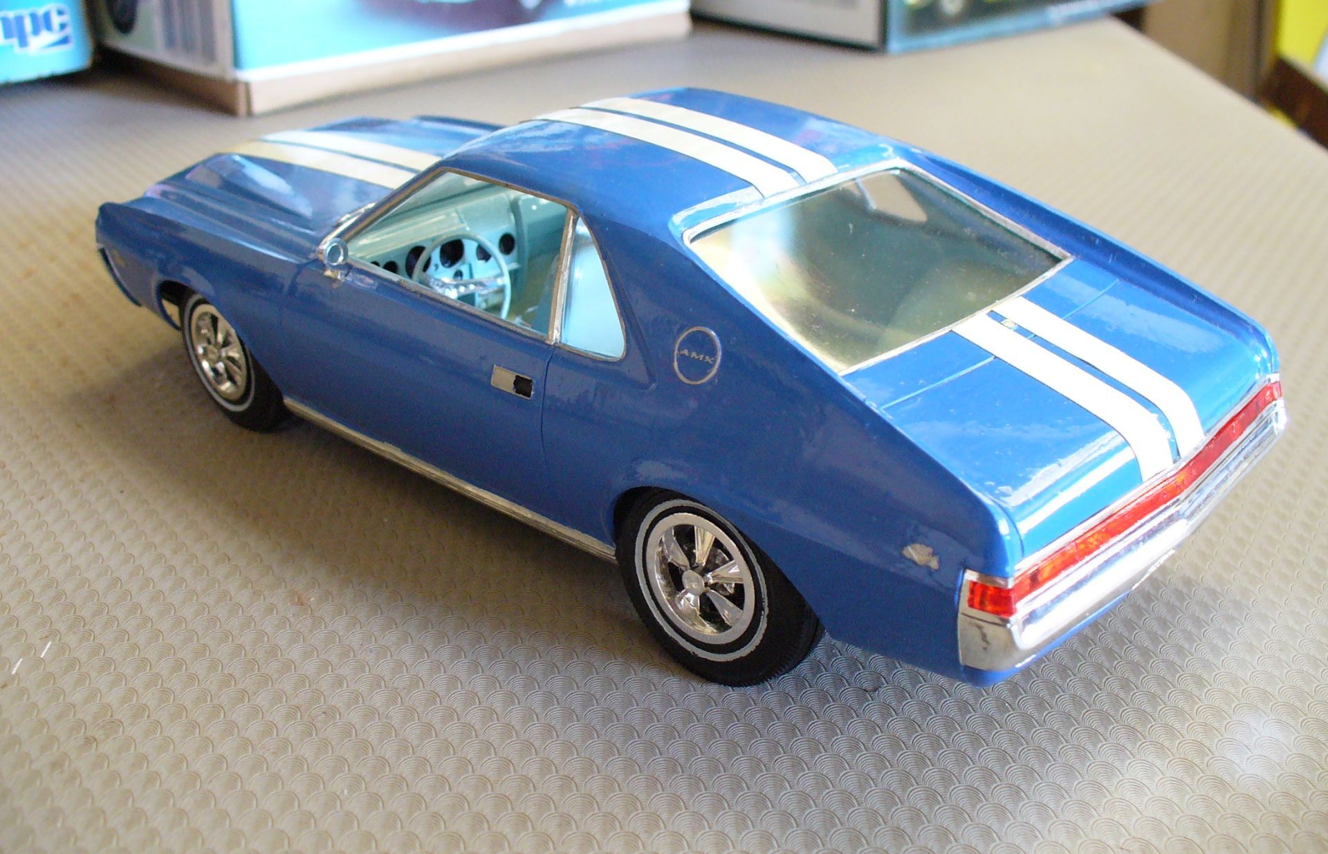
Cars have always used trim, stripes and ornamentation to say something about themselves—and their owners. What began with decorative mouldings and delicate pinstripes evolved into acres of chrome, textured trim and eventually the bold racing stripes and graphics of the muscle-car era. We’ll take a quick look at how that visual language changed today, one (pin) stripe at a time, with emphasis on the latter period.
As usual, there aren’t enough models to tell the full chronological story of these factory jobs, but we’ll go through it in a brief, fun manner, trying to cover a good deal of ground.
In the Beginning
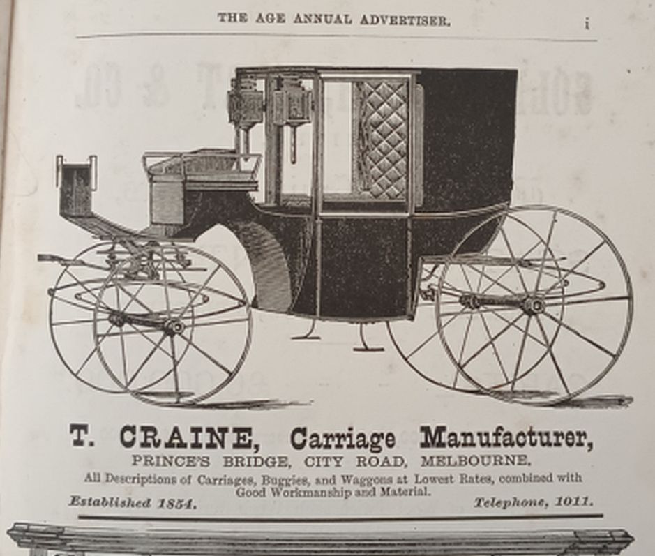
In the olden days of horse-drawn transport, somebody in the know could look at your horses and judge how good they were. Likewise, your conveyance. A cart or wagon was fairly ordinary, but a closed carriage marked you out as somebody special. An unusual body type like a barouche or landaulet was not for everyday use, and showed you were rich enough to have a vehicle for any possible occasion.
In those days a sense of style was conveyed not only by the type of body, but also by the ornamentation applied. Not that the rich went around in vehicles ornamented like gypsy vardos…
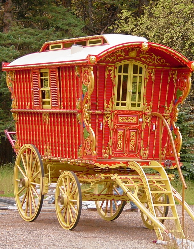
…but the application of decorative mouldings not strictly necessary, and the use of contrasting and decorative pinstriping conveyed a certain sense of superiority; here was a vehicle (ever so slightly) out of the ordinary, a vehicle which cost a bit more.
Sound familiar?
These same ideas carried over into the early days of mechanised transport. Moulding would be added to the body (later pressed into the metal), and pinstriping used to accent moulding. This persisted into the postwar era in Britain; my cousin’s black Series 2 Morris Minor had fine green pinstripes applied on the mid-body mouldings (and wheels). But by the late thirties in the US, chrome trim for body accents was pretty much universal.
Limits to Chrome: Retreat!
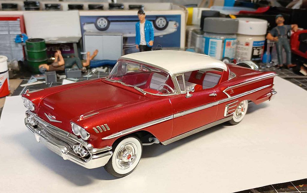
It’s said that all good things come to an end. The work of Harley Earl in the late fifties showed there was a limit to the amount of chrome that could practically be used. Some of Earl’s 1958 designs look to be in rather bad taste today, and reflections off some ‘58 models on a sunny day must have been absolutely horrendous. Short of plating the entire body, Peak Chrome had been reached; the only way forward was back.
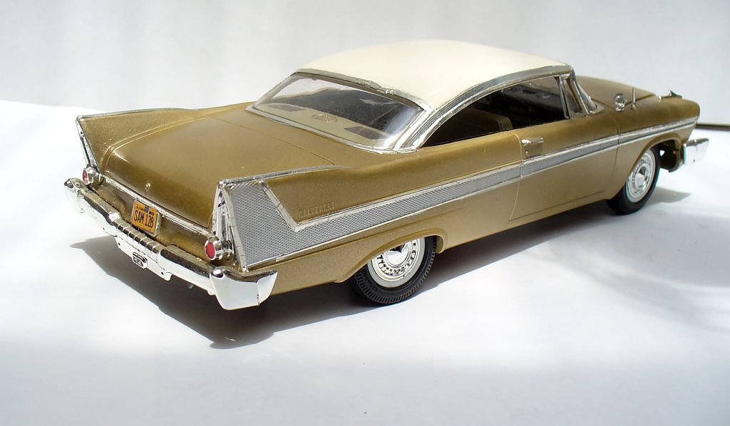
Help of a sort was at hand. Ford used a patterned anodised aluminium sheet for a trim insert on the Fairlane 500, and Plymouth’s Belvedere and Fury made use of this for ornamentation too. Earl even used it in a simpler form on the ’57 Chevy. It avoided an overabundance of glare and added visual interest with a textural element too.
There’s more to life than shiny stuff.
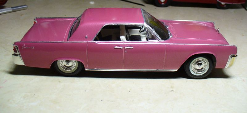
Elwood Engel’s 1961 Lincoln Continental showed the way forward, with clean sheet metal devoid of extraneous mouldings or accents, yet also showing that it was a luxury product. Chrome returned to being an accent, not a feature. Bill Mitchell had taken over the reins at GM, but never simplified his designs quite so much as this. His 1961 Chevrolet had much cleaner sides, with a chrome moulding enclosing contrasting paint.
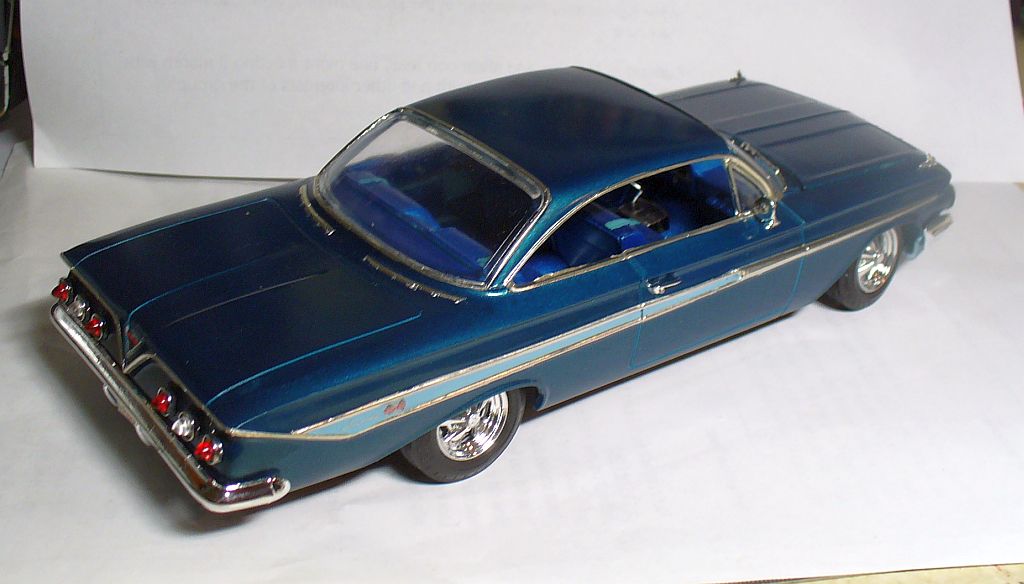
Later upmarket Chevrolets used patterned metal or silver paint to convey the sense of prestige.
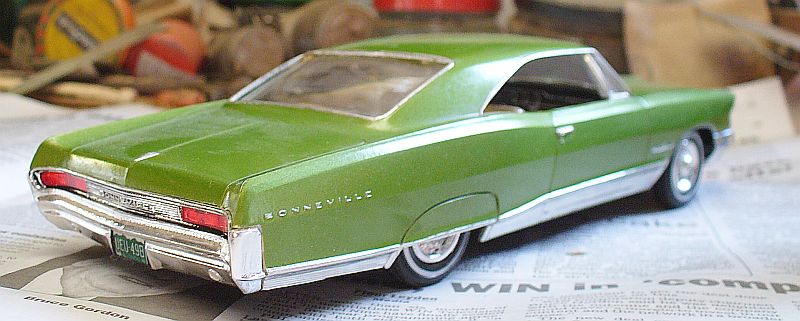
Pontiac made use of ribbed trim panels following the body contours on the lower doors and sills of the ‘65 Bonneville.
But Stripes: really?
The Shelby Cobra was proving to be something of a giant-killer in racing. Often seen with two broad stripes running from front to rear, this pattern was picked up for the first Shelby Mustangs, along with side stripes on the lower body.
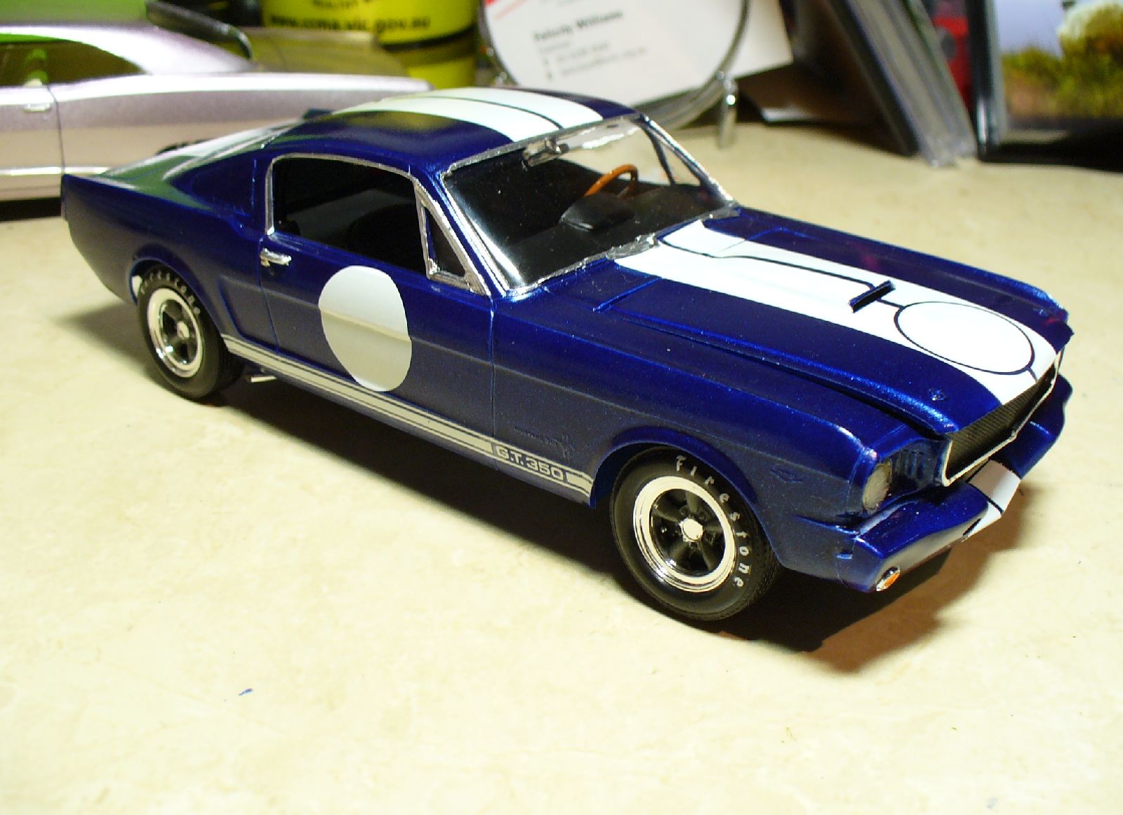
Was this too suggestive for a street car? Perhaps so. Performance versions of regular Mustangs made do with the side stripes above the sills….
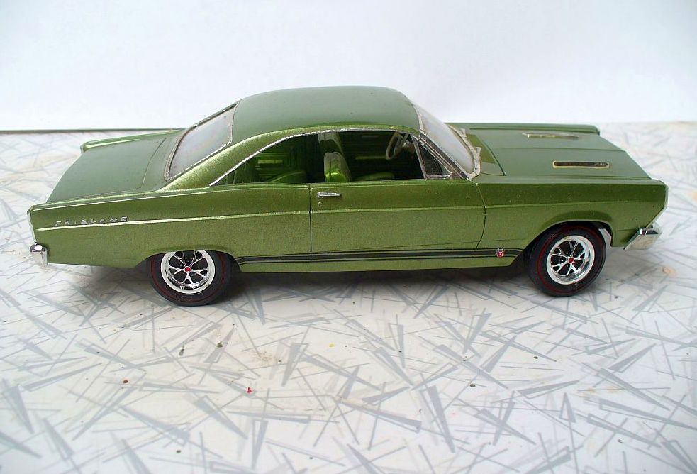
… a pattern which spread to the Fairlane GT….
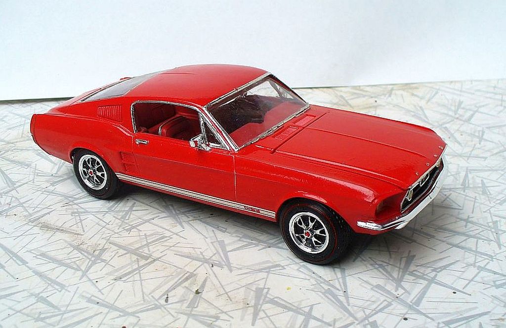
….and carried over onto later Mustang GTs as well (and the ’67 Falcon GT in Australia). It became something of a Ford muscle identifier.
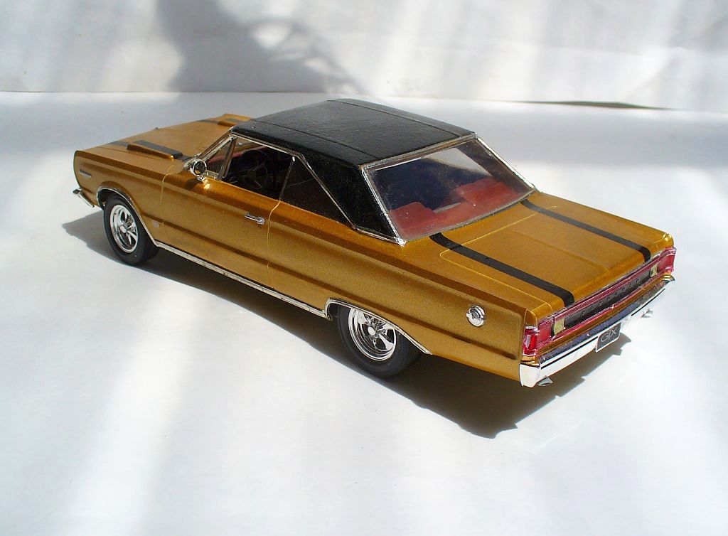
The Plymouth GTX for 1967 could be had with black stripes over the hood and trunk, lining up with the twin hood scoops – perhaps a bit daring for a luxury-performance intermediate in 1967. Or was it?
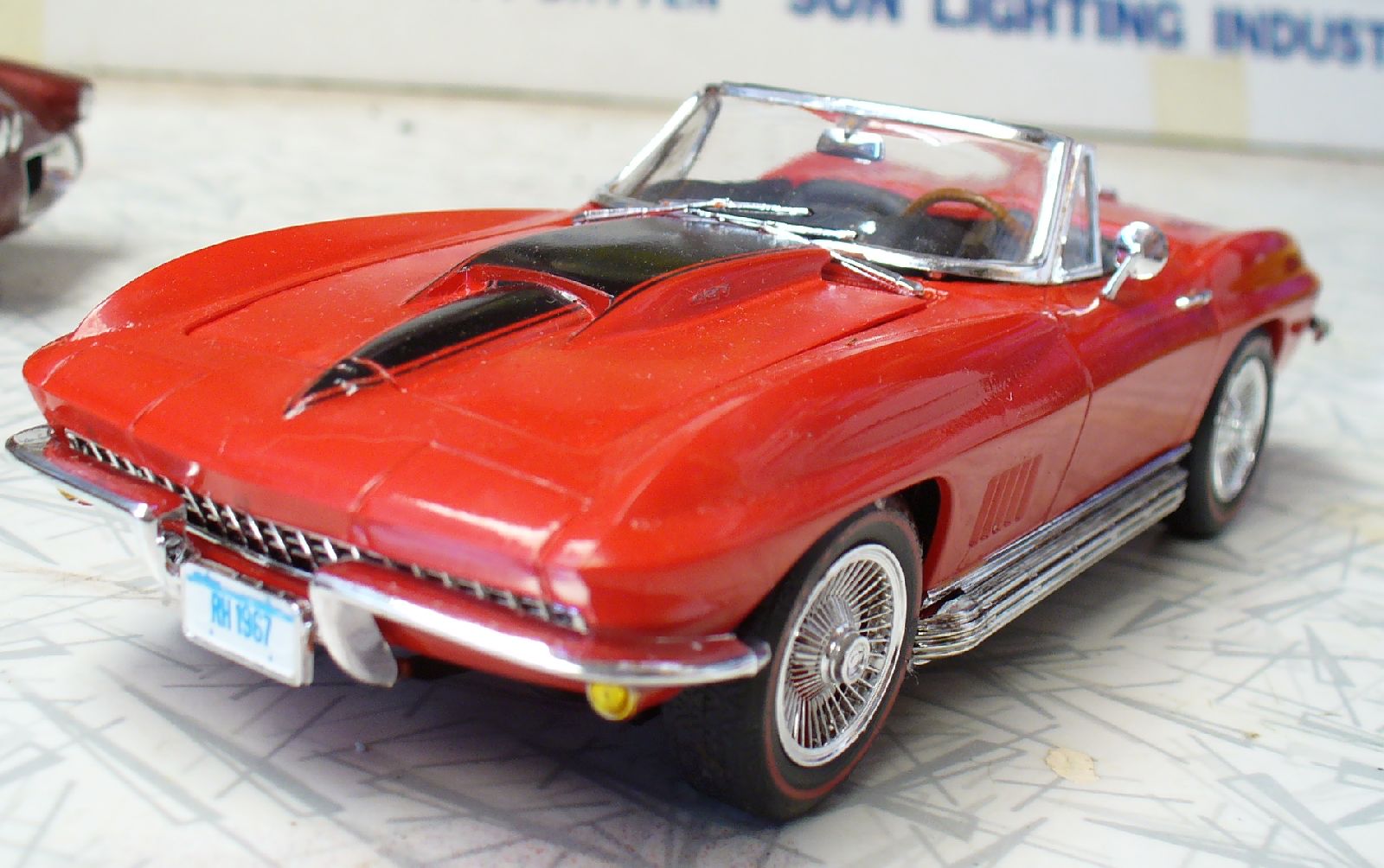
Big-block Corvettes gained these ‘stinger’ hood stripes, following the contours of the bulged hood – just in case you missed the bulge, or the numbers on its side.
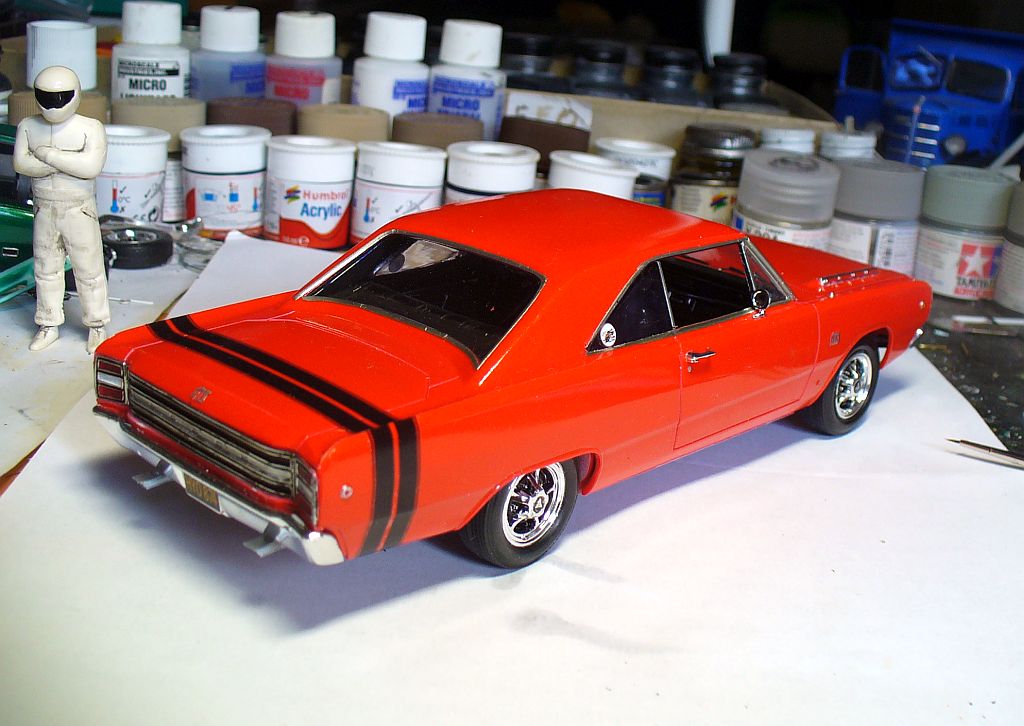
For 1968, performance Dodges in the ‘scat pack’ gained ‘bumble-bee’ stripes around the tail, like on this Dart. Viewed side-on the vertical stripe looked a bit odd at first, but other hot Dodges – Chargers, Coronets – had the same pattern. You soon knew what it meant.
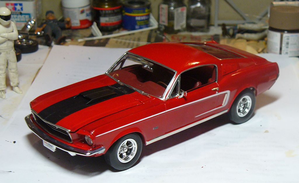
Ford went wilder, with these C-stripes on the ’68 Mustang GT, with a variant on the Torino GT.
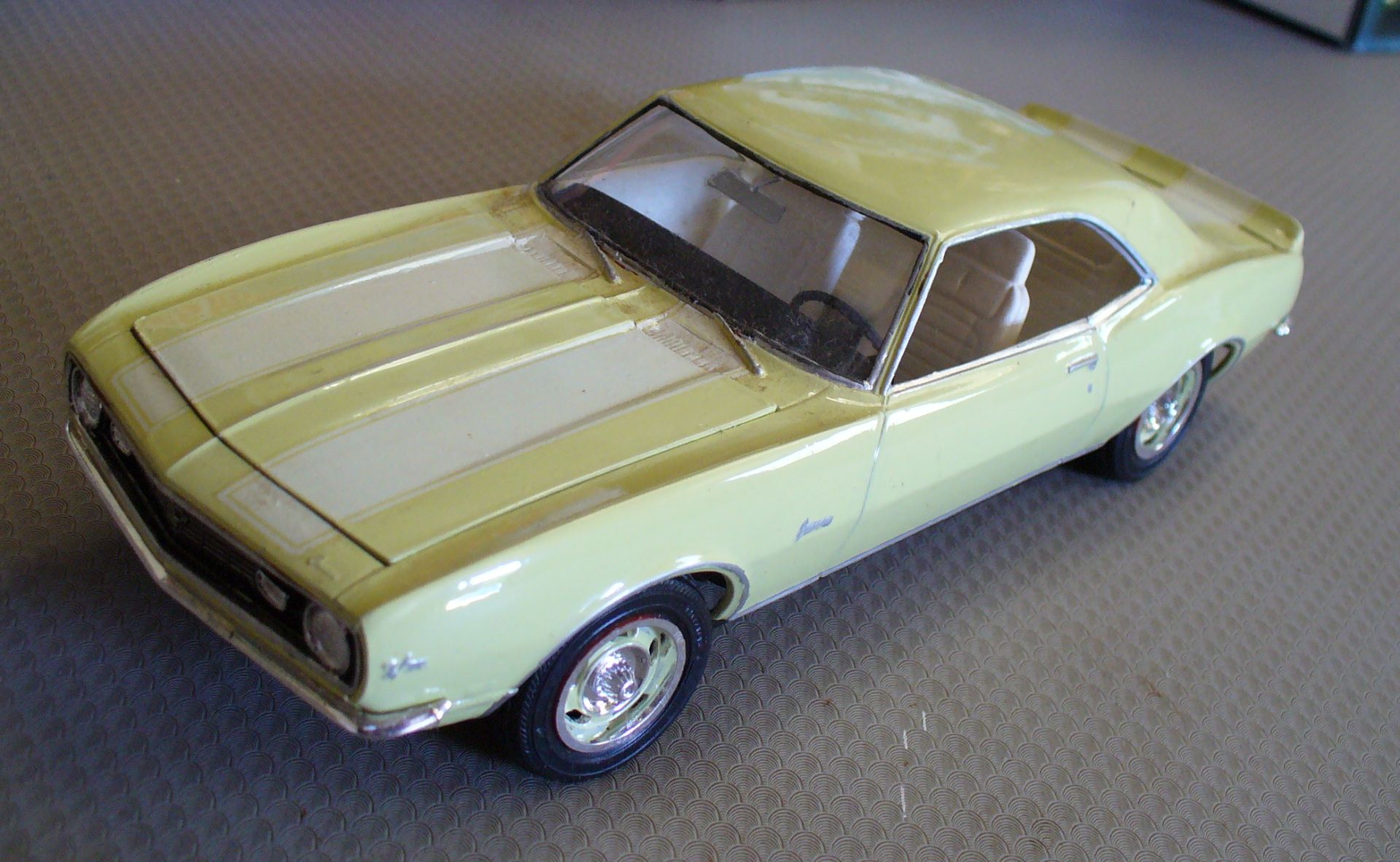
Chevy’s Camaro SS had used a stripe across the nose and front fenders, but that was evidently too subtle for the Z/28, which gained these wide hood and trunk stripes, setting a Chevrolet pattern for years to come.
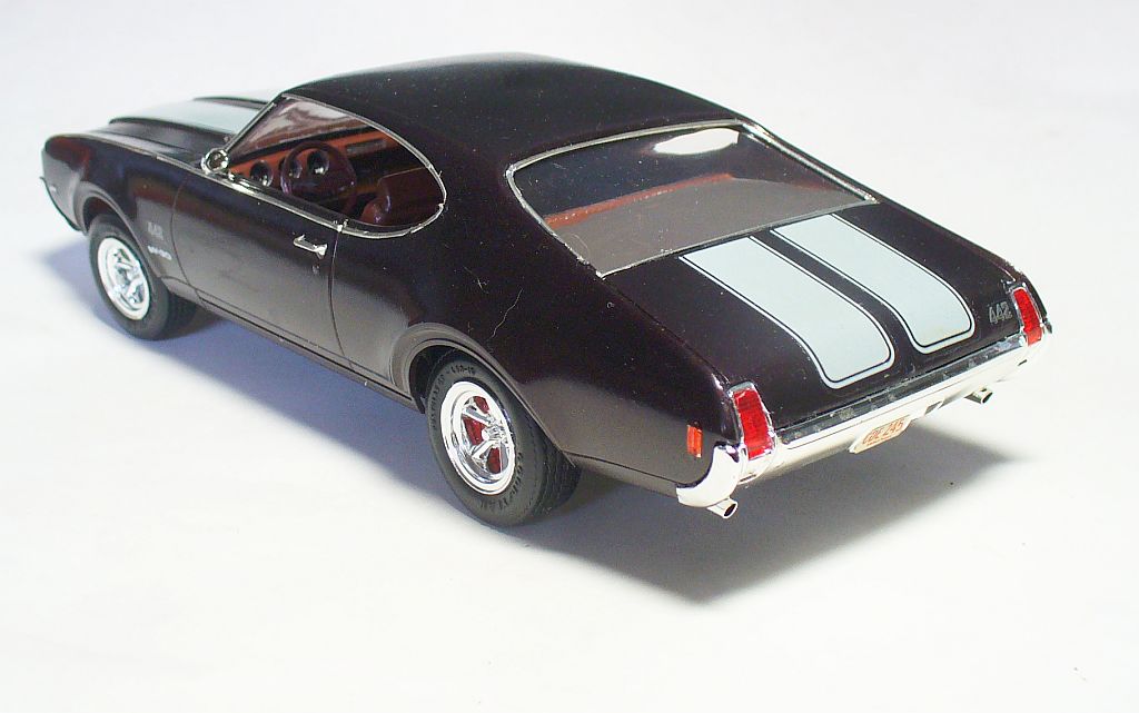
Interestingly, Oldsmobile used the same pattern on this 1969 442. That upper body highlight is in fact a chrome strip, not a stripe.
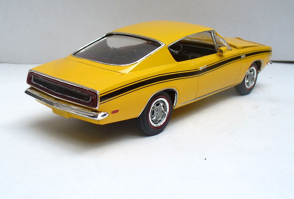
Plymouth’s Barracuda had long offered a racing-style over the top stripe(s) on Formula S versions. I followed a ’66 with one home from town last year. This ’69 had an attractive wide upper body stripe, outlined with a narrow stripe.
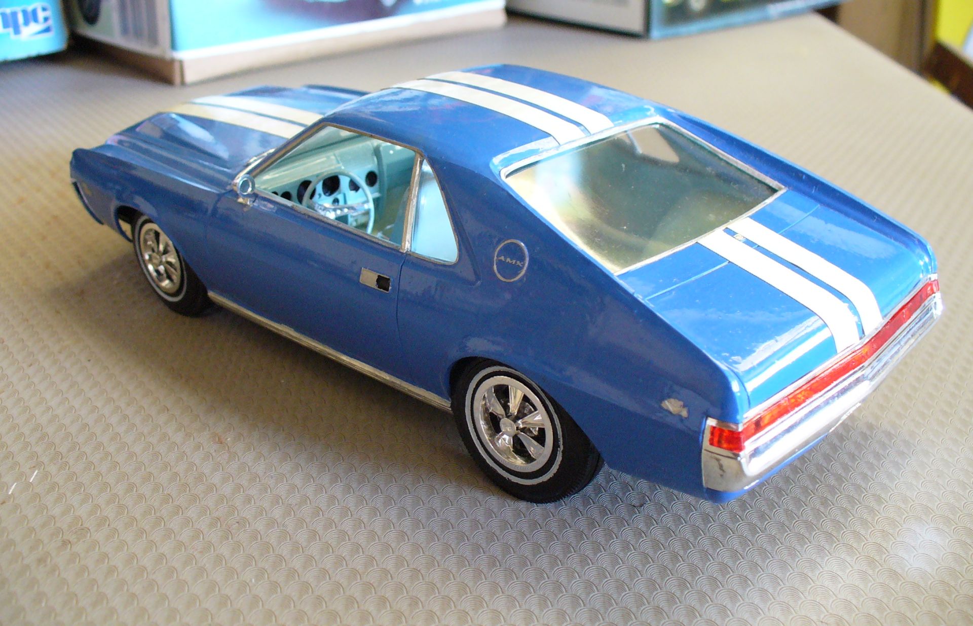
Dual racing style stripes on this AMX. They were not particularly imaginative – yet.
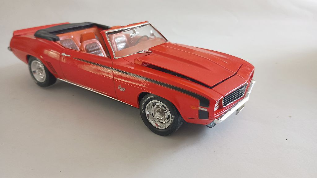
Camaro offered quite a choice for 1969. This SS396 has front fender/door stripes…
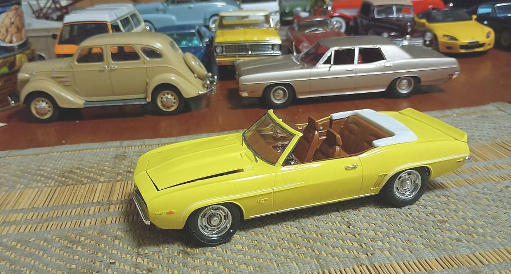
…while this one had subtle pinstripes on the fender/door flares. Dual hood and trunk stripes were also offered, as in previous years. How to confuse the poor customer – which graphics package will I get?!
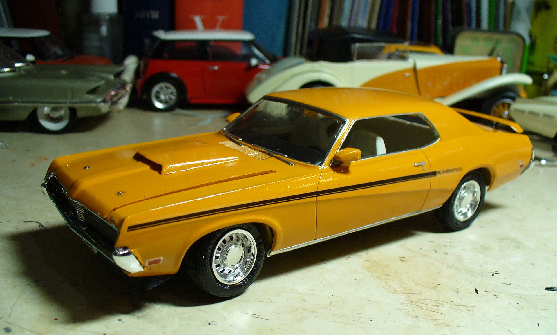
Mercury’s Cougar Eliminator had midbody stripes ending behind the door with the word Eliminator. That’s a neat subliminal trick: the stripes led your eye to the name.
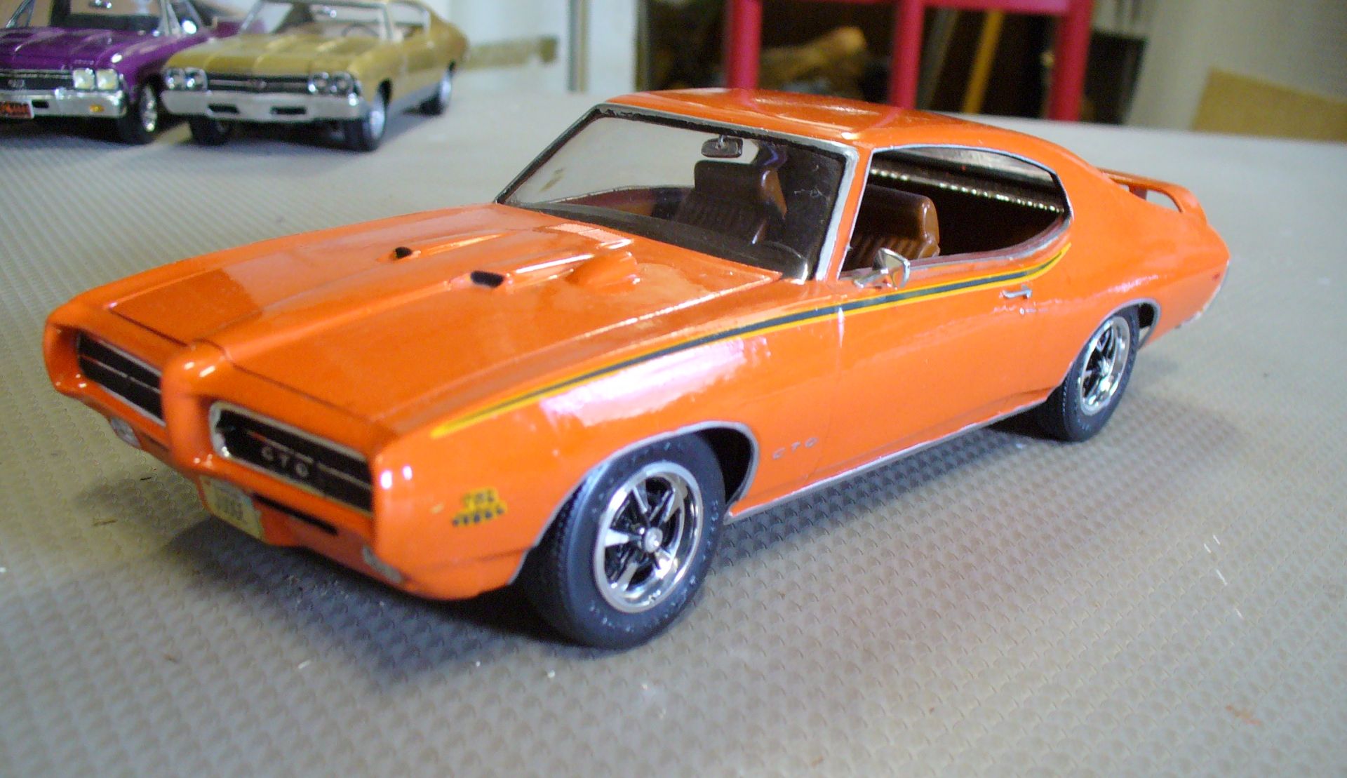
The GTO had been understated for years. For 1969 the new GTO Judge gained multicoloured, almost psychedelic upper body stripes.
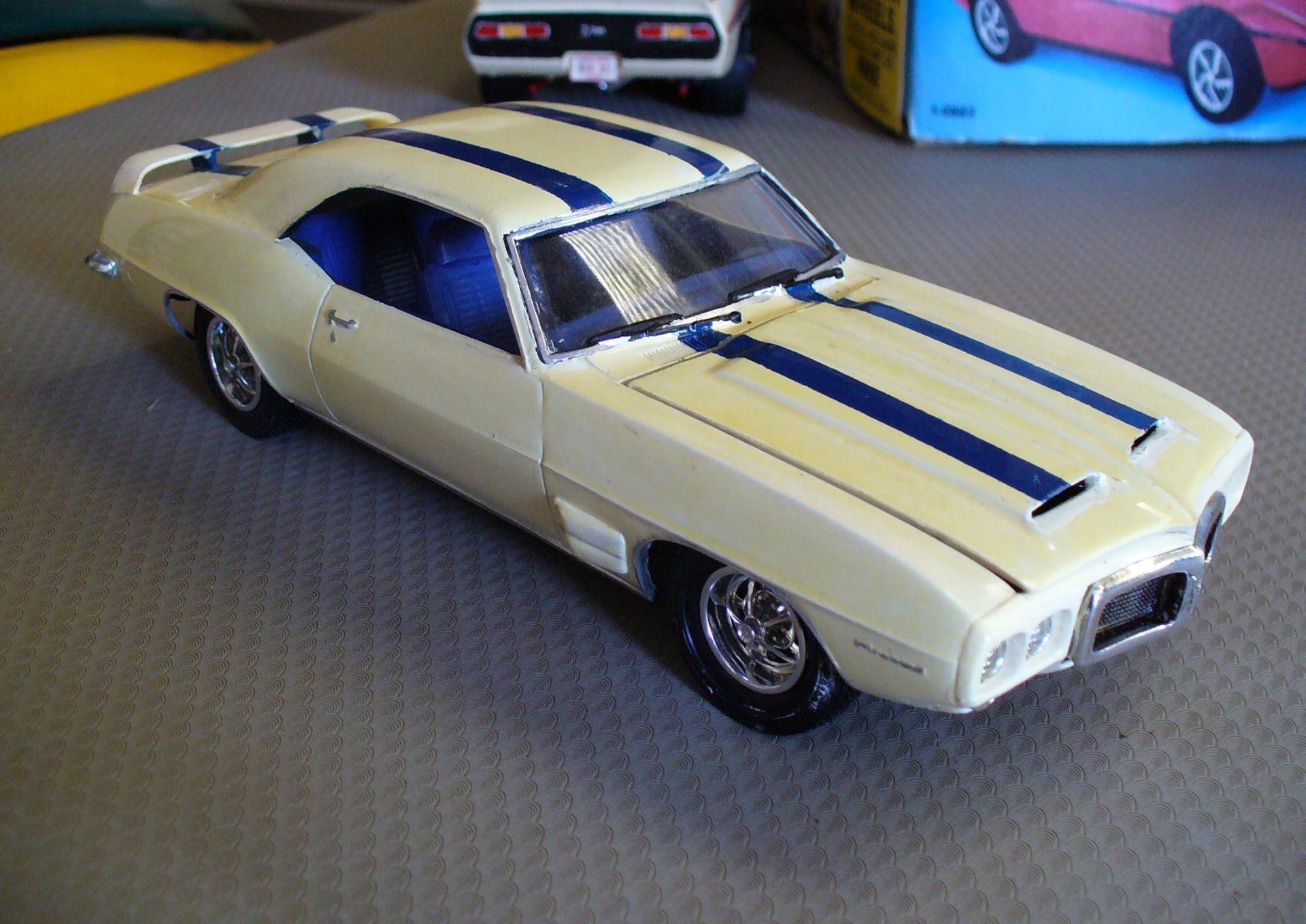
While the new Firebird Trans Am gained no-nonsense racing stripes in blue on white. American racing colours, on a car meant for racing.
But this was only the beginning! The seventies would see a flourishing of wild, weird and wonderful graphic treatments, in an amazing variety of colours and shapes ranging from obviously competition-inspired, through numerous artistic styles to almost-toylike. Could there be too much of a good thing? We shall see.







Peter: As always your exquisite models really highlight the topic being discussed! The right stripe/accent trim on a car (IMO) could elevate the looks from something plain to something that really catches the eye. All of your examples brought back fond memories of what made cars exciting to look at, compared to the grayscale/ melted soap bar styles of today (Kia/Hyundai excluded!) Too bad you didn’t include the “billboard” decals found on early ’70’s E bodies; I read an article that stated they were designed as a joke by an insulted design artist, but management thought that they were great, LOL!! 🙂
Thanks Moparman. This is only the first part – the second part, which I have just begun work on covers the seventies when graphics really went wild. Including ’71’s billboards!
I like the odd pavement the car models are parked on, particularly the mid century modern Formica under the Corvette. Imagine parking in lots that looked like that. The “cobblestone” squares of the waffle fabric are lots of fun too.
Andrea, that’s something nobody has commented on before! I didn’t even give them a second thought, but since you mention them….
That Formica under the Corvette is an old kitchen table left behind in a flat I briefly rented – it was just ‘old junk’ in the eighties when I grabbed it. The waffle fabric is the vinyl surface of a similar-era folding card table; that one gets taken better care of.
Beautiful models as always, Peter.
I think decals and chrome can visually enhance a model, up to the point of becoming a distinctive element of that car. Hard to imagine a Viper without rally stripes for example (I believe those were painted, not decals, but the point still stands) or a late 50s Cadillac without chrome.
They could also dress up a cheap car and make it more “fun”; cheap doesn’t have to mean visually boring.
Besides, better to have the option and not take it, than having no option at all, and this is what i miss most of older cars
Thanks, Gianluca. Indeed, stripes and chrome can become so distinctive as to be essential. While a hypothetical unstriped Viper would still look pretty dramatic (pic), we’re accustomed to the stripes. But many of Harley Earl’s later designs rely too heavily on chrome to the point where it becomes a feature in itself rather then being an accent. Not so much the Cadillac, but imagine a 1958 Oldsmobile or Buick without the chrome; the underlying shape is not attractive at all.
I’ve never had the urge to own a car with stripes – I’m just too low-key for that. My father was the same way, except that he broke that mold in grand style in 1970 when he bought an Oldsmobile Rallye 350.
That car had one of the gaudiest color/stripe combinations imaginable – bright yellow paint with black and red stripes. The photo below isn’t his car, but a similar one I found a few years ago. I don’t really know what prompted Dad to buy it… probably a midlife crisis sort of thing. To show just how out of character it was, I think his previous car was a VW Beetle.
I barely remember Dad’s Rallye 350, since he sold it in 1976, when I was 3, but if I were to pick a favorite car with stripes, it would be this one.
Eric, I’m like you in that. The only car of mine to have stripes was the little hand-me-down Suzuki with dealer-applied pinstripes – a single stripe on one side, duals on the other!
I’ve heard of the Rallye 350; there’s a US modeller who built these Cutlasses in every colour available that year, including a Rallye 350. I quite like the body-coloured bumpers and wheels. Replacing a Beetle with one of these – that’s some midlife crisis!
Great article and history presented in tandem with your great models as supporting evidence.
Thanks Joseph. This was my third attempt at this subject; the first two would have relied too much on models I didn’t have, or which don’t exist. And what is any CC article without supporting pictures?
These stripes so far are fairly tame; things really get interesting in the next part – where the billboards Moparman alluded to are rather mundane compared to some!