Last time we covered the topic of pinstripes and trim, we left off in 1969, when muscle-car stripes were still relatively restrained. But by 1970, things were about to get a lot more interesting. Ford and Mopar, in particular, were getting creative with stripes and graphics, offering a dizzying array of treatments across their performance models. With horsepower becoming increasingly expensive to insure, perhaps a little extra visual drama helped make up the difference. I’ve gathered 14 variations from the year in scale-model form, and subtlety, as you’ll see, was no longer the order of the day.
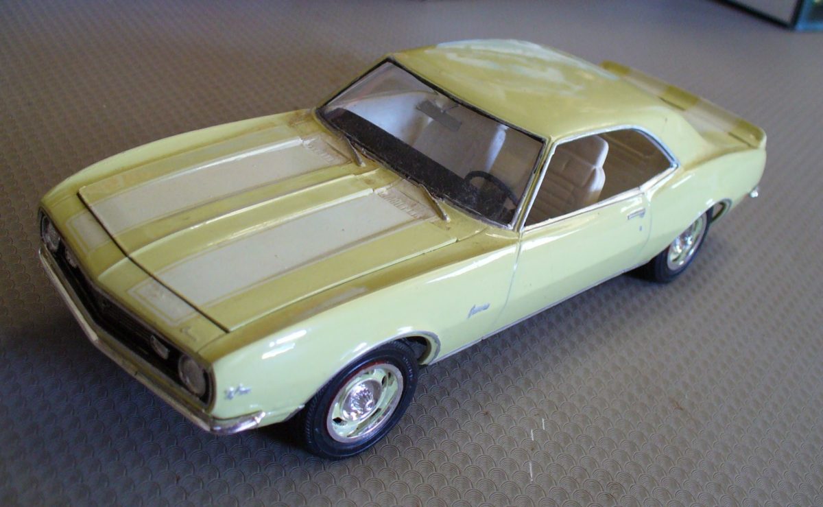
By the time we reached ’69 in my previous post, stripes were still reasonably tame, still largely confined to sills, upper bodies or over-the top (of the car) racing style stripes. Some Camaros had nose stripes, various Dodges had tail stripes, and Ford had a C-shaped bodyside stripe on the Mustang GT, Torino GT, and Galaxie XL. Some of us thought that was rather busy.
I’m doing 1970 as a stand-alone year as there are so many stripe variations to show. Now I don’t have models depicting every possible stripe and/or graphics package, but I’ll show you what I can. It’s a bit uneven, because the kit manufacturers often didn’t bother with correct stripe decals in the seventies when these cars were new. However, they often added them in later reissues. Fair enough: as a teenage modeller I wouldn’t have been too bothered whether stripes were ‘correct’ or not. But for 1970 Mopar and Ford in particular got very creative with regard to stripes and graphics.
As performance was becoming too expensive for many (cough, insurance, cough), it seemed as though stripes were getting bolder/wilder/sillier as though to provide some compensating excitement that wouldn’t increase costs.
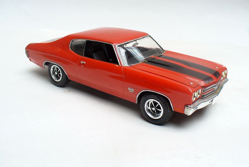
Chevrolet didn’t alter their stripes much through the muscle era, preferring to stick with the dual wide hood and trunk stripes as something of a Chevy muscle identifier.
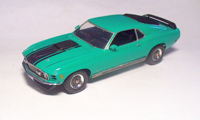
On the other hand, Ford were continually changing things. Mustang’s stripes came in two varieties for 1970. The Mach I is tamer, with a triple hood centre stripe leading to an air scoop, but has wide textured lower door/sill mouldings unique to this model.
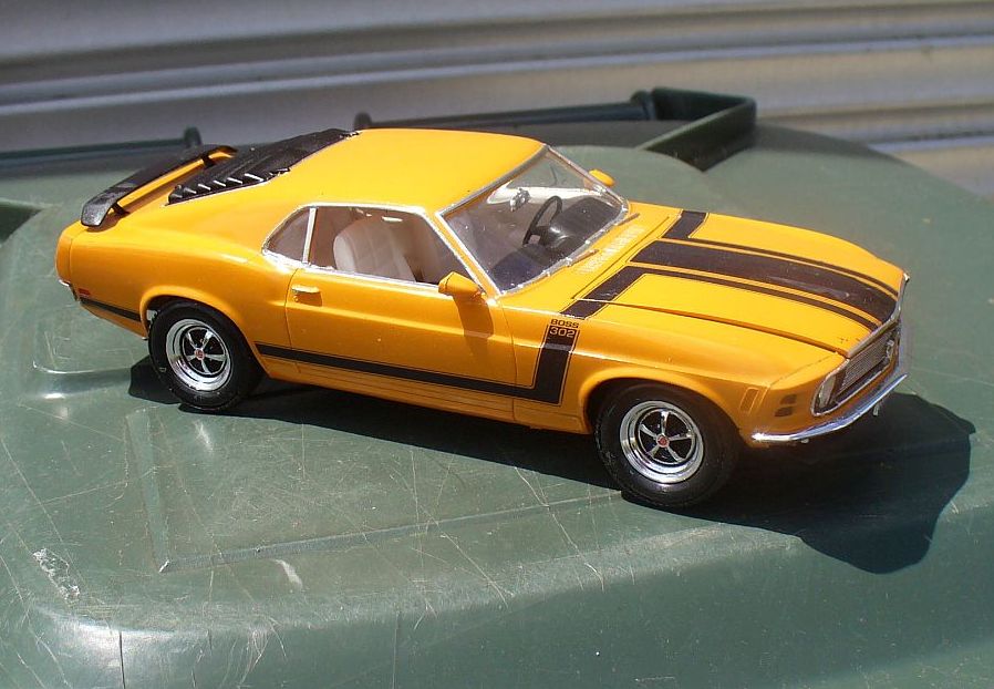
The Boss 302 is an early attempt to integrate hood and bodyside treatment, using black stripes which wrap from the hood, over the fender tops and along the sides, neatly calling out the engine spec on the way.
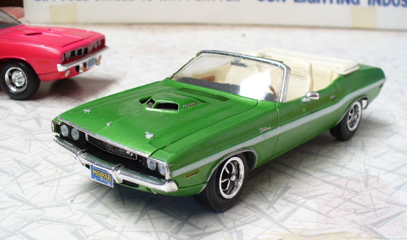
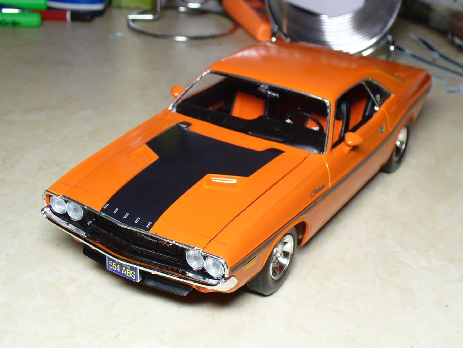
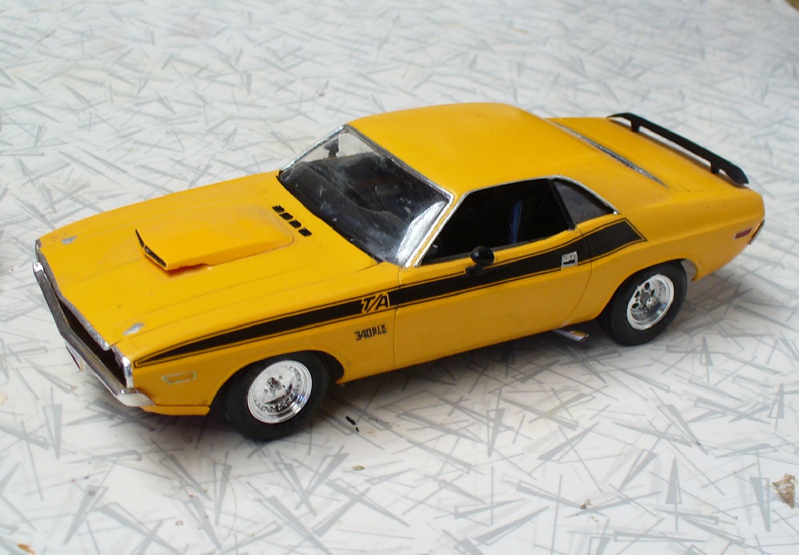
Dodge’s new Challenger shows three variations. The green convertible shows the R/T longitudinal mid-body stripe. The orange coupe has the R/T hood panel for its dual-scoop hood (not suitable for the shaker hood), and the yellow coupe shows the T/A’s upper-body stripe.
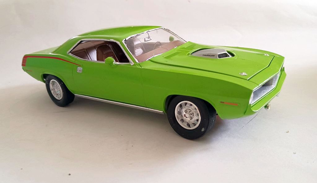
The new Barracuda seemed rather restrained, with this upper rear fender stripe (in a variety of colours). This would change the next year. Body-coloured bumpers were available, but only with some colours.
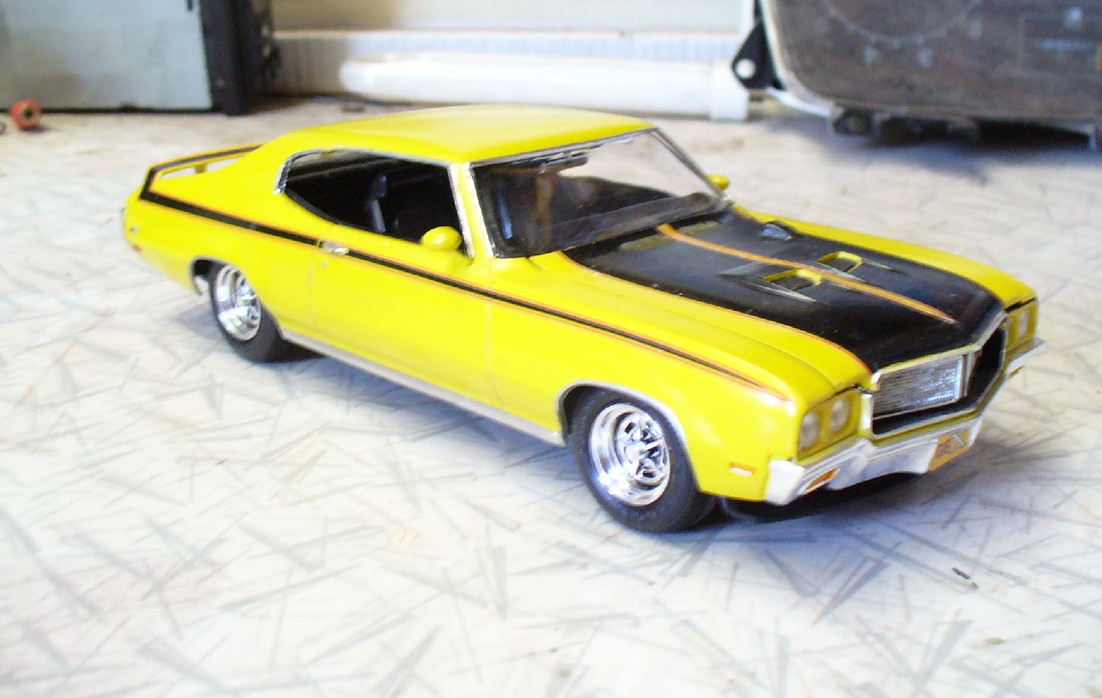
Buick gets into the act, and how! The black longitudinal stripe wraps up over the spoiler, and comes back down the other side. As well as that, there are hood stripes – all outlined with red pinstripes. Rather daring for a Buick? I guess it depends on what you think a Buick is.
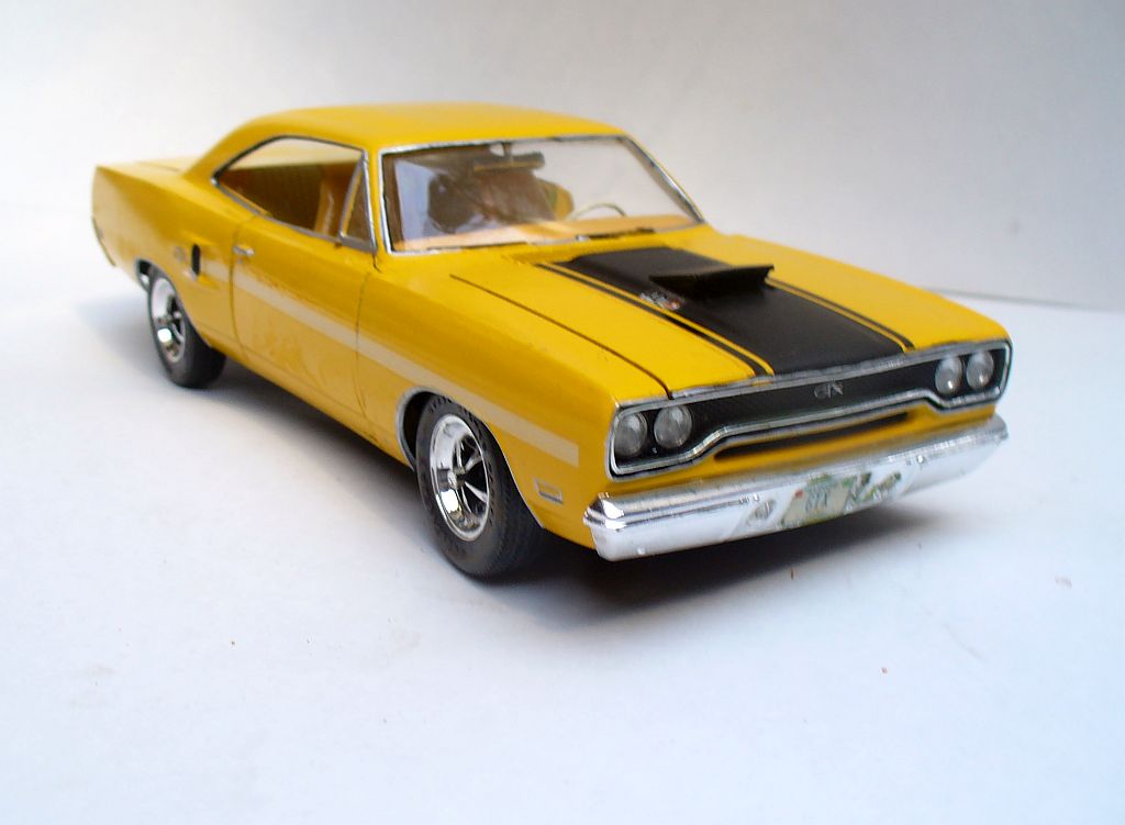
Plymouth put dual bodyside stripes on the GTX, as far as the quarter panel scoop, as well as the centre stripe on the hood – with that remote-controlled ‘missile-launcher’ hood scoop.
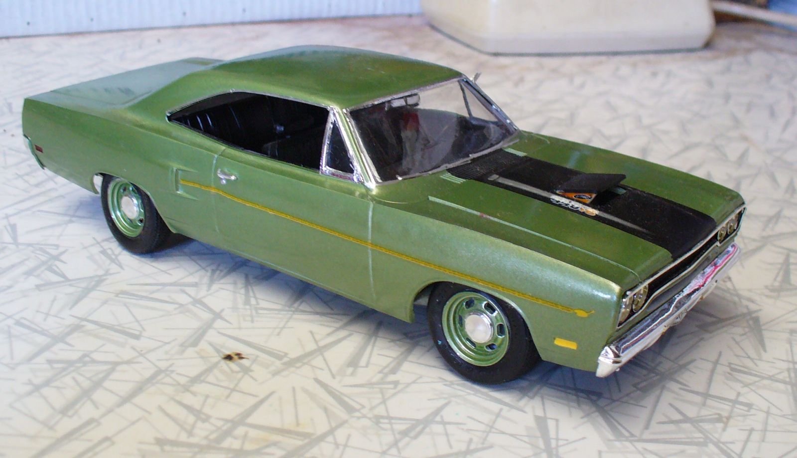
For the Road Runner, the stripes became a cartoon dust trail from the cartoon Road Runner on the front fender. That same menacing air scoop was available.
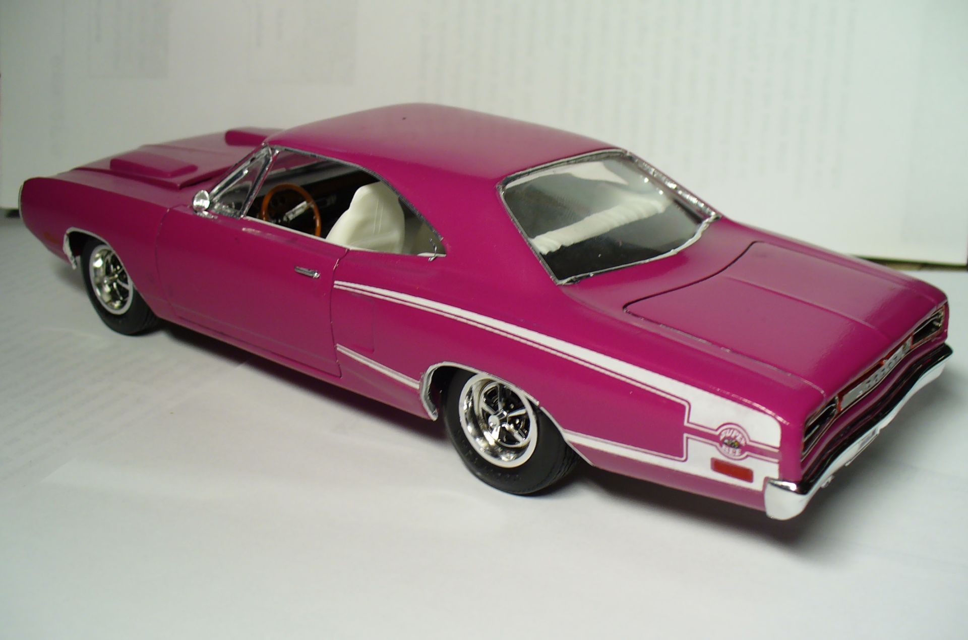
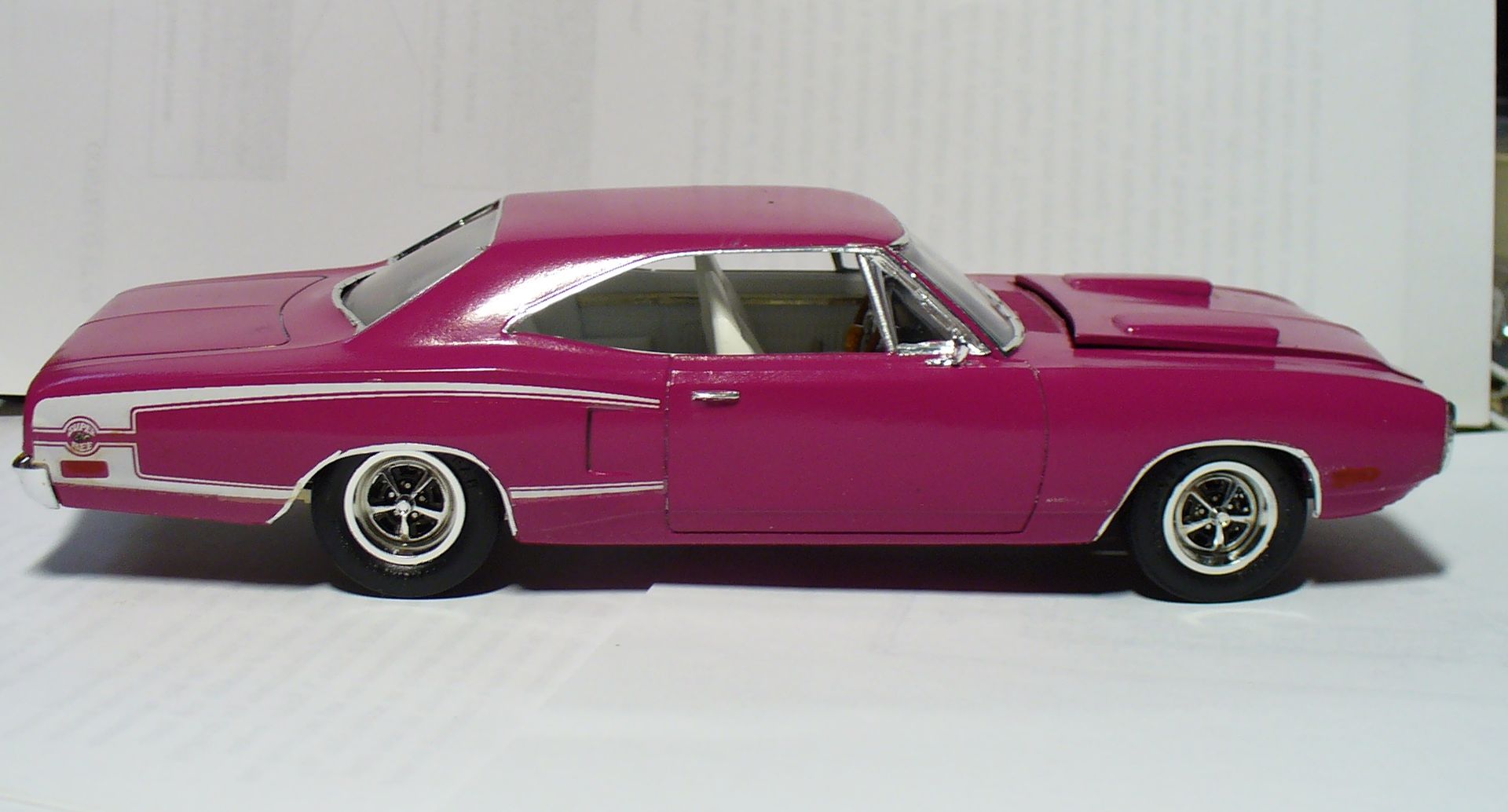
Described as a Reverse C-stripe, the Super Bee had this rear fender graphic treatment incorporating the cartoon Super Bee logo.
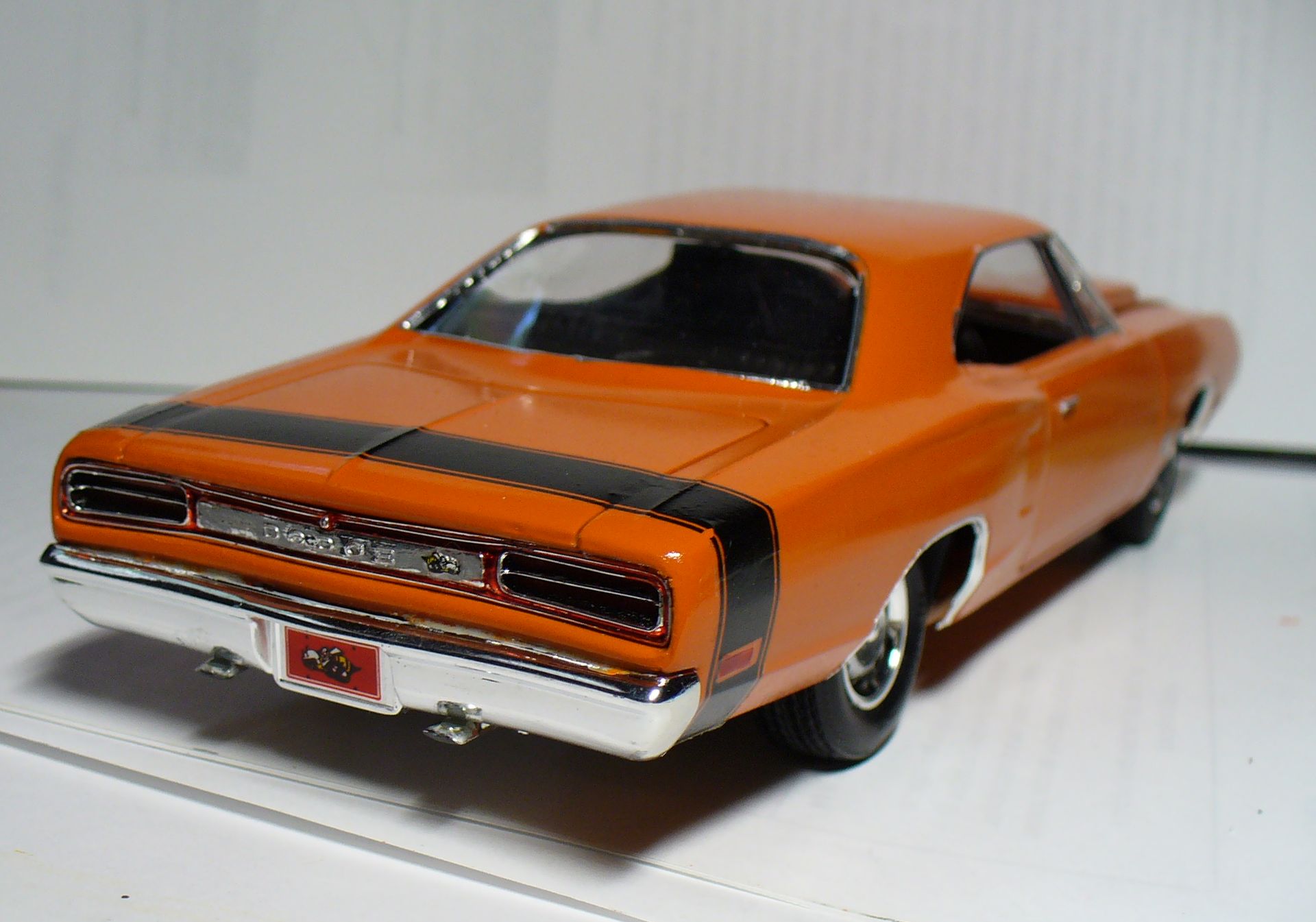
A ‘Scat Pack’ tail stripe similar to the previous year seems to have been the basic stripe. AMT’s kit (a pain to build) includes both.
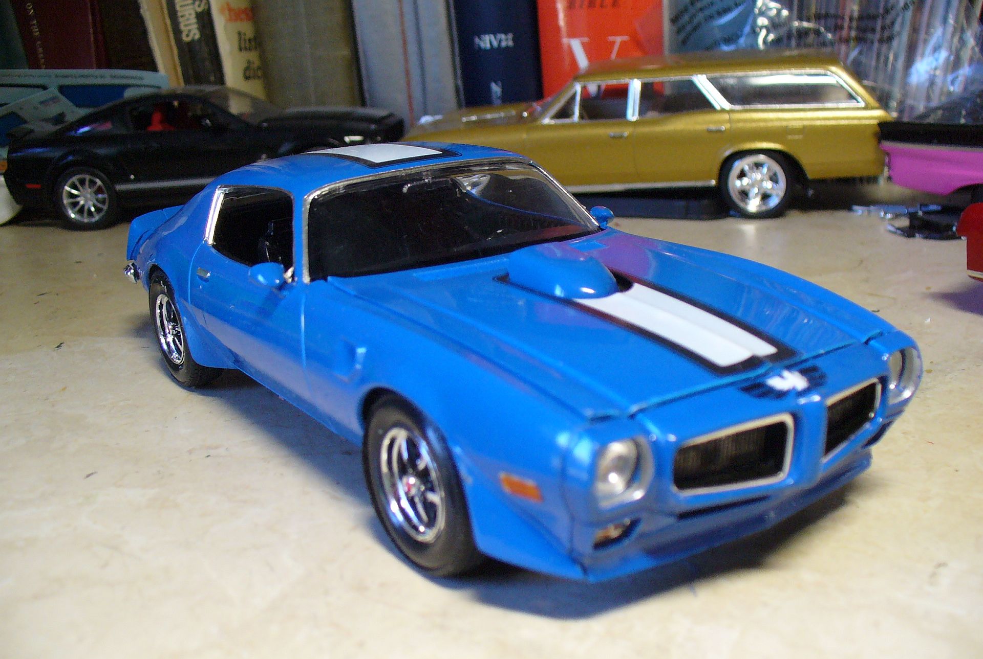
The Trans Am’s hood birdie began to hatch. A single wide over-the-top stripe replaced 1969’s two narrower ones, with a ‘little’ Firebird logo at the front. Well, he seemed pretty big back in ’70, but little compared with what was to come…
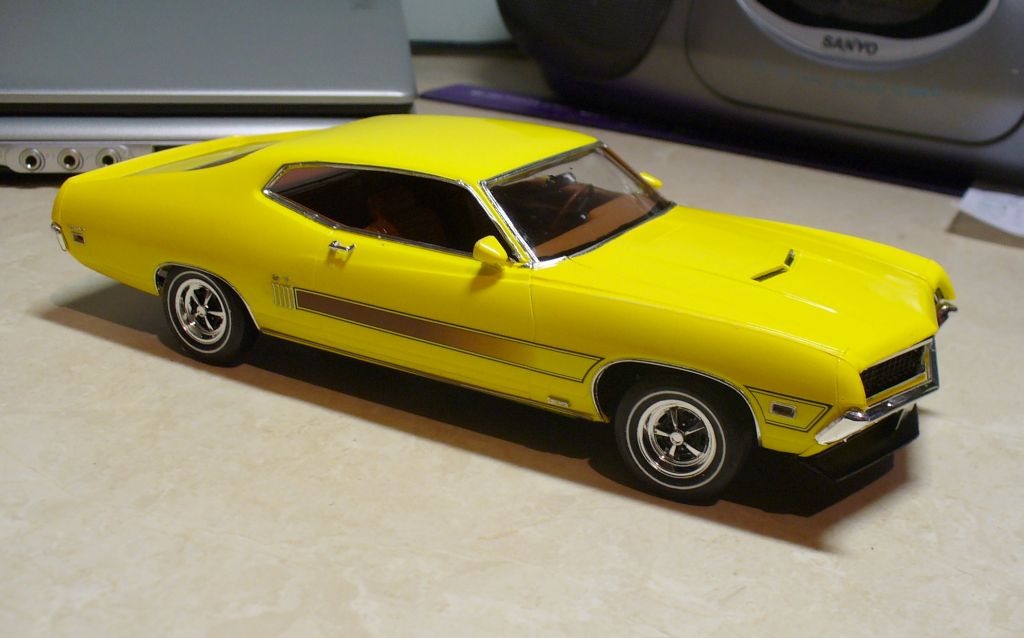
Were Ford’s graphics the wildest of the three? Ford put these amazing laser stripes on the Torino GT, in several different colour combinations to tone with the body colour selected.
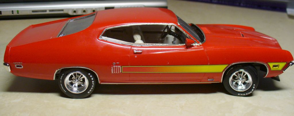
Instructions for the Monogram Torino GT included a chart of which colour stripe (they provided four) went with which body colours.
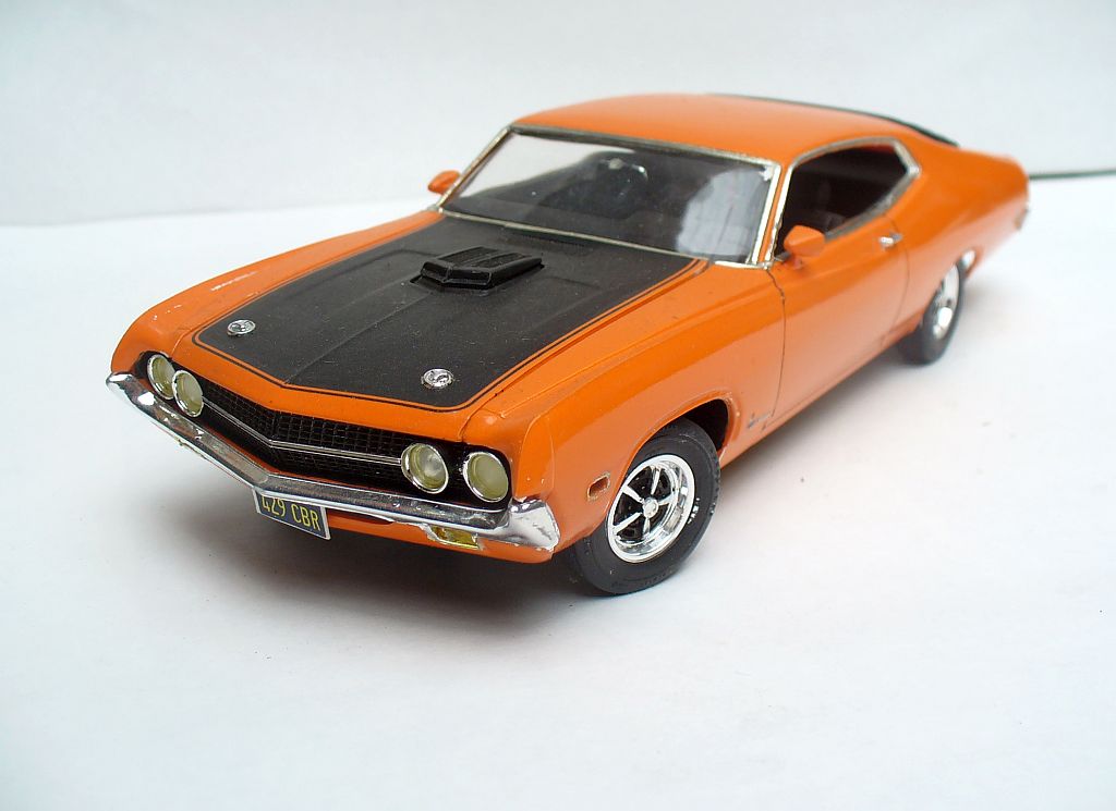
The Torino Cobra missed out on stripes, but got this huge black panel on the hood, outlined with pinstripes.
So things were heating up in the graphics department, if not under the hood. But wait till 1971!




They probably didn’t make many models of the cars that had the most vulgar graphics. Once the big engines went away, we got things like the Trans Am screaming chicken but there were far worse. The Mustang II Cobra had a similar theme to the Trans-Am but with a psychedelic snake. One year the Roadrunner had a tunnel theme on the trunk lid. Even the Camaro loosened up and had sort of a flame thing going around the hood bulge and in 1974 the hood proclaimed Z-28 in 12″ tall letters with three vertical stripes. Oh, it was a horrible time to be alive.
Yes, as a teenager at the time, I thought some of the graphic treatments later in the seventies were a bit childish, cringeworthy, the sort of thing I would have been embarrassed to be seen in. We’ll get to them next time – though as you say the kit makers didn’t do all of them – thankfully!
I was waiting for your next update on the series, i love wild ’70s graphics!
Interesting about the Firebird, I had forgotten about the decal with small phoenix; in my mind it is just the huge screaming chicken that arrived later in the decade
The big screaming chicken came in 1973 along with the broadened color palette, but oddly enough for that year only you could get the small one on the bumper instead
Thanks Gianluca. Seventies graphics were certainly trying to convey a sense of excitement, and all the more so when the cars lacked the hardware to back up the looks.
Excellent work! I never failed to fail installing decals on models!
Ford seemed to be the brand that pushed the envelope with stripes, a lot of cars up to and including 1970 usually had them in solid opaque colors with rather simple designs while the 68 Torino GTs basically applied the elaborate GT40 livery, Ford’s Boss 302 and 69 Mach 1 side stripes actually were reflective in person, that plus the 70 Torino’s colorful laser stripe. Course the GTO Judges also pushed that envelope, and by the late 70s most stripes available became extra colorful and outlandish on far more cars than muscle coupes, though I’m probably jumping ahead from the topic at hand.
Matt, to this day decals remain my least favourite part of modelling. It is not unusual for a model to sit on my bench for weeks (sometimes longer) awaiting those final decals. Part of the problem can be the quality: they don’t all behave the same. Some are so thick and inflexible they don’t conform to body contours; others so thin they tear or get tangled up trying to apply them.
I haven’t written the next part yet but have about twenty models chosen to illustrate it.
Peter I am 100% with you on decals, I haven’t done a musclecar in a while because of them.
And that ’70 Super Bee has to be one of the worst factory “kit-bash” special when it comes to engine installation and keeping the hood down.
I got to the point that when I paint a model I look up whether the car had a stripe delete possibility from the factory, and if so …. Yep totally intentional, it’s rare! 😆
I’ve encountered both thicknesses and found the same frustration, but also it’s a skill issue, being able to apply them so they’re not crooked is an art in itself. I also always wind up with a bubble somewhere under the strip no matter what I try.
I’ve had some success painting on stripes if they’re not overly elaborate but it’s extremely tedious if there’s a pinstripe border and avoiding a raised edge is near impossible. That can be wet sanded and buried in clearcoat for some successfully, but not so much for matte black stripes on gloss bodies
Gorgeous models!
Having done strips on HO scale locomotive models, and trying to keep them straight, I am impressed with how well these are all applied. Some of those bigger ones must be quite the challenge to keep them intact while getting them in position.
Bring on ’71!
Thanks! And when I see some of my son’s HO work, I am amazed at what can be done in a smaller scale (pic). HO aftermarket decals are often thinner and more fragile to apply.
As I said to Matt, car decals seem to vary a lot. You’ll get really thin ones which tear and tangle, and thick ones that really need to be hit with setting solutions to soften them; though thankfully the days are past when decals disintegrated under a gentle application of setting solution. I often find myself holding my breath when applying larger ones, and sometimes cut them at panel joins or corners, and piece them together again once they’re on the body.
The technique seems to be to dip them in the water for no more than five seconds and leave them to soak.
Wet the model surface with a paintbrush and as soon as the decal lets go from the backing, slide into place.
If the surface is wet enough, one can poke the decal around with a scalpel tip until satisfied.
Then comes the careful application of blotting paper to remove the water around the decal and finally press into place.
But thin, crappy ones can tear. But can be slid into alignment with luck.
Generally speaking that’s right Nick, and a pretty good rule of thumb to follow. But different manufacturers’ decals sometimes need subtly different treatment. Some need longer soaking, some need hotter water. Some disintegrate if the water’s too hot! If the kit is an older one, decals sometimes don’t want to release from the backing even after a longer soak – while newer ones might disintegrate under such treatment.
And if you ever need to get your place fumigated, take the models out first. While the gas might attack the chrome, it will certainly ruin the decals.
Some claim that 1970 was the peak year for musclecars, but all those wild scoops, stripes, and spoilers that began in that year make me think that the best year was really 1969. You know, back when engine call-outs were just small, discreet emblems, typically somewhere low on the front fenders.
Beginning in 1970, that all went out the door, and not for the better.
Like many of the visual arts, it’s a matter of personal taste. As a somewhat shy and retiring teenager, I hated the broad high-contrast stripes and cartoon hot-rod kangaroo (yes, really!) on the XW Falcon GT (below). That was in 1969. Yet to see one these days without them, it seems undressed, incomplete.
There is a lot to be said for subtlety, the ’wolf in sheep’s clothing’ approach. Yet the artist in me like seeing the weirdnesses of this era as an exercise in graphics – so long as I don’t have to drive a car like that!
I totally agree, the XW (and XY) Falcons just look like a weird face/buttlift to what in American eyes is the already frumpy 66 Falcon sedan. With the stripes however it’s a supercar icon, so cool I kind of want to clone one out of a US Falcon for a project, if only I had the sheetmetal skills! (And time… and money… and space… )
And there’s other instances like scoops, the standard 70 Challenger R/T hood in my mind should have been on every Challenger, it fits the styling perfectly and the standard flat hood is b-l-a bland. Everyone loves 68-70 Chargers, and one of the things that stands out to me is every last one of them whether 426 Hemi powered or 225 slant six powered got the same exact hood with fake air extractors, because it looked good and fit the styling. Dodge ultimately did just that with the late model Challengers; give the people the complete design!.
Some cars need a stripe, or a scoop or a spoiler to work. Another example would be second gen Firebirds: for whatever reason I don’t mind (the lack of) it on 70-73s but 74-81 NEED the ductail spoiler to look complete for me. Doesn’t need to be a Trans Am or Formula or anything outlandish in any other way, but that spoiler is essential.
Hey, we think your Falcons are the weird ones, Matt!
If you want an XW or XY, DDA produces kits in several versions in 1/24 (even a ute), complete with those stripes for the GT (link to review below) . That might be easier than doing all the roofline, fender and trunk mods to a US Falcon.
Good point about giving everyone the complete design – usually. On our XB and XC Falcons, models without the scooped hood got the same hood pressing with no scoops in the bulge – which I always thought looked weird. Imagine if scoopless ’71-3 Mustangs used the same hood pressing, and you’ll get the idea.
.
https://www.scalemodeller.com.au/blogs/from-the-desk-sms/lets-build-the-1-24-xw-ford-falcon?srsltid=AU7gw4VT9q4O52lXWIWrb-vKE3vudA2E-fvyFJnKrkkXX8JXukOHJE8p
There are some interesting variations on the striping here and you’ve done them proud, Peter! I think I have a slightly greater fear of messing up painting than messing up transfers, but you’re right, some are easier to deal with than others and you usually only find out when you try to apply them.
The most adventurous car graphic I’ve done (1:76 scale) so far has been a Viva GT with the extended red pin striping and semi-matt bonnet. Fairly obviously hand painted though. I do have a part build 3.0 Capri S but I’ve yet to make the strobe transfers for. I did have a version I did about 20 years ago, but whether I can find the file now I doubt. Probably quicker to start again.
That pinstriping is amazing on such a tiny car! As a kid I used to paint stripes on my Matchbox cars sometimes, but could never have achieved something as fine as that.
A few months back I built an early eighties Ford Laser (Mazda 323 clone). The old Nitto kit’s decals had to be manually peeled from the backing after almost ten minutes of soaking and standing, so I called it quits after I got the number plates on; I painted the Ford oval and didn’t bother with the stripes.
I did ‘cheat’ slightly by using a sharpened matchstick dipped in either white spirit or methylated spirits (can’t remember which now; it was nearly 40 years ago) to tidy the brush painted line as I went along. Stripe-less ‘deluxe’ and base models are certainly easier!
Peter: Late to the party this time, but the “C” striped Super Bee lead photo jumped out and grabbed me! As always, there are many more of your creations that I really like, rather than dislike: the red stripe on the green ‘Cuda seems odd, and the white stripes on the pale yellow Camaro don’t do anything for me. All of the rest are superb!! 🙂